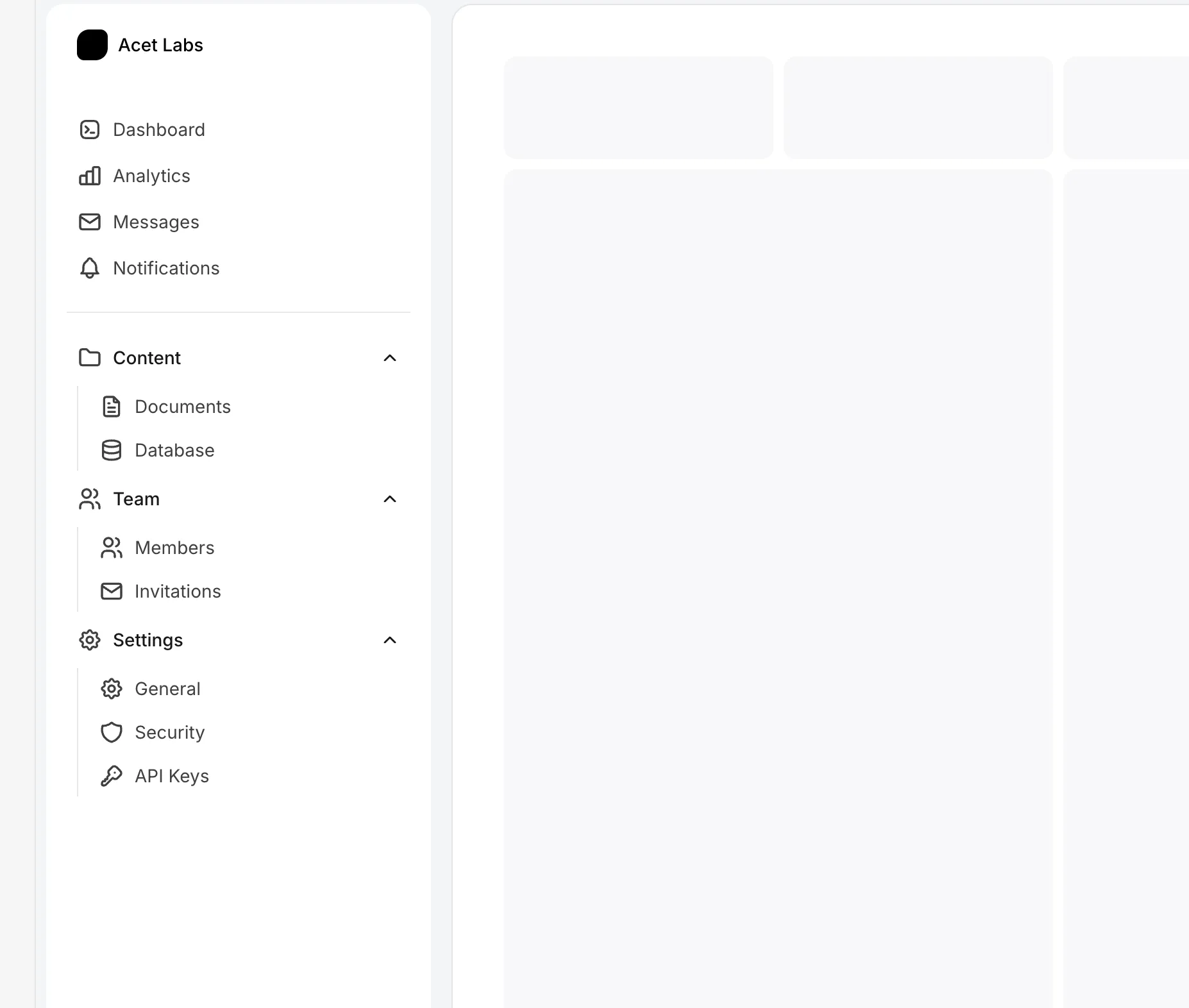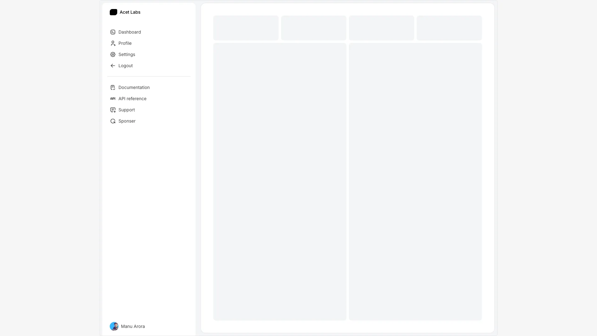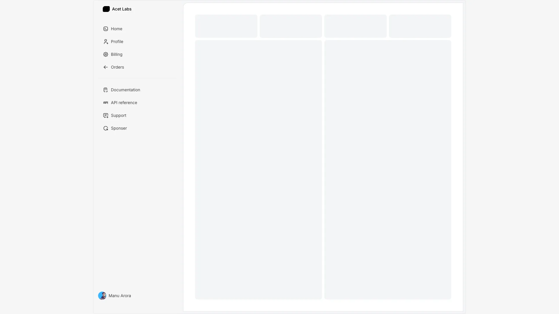








All three handle the collapsed width transition and the active link state. Replace the link arrays with your own routes and icons.
The collapsed state is where sidebars break. An icon-only rail saves maybe 200px of width and costs your users the ability to identify anything they have not already learned, so if you collapse by default you need tooltips on hover and an accessible name on every link. Put the label in the button as visually hidden text or use aria-label, because a link whose only content is an SVG announces as nothing useful. The hover-to-expand sidebar here sidesteps some of this by revealing real labels rather than tooltips, which I prefer.
Keyboard behaviour deserves ten minutes of deliberate testing. Tab through the whole rail and confirm the focus ring is visible against your background, that collapsed groups do not leave hidden links in the tab order, and that the collapse toggle exposes aria-expanded. Mark the current page with aria-current="page" rather than only a background colour, since colour alone tells a screen reader nothing. If your sidebar has more than about fifteen destinations, a roving tabindex with arrow-key movement starts to beat plain tabbing.
Persisting the open state is worth it and slightly annoying in Next.js. Reading localStorage during render throws on the server, and reading it in an effect gives you a visible flash where the sidebar snaps from expanded to collapsed after hydration. The two fixes that work are storing the preference in a cookie so the server renders the right width immediately, or writing a class onto the html element from a small blocking script before paint. The grouped sidebar here uses localStorage, so plan for that flash if your default and stored states differ.
On mobile a sidebar should stop being a sidebar. Below the medium breakpoint, turn it into an overlay drawer with a backdrop, trap focus inside it while it is open, close it on escape and on route change, and lock body scroll. Keep the nav element scrollable independently of your main content too, otherwise a long link list drags the whole page around on short viewports.
Hold a boolean in state, animate the container width between two fixed values, and hide the labels with opacity rather than unmounting them so the text does not reflow mid-transition. Animate width or transform on the container only, and avoid animating margin on the main content since that triggers layout on every frame.
Write the preference to localStorage or a cookie when it changes. A cookie is better in Next.js because the server can read it and render the correct width on the first paint, whereas localStorage is only readable after hydration and gives you a visible snap.
Use a sidebar when you have more than roughly eight destinations or any nesting, since vertical lists scale and horizontal ones do not. A top navbar is better for marketing pages and for apps where the content needs the full window width, like editors and data tables.
Around 240px to 280px expanded, and 56px to 72px collapsed to an icon rail. Narrower than 240px and longer link labels start to truncate, wider than 280px and you are spending window space that the content usually needs more.
Here's what some of our users have to say about Aceternity UI.

amazing to see @calcom find its way into proper templates 🥳 excited to be powering the next thousands of startups and their demo calls!

Stumbled upon ui.aceternity.com today and my mind is blown 🤯 The seamless integration of framer-motion, tailwind CSS, and shadcn showcases a masterclass in UI design. 🚀 Kudos to @mannupaaji for creating such an innovative and inspirational resource for devs! #UI #nextjs

Have you heard of Aceternity UI? It's packed with various animated components that are ready to copy and paste! Mind-blowing stuff... 🤯 Click here ➡️ ui.aceternity.com #framermotion #nextjs #tailwindcss #techinnovation

ui.aceternity.com So well done. And its bloody free 🤯🤯 Phenomenal work by @mannupaaji

So happy to see @mannupaaji work being recognised 🥹🤌🏻♥️ His work is literally a treasure trove for devs 💎

Aceternity UI has some of the best components for designing landing pages I've ever seen. If you're struggling with figuring out what animations to use. Check it out. Thank me later 😉. ui.aceternity.com
See what the best YouTubers are saying about Aceternity UI.



ceternity UI
Access an ever-growing collection of premium, meticulously crafted templates and Component Blocks.
© 2026 Aceternity Labs LLC. All Rights Reserved.