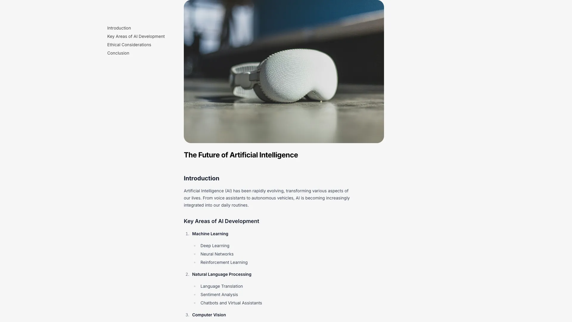








Both render Markdown through react-markdown and style the output, so you can pipe in MDX or a CMS response without rewriting the typography.
Measure is the setting that matters most and the one people get wrong. A line of body text should hold roughly 60 to 75 characters, which at an 18px font size lands around 680px of content width. Set it with max-w-prose or a ch-based width rather than a pixel value, so it tracks your font size if you change it later. Full-width paragraphs on a 27 inch monitor are physically tiring to read, and the fix is one class.
Get the heading hierarchy right because two different systems depend on it. Exactly one h1 for the post title, then h2 for sections and h3 for subsections with no levels skipped, since screen reader users navigate by heading level and a table of contents generated from your Markdown will produce nonsense if the levels jump. Slugify each heading into an id and render an anchor link on it. That gives people a way to link to a specific section, which is the single most useful affordance on a long technical post.
A sticky table of contents needs two details to feel right. Highlight the current section with an IntersectionObserver on your headings rather than by comparing scroll offsets, and set scroll-margin-top on every heading equal to the height of your sticky header, otherwise every anchor click lands with the title hidden underneath the navbar. On mobile the sidebar has nowhere to live, so collapse it into a floating button that opens a sheet, which is what the TOC block here does. Reserve the sidebar column even while the TOC is empty so the article does not shift.
For the body styles, decide once whether you are using the typography plugin or hand-writing the rules. The plugin gets you sane defaults quickly and then fights you on anything custom, while hand-written rules mean you own every element including the ones you forget until a post uses them. Either way, test with an article that contains a wide code block, a table, a blockquote and a nested list. Set line-height around 1.65 for body copy, tighten it for headings, add overflow-x-auto on pre and never justify text on the web.
Aim for 60 to 75 characters per line, which is roughly 640px to 720px at an 18px font size. Tailwind's max-w-prose implements this for you, and it is a better choice than a fixed pixel width because it scales with the font.
Extract the h2 and h3 headings from your Markdown at build time with a remark plugin, or query them from the DOM after mount, then render a list of anchor links to their ids. Track the active heading with an IntersectionObserver and add scroll-margin-top to the headings so a sticky header does not cover them.
Either add @tailwindcss/typography and wrap the rendered HTML in the prose class, or write your own element selectors under a scoped parent class. The plugin is faster to start with; hand-written styles are easier to live with once your design diverges from its defaults.
Yes. Giving each heading an id and a visible anchor lets readers link directly to a section, which is how technical posts get cited in issues and chat. Keep the anchor visible on focus so it is reachable by keyboard rather than hover only.
Here's what some of our users have to say about Aceternity UI.

amazing to see @calcom find its way into proper templates 🥳 excited to be powering the next thousands of startups and their demo calls!

Stumbled upon ui.aceternity.com today and my mind is blown 🤯 The seamless integration of framer-motion, tailwind CSS, and shadcn showcases a masterclass in UI design. 🚀 Kudos to @mannupaaji for creating such an innovative and inspirational resource for devs! #UI #nextjs

Have you heard of Aceternity UI? It's packed with various animated components that are ready to copy and paste! Mind-blowing stuff... 🤯 Click here ➡️ ui.aceternity.com #framermotion #nextjs #tailwindcss #techinnovation

ui.aceternity.com So well done. And its bloody free 🤯🤯 Phenomenal work by @mannupaaji

So happy to see @mannupaaji work being recognised 🥹🤌🏻♥️ His work is literally a treasure trove for devs 💎

Aceternity UI has some of the best components for designing landing pages I've ever seen. If you're struggling with figuring out what animations to use. Check it out. Thank me later 😉. ui.aceternity.com
See what the best YouTubers are saying about Aceternity UI.

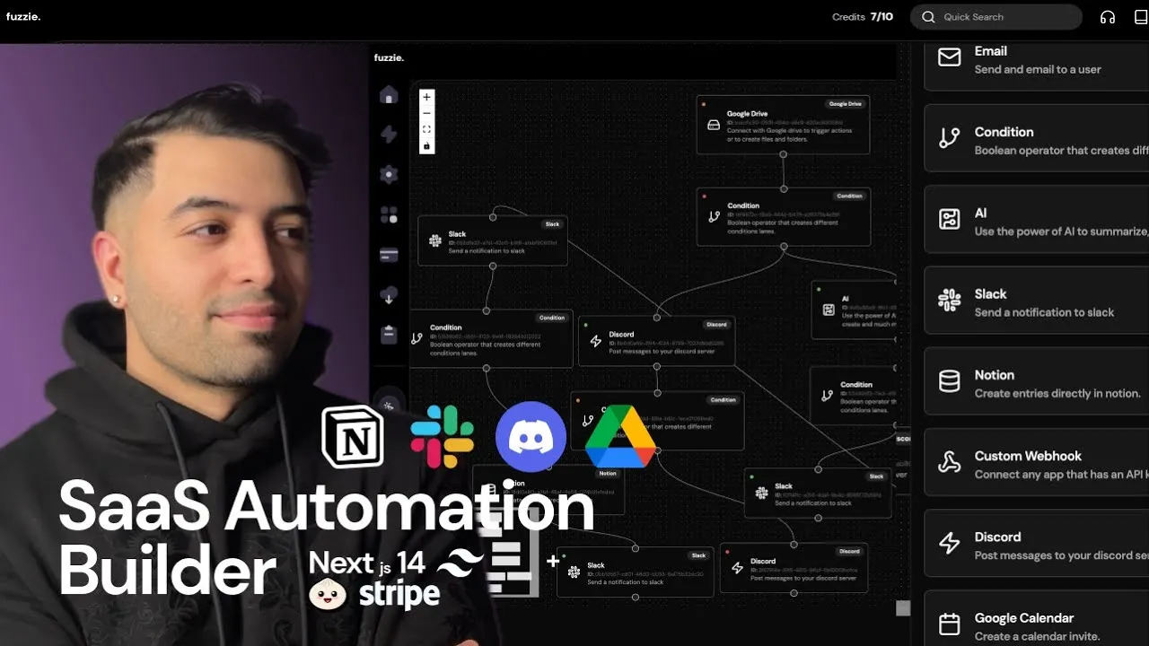
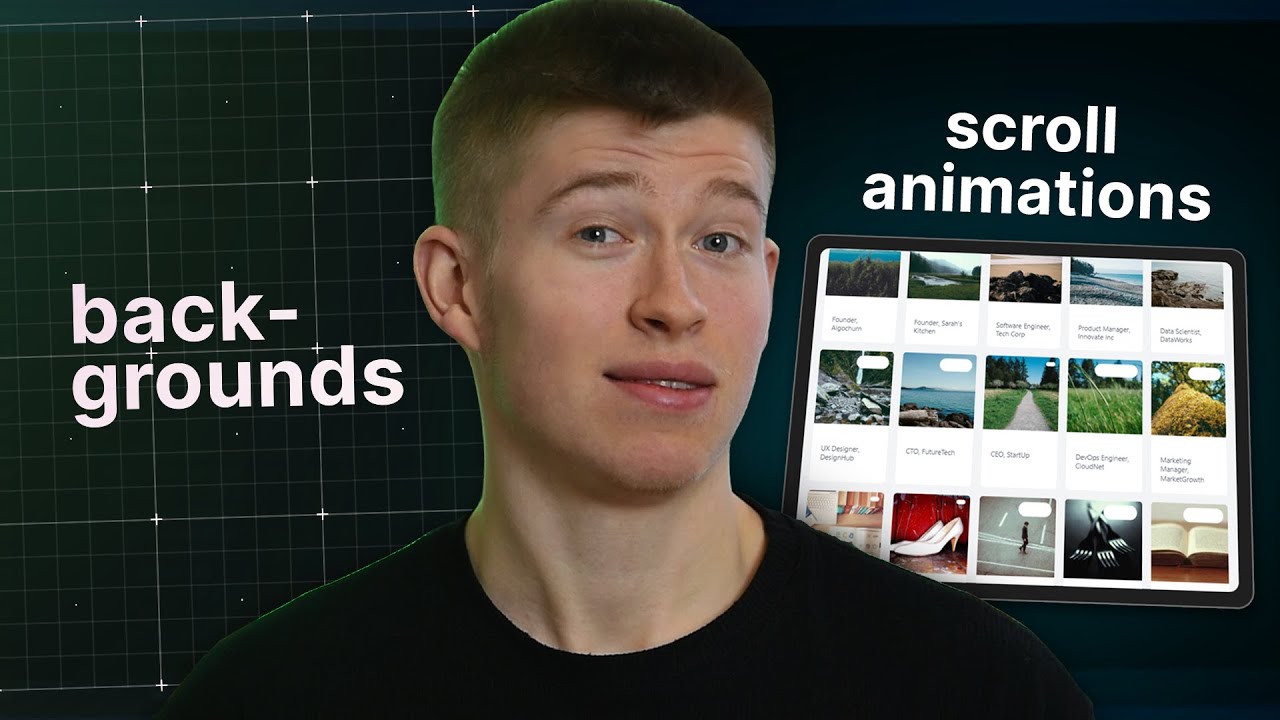

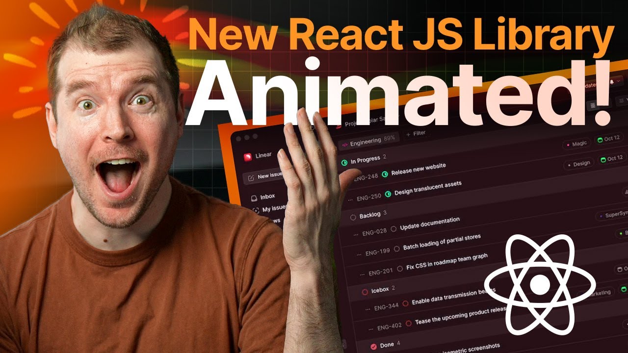

ceternity UI
Access an ever-growing collection of premium, meticulously crafted templates and Component Blocks.
© 2026 Aceternity Labs LLC. All Rights Reserved.