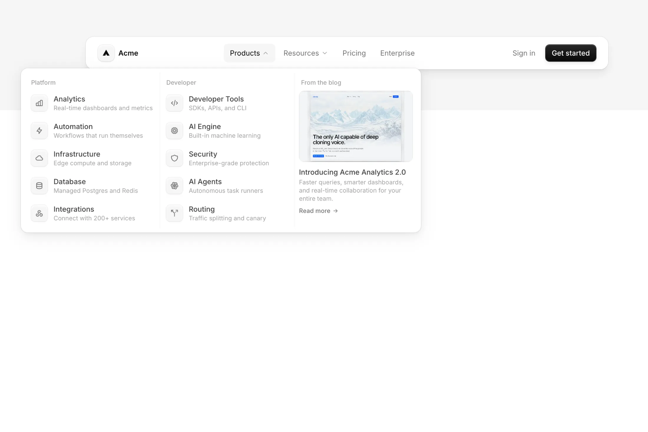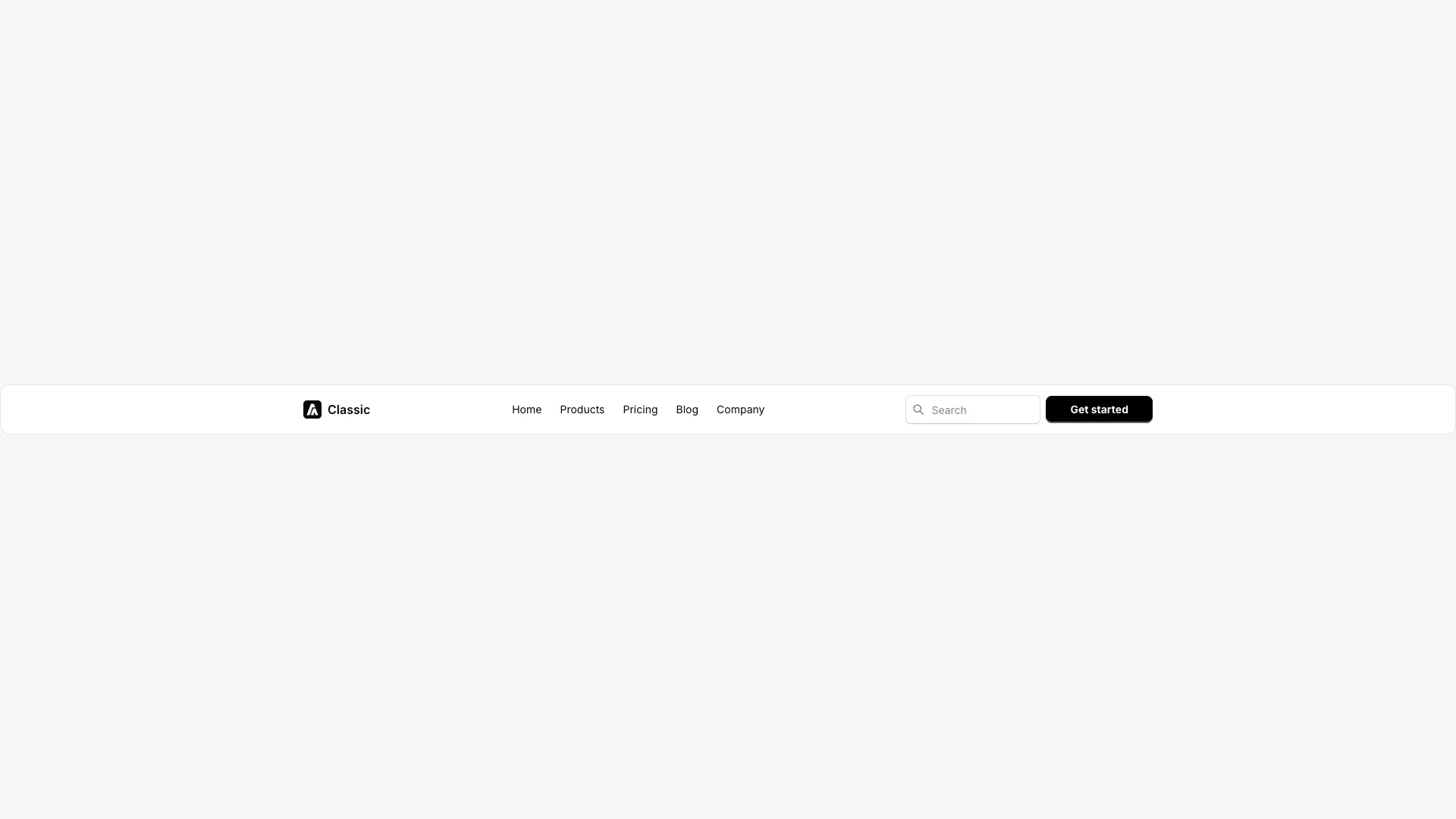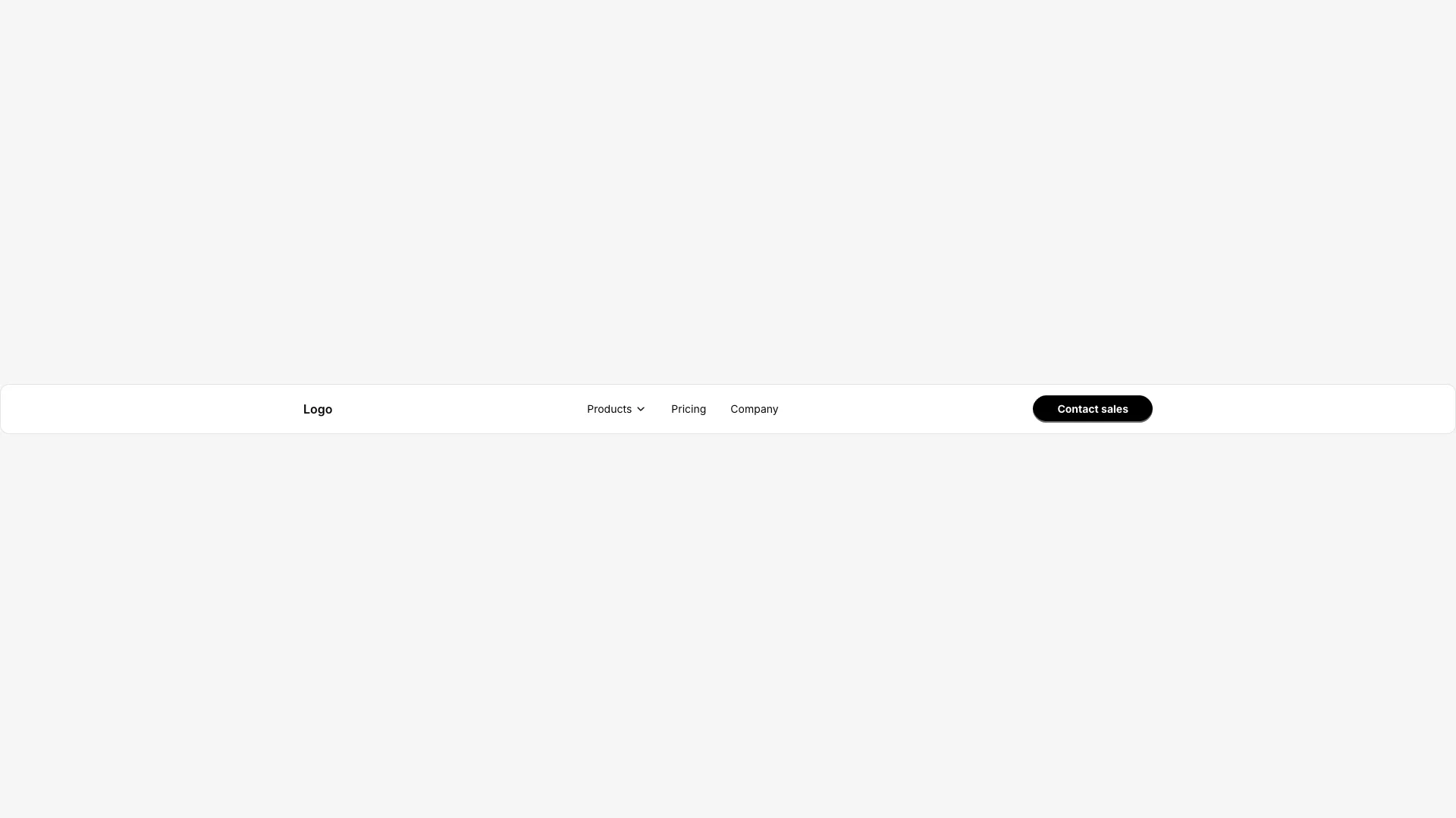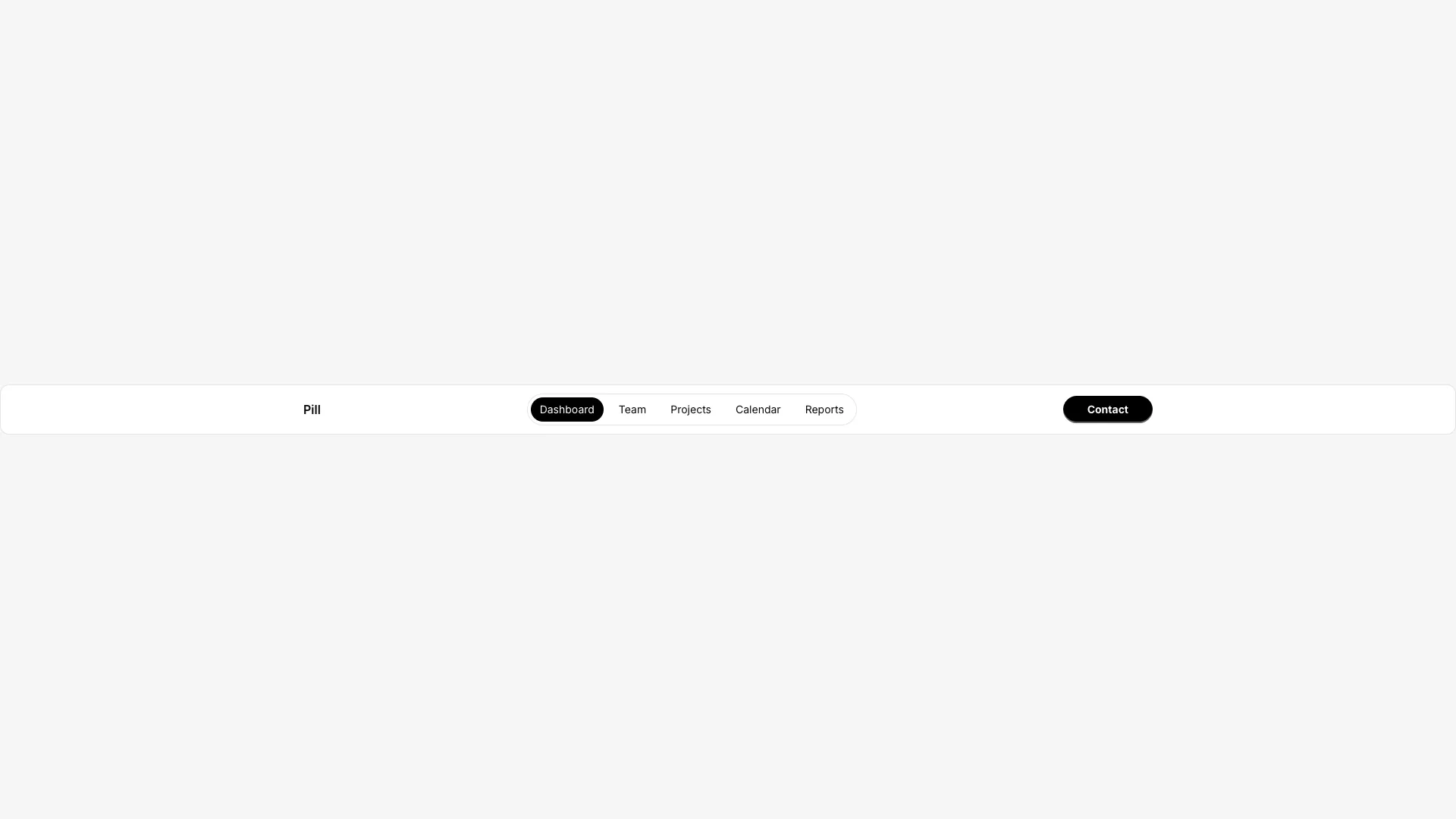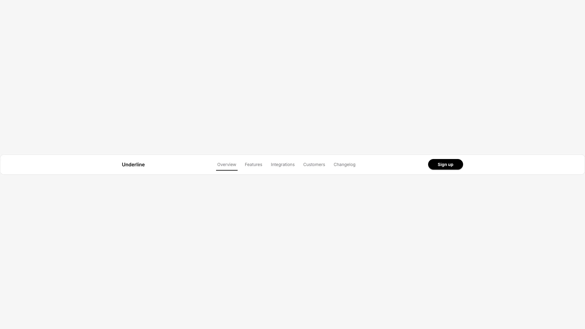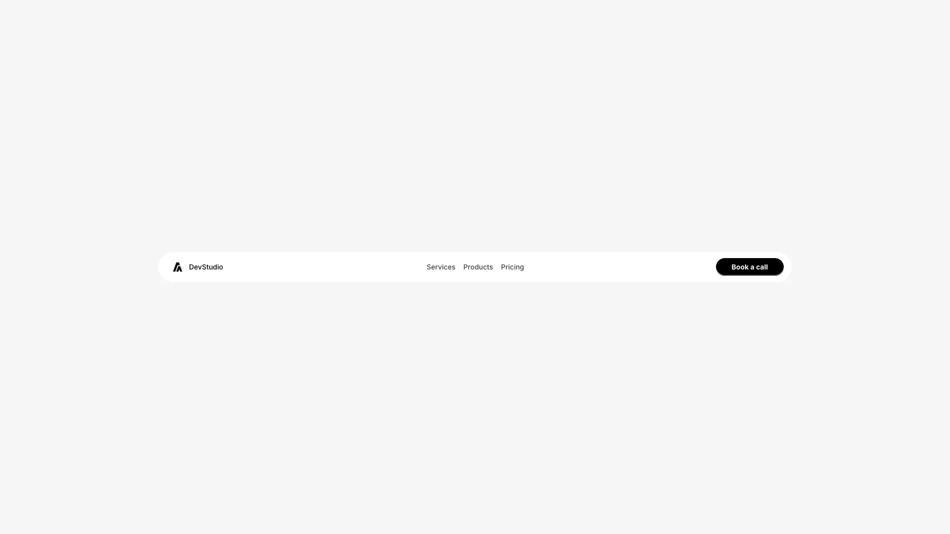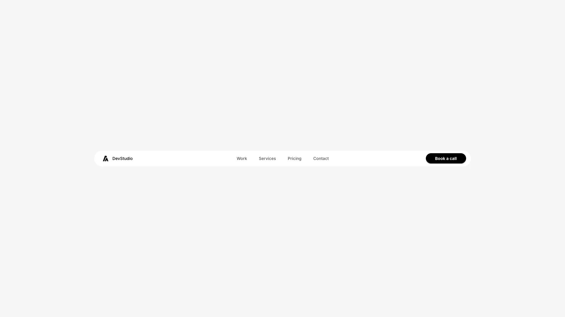








All seven handle the scroll state, the mobile breakpoint and keyboard focus. Copy the file and replace the link array with your own routes.
Navigation is the one component where being interesting is usually a mistake. People arrive with a learned model of where things are, and a navbar that violates it costs them time even when it looks better. The safe default is a logo on the left, links in the centre or right, and one visually distinct call to action at the far right.
The decision that actually matters is whether the bar stays fixed while scrolling. Fixed navigation helps on long marketing pages where the call to action would otherwise scroll away, and hurts on content pages where it eats vertical space on small screens. If you fix it, shrink it after the first scroll so it takes less room once someone is reading.
Mega menus only pay for themselves past roughly fifteen destinations. Below that they add a hover target and a layer of hesitation for no benefit. If your site has six pages, a plain row of links will outperform anything more elaborate.
Whatever you pick, check it with a keyboard. A navbar where the mobile drawer cannot be closed with escape, or where tab order jumps into hidden links, is broken for a meaningful slice of visitors and for the crawlers that follow focusable elements.
Apply sticky top-0 with a z-index above your page content, and give the element a background colour so text does not show through as it scrolls. The sticky navbars in this collection also add a backdrop blur and a border once the page has scrolled past a threshold.
Yes. Each one includes a mobile breakpoint with either a hamburger drawer or a collapsed menu, with focus trapping and escape-to-close handled in the component rather than left to you.
One of the seven is a mega menu with multi-column panels and hover intent. If you want to add panels to a simpler navbar, the mega menu component shows the positioning and animation approach you would copy.
The interactive navbars use semantic nav and button elements, expose aria-expanded on toggles, and keep focus inside an open mobile drawer until it is dismissed.
Here's what some of our users have to say about Aceternity UI.

amazing to see @calcom find its way into proper templates 🥳 excited to be powering the next thousands of startups and their demo calls!

Stumbled upon ui.aceternity.com today and my mind is blown 🤯 The seamless integration of framer-motion, tailwind CSS, and shadcn showcases a masterclass in UI design. 🚀 Kudos to @mannupaaji for creating such an innovative and inspirational resource for devs! #UI #nextjs

Have you heard of Aceternity UI? It's packed with various animated components that are ready to copy and paste! Mind-blowing stuff... 🤯 Click here ➡️ ui.aceternity.com #framermotion #nextjs #tailwindcss #techinnovation

ui.aceternity.com So well done. And its bloody free 🤯🤯 Phenomenal work by @mannupaaji

So happy to see @mannupaaji work being recognised 🥹🤌🏻♥️ His work is literally a treasure trove for devs 💎

Aceternity UI has some of the best components for designing landing pages I've ever seen. If you're struggling with figuring out what animations to use. Check it out. Thank me later 😉. ui.aceternity.com
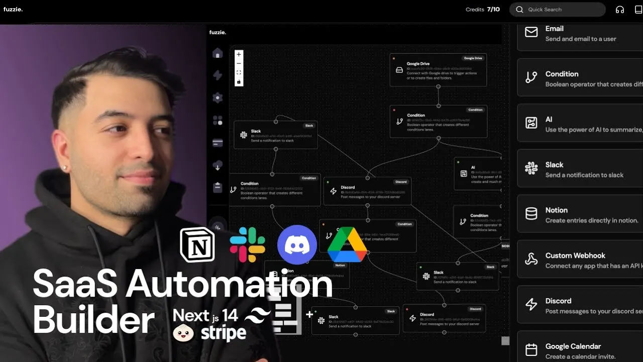
See what the best YouTubers are saying about Aceternity UI.


ceternity UI
Access an ever-growing collection of premium, meticulously crafted templates and Component Blocks.
© 2026 Aceternity Labs LLC. All Rights Reserved.