







Drop your own SVGs into the logos array and the spacing, masks and animation timing stay as they are. Placeholder logos are included so the block renders before you have assets.
Start with permission, because a logo is a trademark and putting one on your marketing site is a use of someone else's brand. Most enterprise contracts have a clause about this, and plenty of companies keep a brand page with rules on clear space and minimum size. Get written sign-off from your contact, or from their marketing team if the contract is silent, and keep the email. Pulling a logo off a website because the customer's legal team asked you to is a bad afternoon that a two-line email prevents.
The convention is to desaturate logos with grayscale and reduce opacity so a row of clashing brand colours does not fight your page. It works, and it has a real cost: recognition drops when you strip the colour that makes a brand identifiable, and heavy opacity reduction can push the marks below a usable contrast level. My compromise is grayscale at full opacity on light backgrounds, and if you insist on a hover state that restores colour, remember touch devices never see it.
Size logos optically rather than uniformly. Setting every SVG to the same width makes a wide wordmark tower over a square icon, so normalise on visual mass instead, which usually means matching cap height and giving each logo its own max-height. Export every mark at the same viewBox padding so your spacing is predictable. For dark mode you need either logos that use currentColor or two files per brand, because a black wordmark on a dark background is a bug you will only notice in screenshots.
Motion is optional and often counterproductive. A marquee duplicates its content to loop, so mark the clone aria-hidden and never put real links inside a moving strip, since asking someone to click a target that is sliding away is hostile. Pause on hover, and stop entirely under prefers-reduced-motion. The rotating clouds have a subtler problem: at any moment half your social proof is off screen, so if you only have eight logos worth showing, show all eight and let them sit still.
Generally yes. Logos are trademarks, and using one implies an endorsement you may not have, so check the customer contract for a marketing clause and get written approval from their team. Many companies publish brand guidelines that specify acceptable colour, spacing and minimum size.
Grayscale keeps a row of mismatched brand colours from overwhelming the section, which is why it became the default. The tradeoff is lower recognition, so if the brands you list are your strongest proof, keep them in colour and control the visual noise with spacing and consistent sizing instead.
Duplicate the logo list, put both copies in a flex row, and translate the container by negative fifty percent with a linear infinite animation so the loop is seamless. Add a mask-image that fades both edges, hide the duplicated set from assistive technology, and disable the animation under prefers-reduced-motion.
Five to eight in a single row, or up to twelve in a grid. Fewer than four rarely reads as a pattern of adoption, and past a dozen individual names stop registering and the section turns into texture.
Here's what some of our users have to say about Aceternity UI.

amazing to see @calcom find its way into proper templates 🥳 excited to be powering the next thousands of startups and their demo calls!

Stumbled upon ui.aceternity.com today and my mind is blown 🤯 The seamless integration of framer-motion, tailwind CSS, and shadcn showcases a masterclass in UI design. 🚀 Kudos to @mannupaaji for creating such an innovative and inspirational resource for devs! #UI #nextjs

Have you heard of Aceternity UI? It's packed with various animated components that are ready to copy and paste! Mind-blowing stuff... 🤯 Click here ➡️ ui.aceternity.com #framermotion #nextjs #tailwindcss #techinnovation

ui.aceternity.com So well done. And its bloody free 🤯🤯 Phenomenal work by @mannupaaji

So happy to see @mannupaaji work being recognised 🥹🤌🏻♥️ His work is literally a treasure trove for devs 💎

Aceternity UI has some of the best components for designing landing pages I've ever seen. If you're struggling with figuring out what animations to use. Check it out. Thank me later 😉. ui.aceternity.com
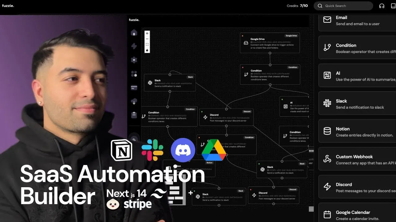
See what the best YouTubers are saying about Aceternity UI.



ceternity UI
Access an ever-growing collection of premium, meticulously crafted templates and Component Blocks.
© 2026 Aceternity Labs LLC. All Rights Reserved.