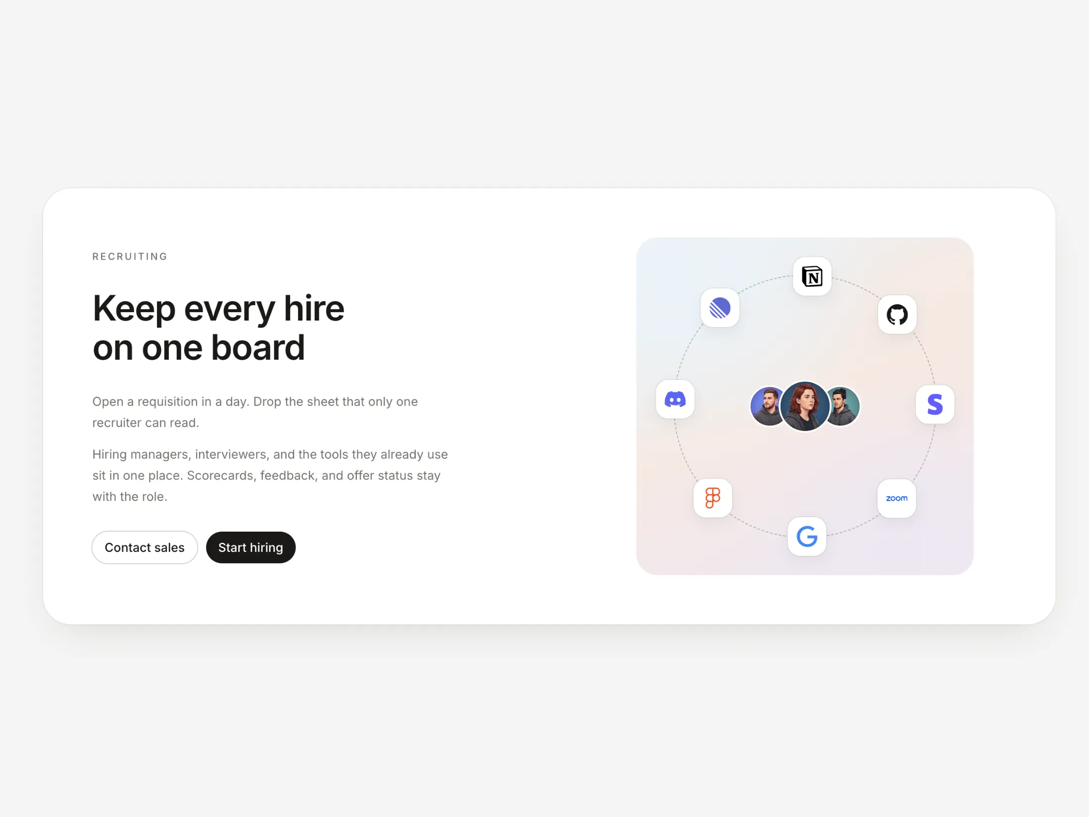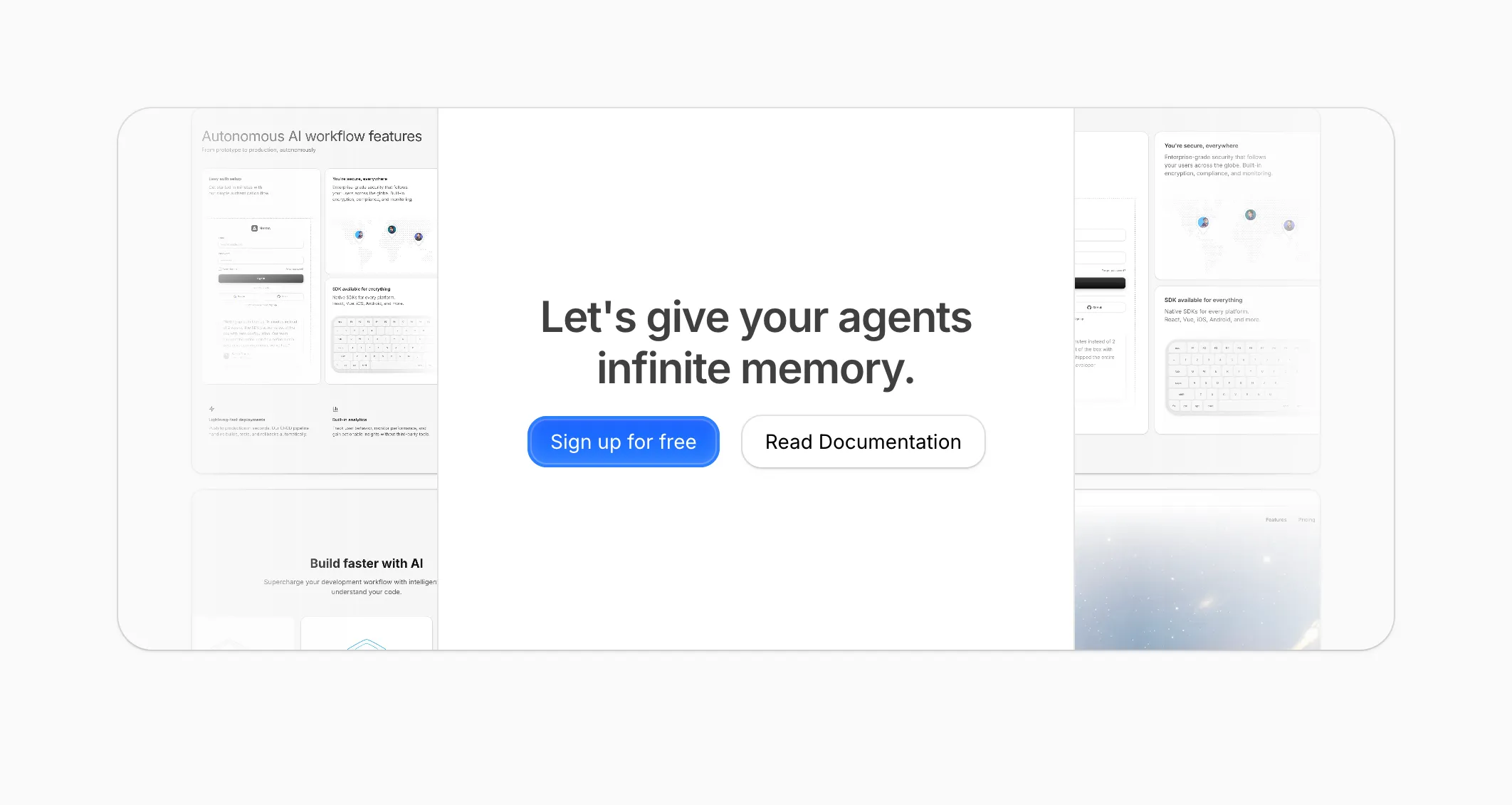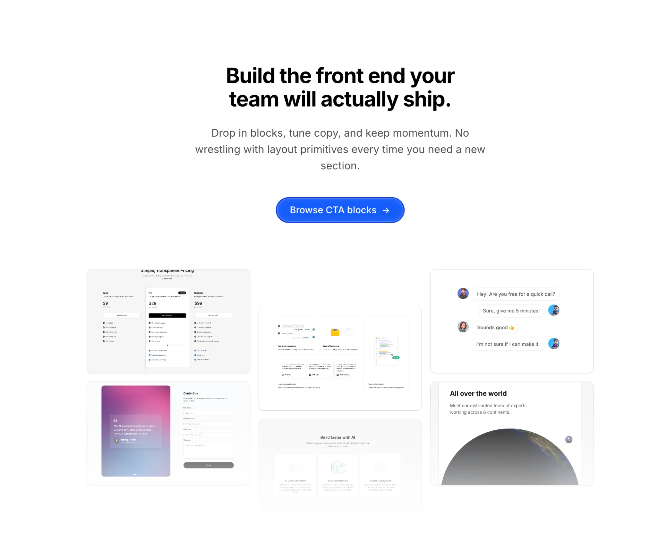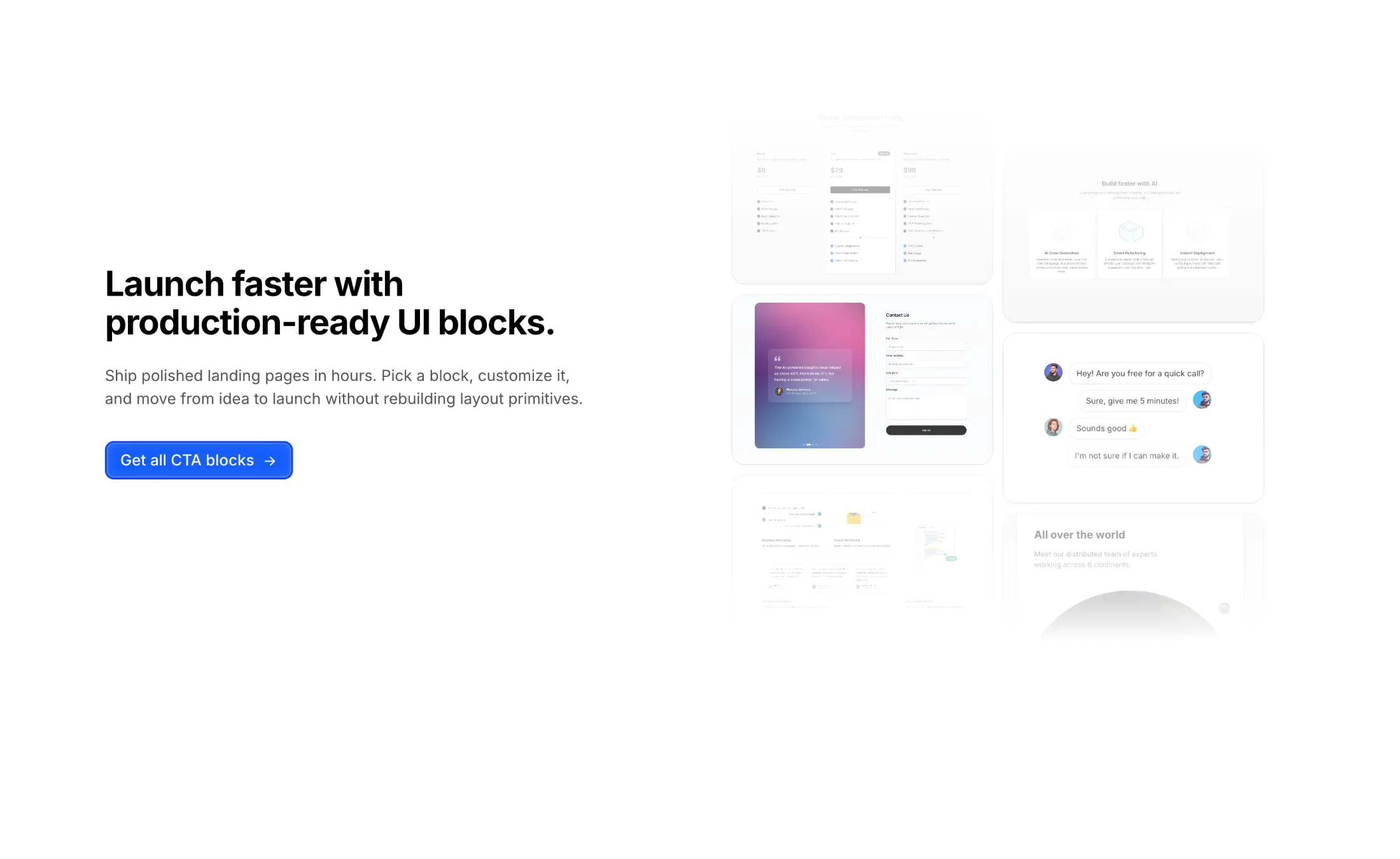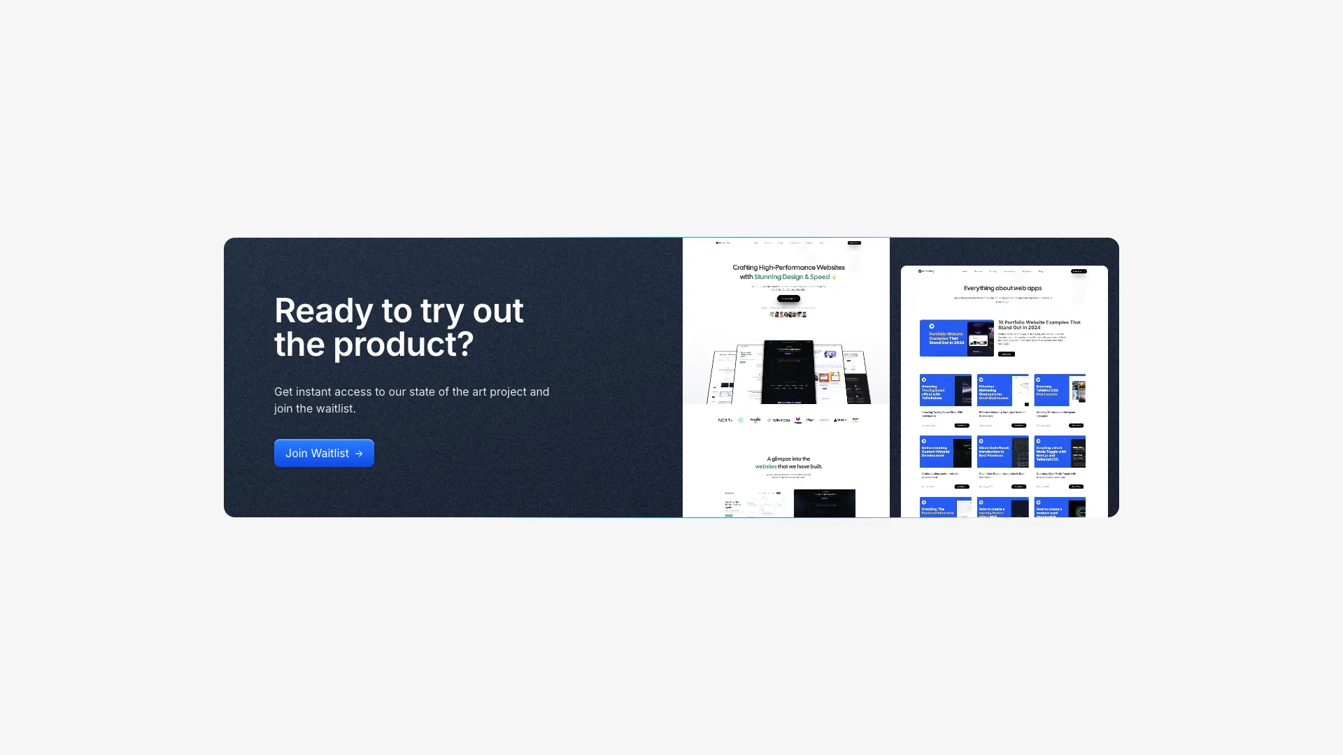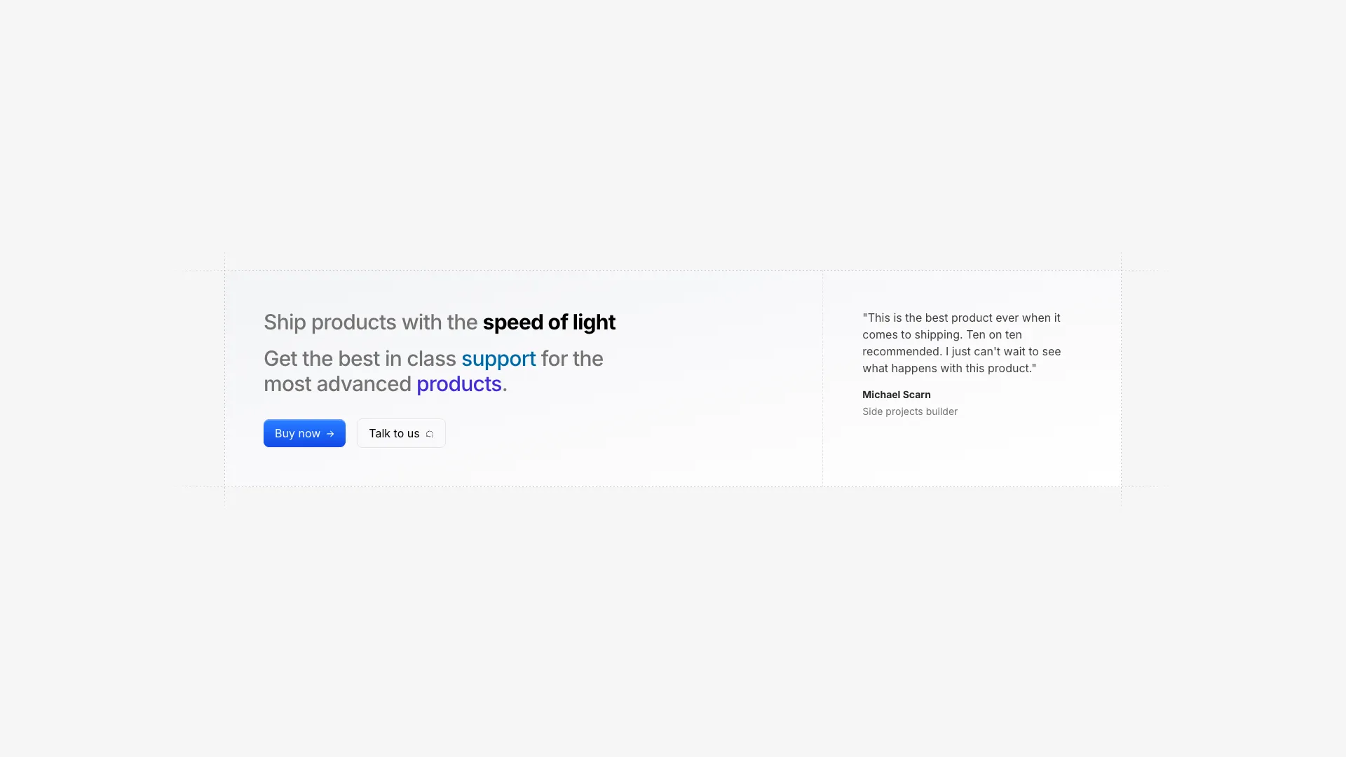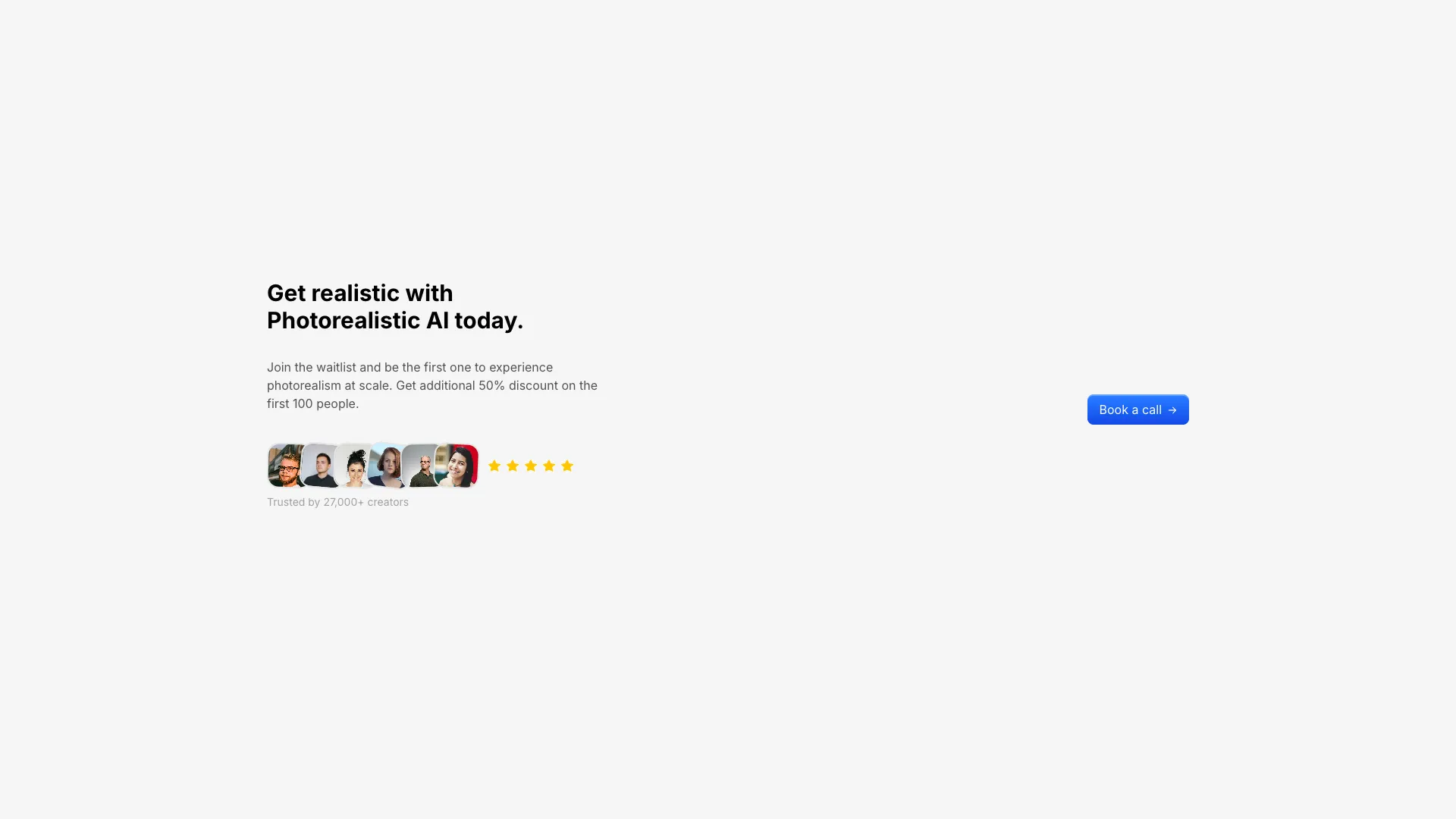








Each one is a single section you can paste near the end of a page. Swap the headline, the button label, and the href, and you are done.
One action per CTA. Two buttons of equal weight force a decision that has nothing to do with buying, and the usual result is that a visitor picks neither. If you need a secondary path, make it visually quieter: a ghost button or a text link next to the primary. The centered CTA block in this set pairs a filled button with an outline one for exactly that reason, and the outline button should point at documentation or pricing rather than a competing signup flow.
Label the button with the action, in the visitor's words. "Start free trial" and "Get the docs" describe what happens next. "Submit", "Learn more", and "Get started" do not, and the vaguer the label the more hesitation it creates. Add the friction-removing detail immediately below in small text: no credit card, cancel anytime, or the actual install command. That one line does more for conversion than any change to the button colour.
Placement matters as much as wording. A CTA belongs at the end of the page and repeated after any section that does persuasive work, typically after the feature list and after the testimonials. Repetition is not clutter here, since visitors decide at different depths and should not have to scroll back up. What does hurt is a full-viewport CTA sandwiched between two content sections, which reads as an interruption rather than a conclusion.
The dark high-contrast variants convert well because they break the visual rhythm of a light page, and they need care. Check the contrast ratio of the button against the dark panel, not against the white page you designed it on. Noise textures and gradient overlays can drop text contrast below 4.5:1 without anyone noticing. Keep the headline under about ten words, because a long sentence in a dark band is harder to read than the same sentence on white.
One primary button. If you add a second, style it as an outline or a text link and point it somewhere non-competing such as docs or pricing. Two equally weighted buttons split attention and reduce clicks on both.
In the hero, then again after the feature section and after the social proof, and once more at the end before the footer. People commit at different scroll depths, so repeat the same offer rather than making them scroll back.
A verb plus the outcome, such as Start free trial or Book a demo. Avoid Submit and Learn more, which describe nothing. Put reassurance like no credit card required in small text directly underneath.
Change the background so the section breaks the page rhythm, which is what the dark and noise-textured blocks here do. Then verify button and text contrast against the new background, since overlays often push it below the 4.5:1 threshold.
Here's what some of our users have to say about Aceternity UI.

amazing to see @calcom find its way into proper templates 🥳 excited to be powering the next thousands of startups and their demo calls!

Stumbled upon ui.aceternity.com today and my mind is blown 🤯 The seamless integration of framer-motion, tailwind CSS, and shadcn showcases a masterclass in UI design. 🚀 Kudos to @mannupaaji for creating such an innovative and inspirational resource for devs! #UI #nextjs

Have you heard of Aceternity UI? It's packed with various animated components that are ready to copy and paste! Mind-blowing stuff... 🤯 Click here ➡️ ui.aceternity.com #framermotion #nextjs #tailwindcss #techinnovation

ui.aceternity.com So well done. And its bloody free 🤯🤯 Phenomenal work by @mannupaaji

So happy to see @mannupaaji work being recognised 🥹🤌🏻♥️ His work is literally a treasure trove for devs 💎

Aceternity UI has some of the best components for designing landing pages I've ever seen. If you're struggling with figuring out what animations to use. Check it out. Thank me later 😉. ui.aceternity.com
See what the best YouTubers are saying about Aceternity UI.


ceternity UI
Access an ever-growing collection of premium, meticulously crafted templates and Component Blocks.
© 2026 Aceternity Labs LLC. All Rights Reserved.