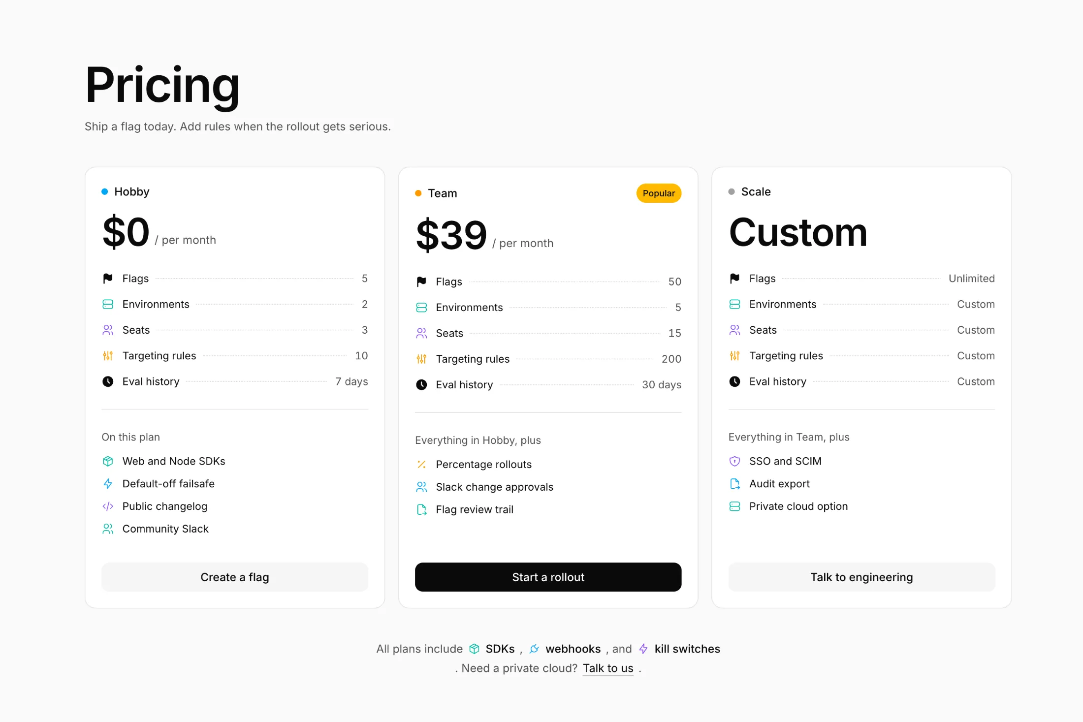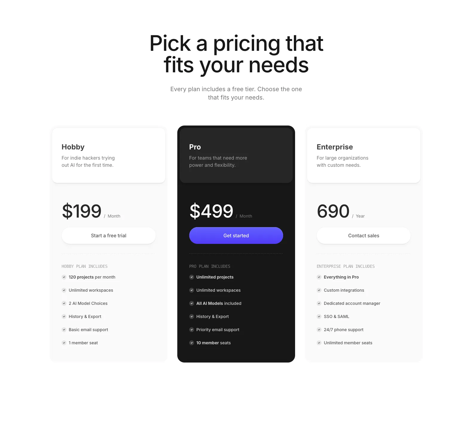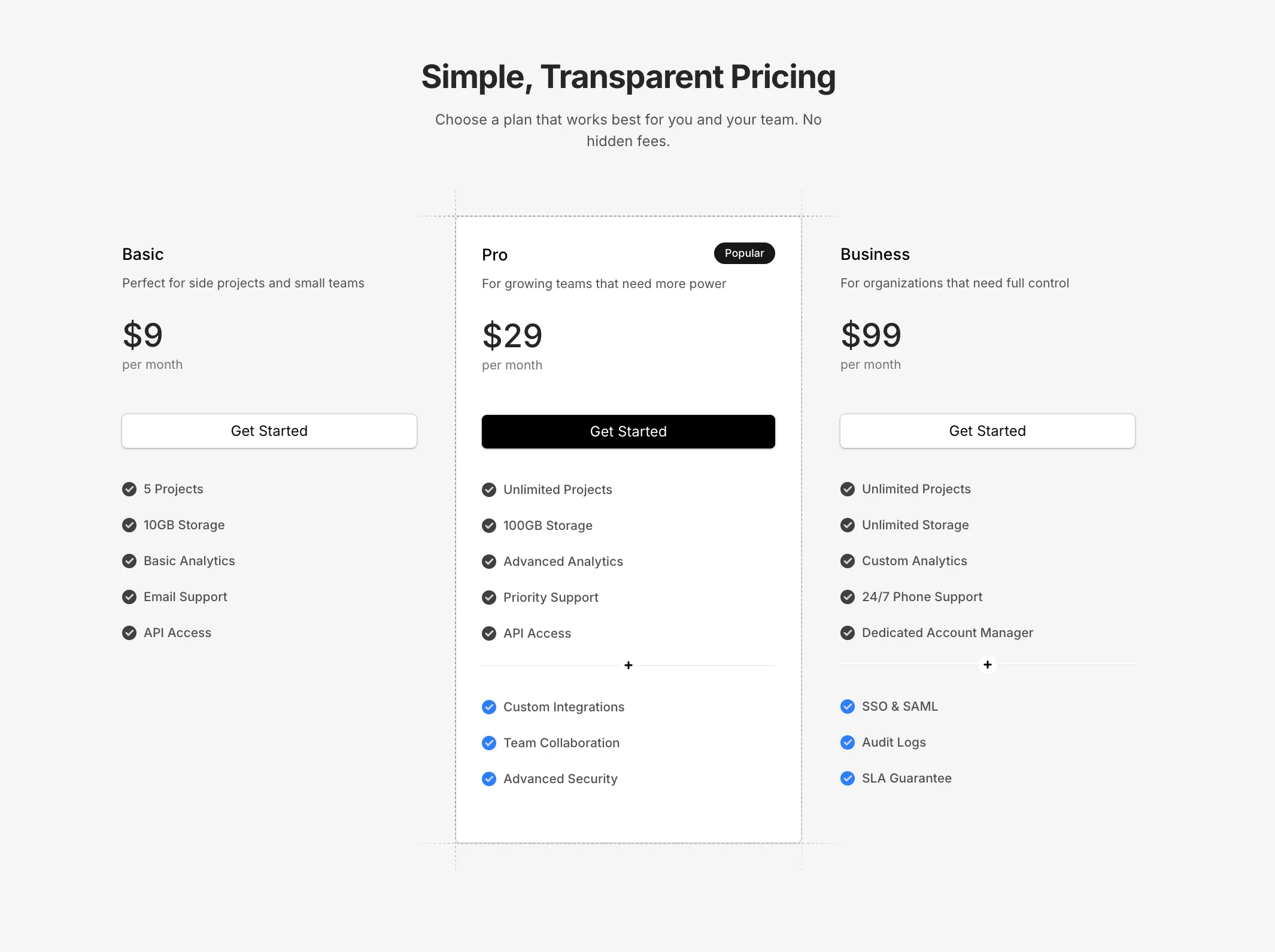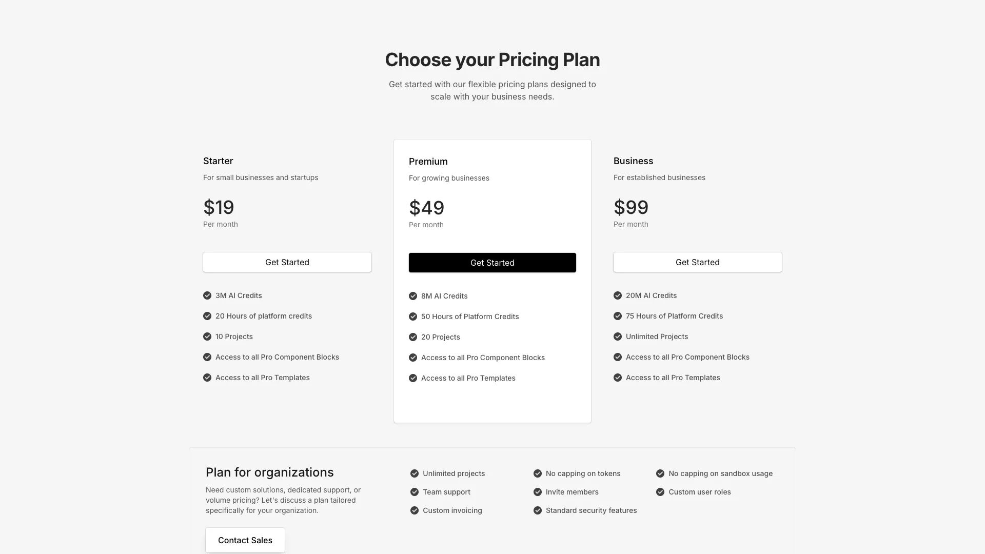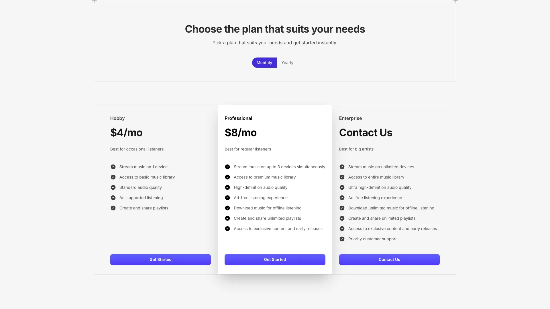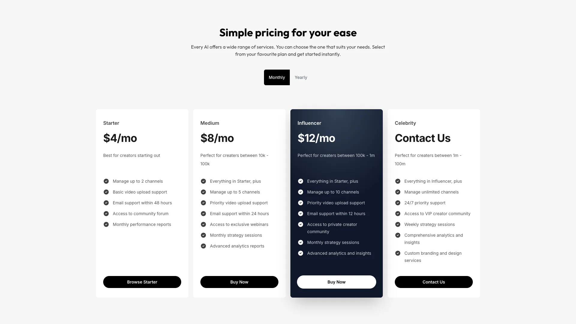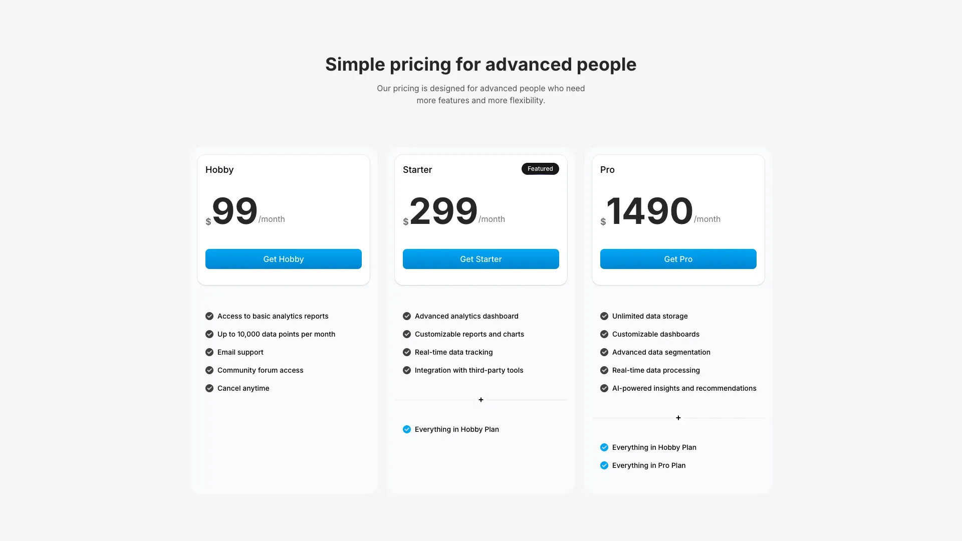








Plans are defined as typed arrays, so you change prices and feature lists in one object rather than editing repeated card markup.
Three tiers is the convention because it gives buyers a reference point. Shown a single price, people have no idea whether it is reasonable. Shown a cheap tier, a middle tier, and an expensive one, they judge the middle against its neighbours and usually pick it. That is anchoring, and it is why the highlighted plan in almost every pricing block sits in the centre column. If you only have two real plans, adding a fake third one is worse than shipping two, because inventing a tier nobody wants creates support questions you then have to answer.
Order the columns cheapest to most expensive left to right and let the highlighted card break the grid slightly, either taller or with a border and a badge. Feature lists should be cumulative, so each tier reads as "everything above, plus". Comparison becomes a scan down one column instead of a diff across three. Never hide the number that matters. "Contact sales" belongs on the enterprise card only, and the pricing page with a separate enterprise card exists precisely so that self-serve tiers keep their prices visible.
Monthly to yearly toggles are where layout breaks. When the price switches from 29 to 290 the string gets a character longer, the card reflows, and every card below it shifts. Reserve the width with tabular-nums and a fixed min-width on the price container, or animate the digits in place as the toggle blocks in this collection do. Put the discount label next to the toggle rather than inside the card, and default to whichever period you actually want people on, usually annual.
Two things buyers look for and rarely find. First, what happens at the limit: say whether you block, throttle, or charge overage, because an unanswered ceiling reads as a trap. Second, the trial and cancellation terms, in plain words, directly under the buttons. Both belong in the section itself, not in an FAQ two scrolls down. Every extra scroll between the price and the answer costs you conversions.
Three for most products, plus a separate enterprise card if you sell to large teams. Three gives buyers something to compare the middle option against, and beyond four the columns get too narrow to read comfortably on a laptop.
Two blocks here ship one already. Store the billing period in state, keep both prices on each plan object, and fix the width of the price container so the card does not reflow when the number changes length.
Show them for anything self-serve. Hidden prices filter out qualified buyers who will not fill in a form, and they push visitors to comparison sites for a number. Reserve contact sales for the enterprise tier where the price genuinely varies.
The plan you want most people on, which is usually the middle one. Highlight it with a border, a badge, and slightly more height rather than a different colour scheme, so the section still reads as one table.
Here's what some of our users have to say about Aceternity UI.

amazing to see @calcom find its way into proper templates 🥳 excited to be powering the next thousands of startups and their demo calls!

Stumbled upon ui.aceternity.com today and my mind is blown 🤯 The seamless integration of framer-motion, tailwind CSS, and shadcn showcases a masterclass in UI design. 🚀 Kudos to @mannupaaji for creating such an innovative and inspirational resource for devs! #UI #nextjs

Have you heard of Aceternity UI? It's packed with various animated components that are ready to copy and paste! Mind-blowing stuff... 🤯 Click here ➡️ ui.aceternity.com #framermotion #nextjs #tailwindcss #techinnovation

ui.aceternity.com So well done. And its bloody free 🤯🤯 Phenomenal work by @mannupaaji

So happy to see @mannupaaji work being recognised 🥹🤌🏻♥️ His work is literally a treasure trove for devs 💎

Aceternity UI has some of the best components for designing landing pages I've ever seen. If you're struggling with figuring out what animations to use. Check it out. Thank me later 😉. ui.aceternity.com
See what the best YouTubers are saying about Aceternity UI.


ceternity UI
Access an ever-growing collection of premium, meticulously crafted templates and Component Blocks.
© 2026 Aceternity Labs LLC. All Rights Reserved.