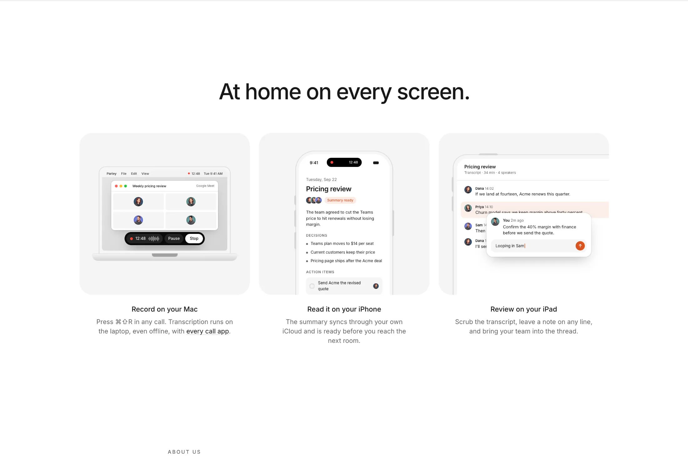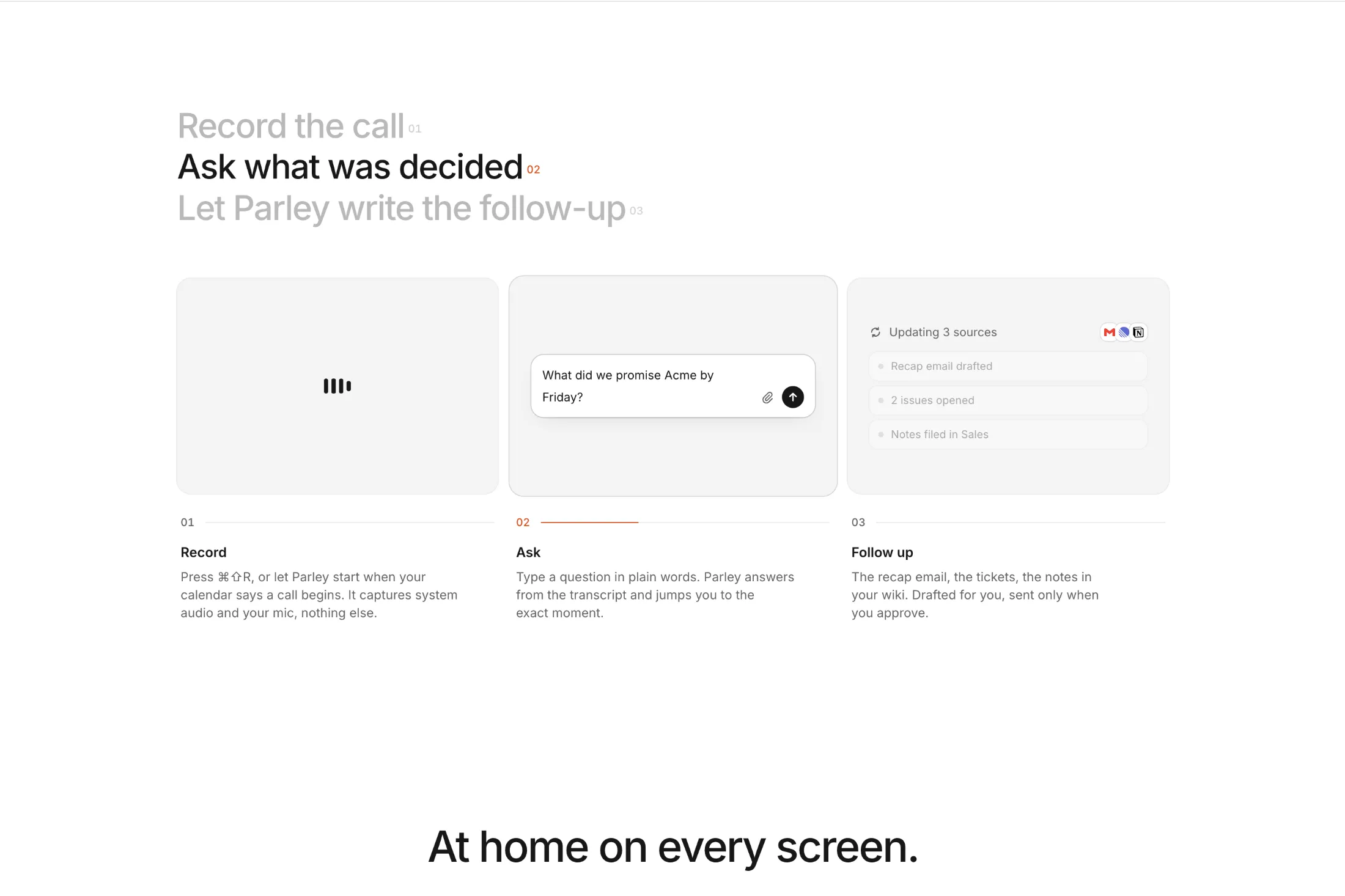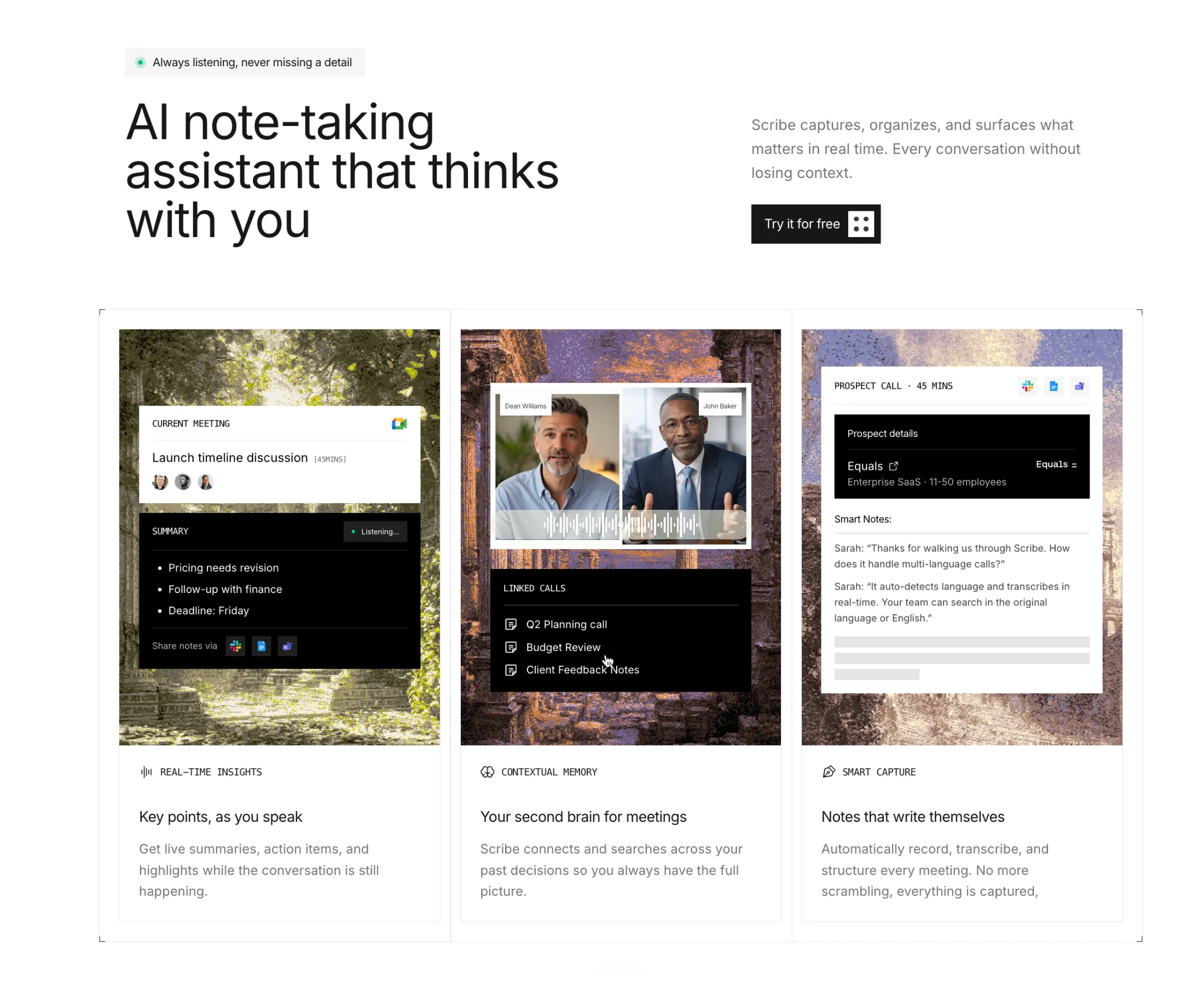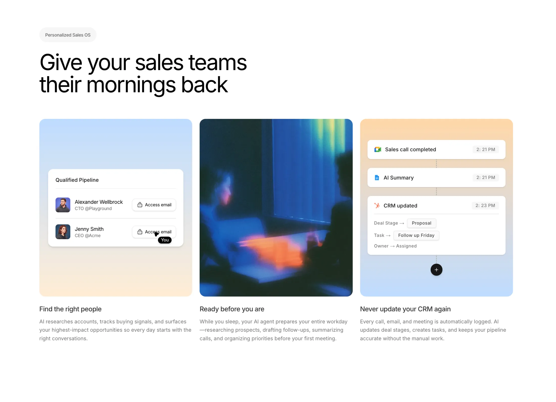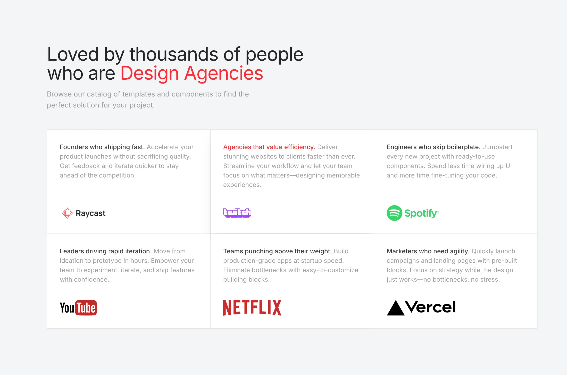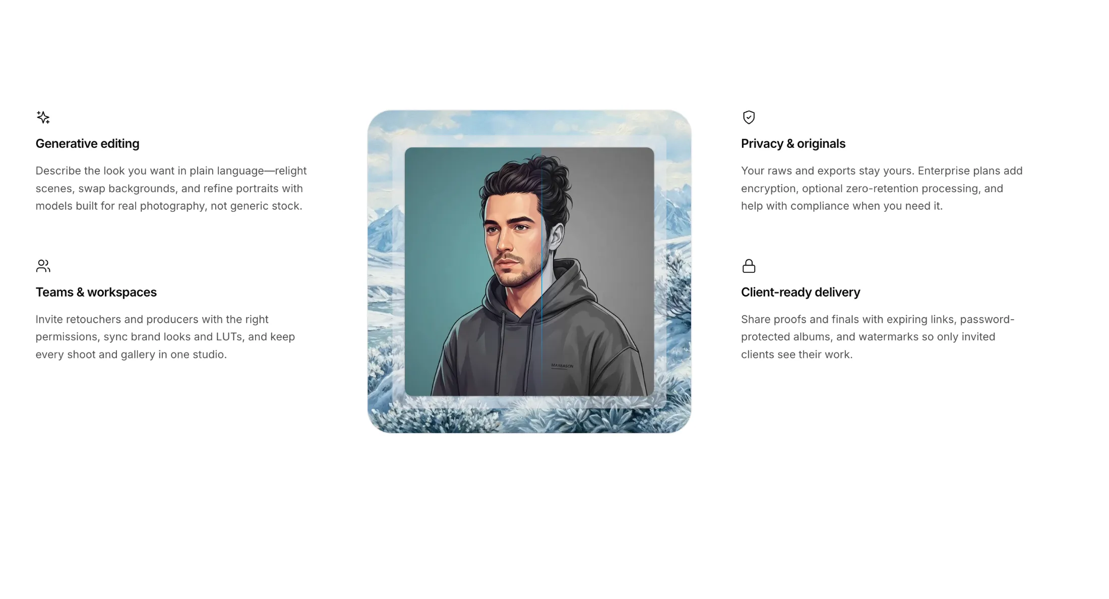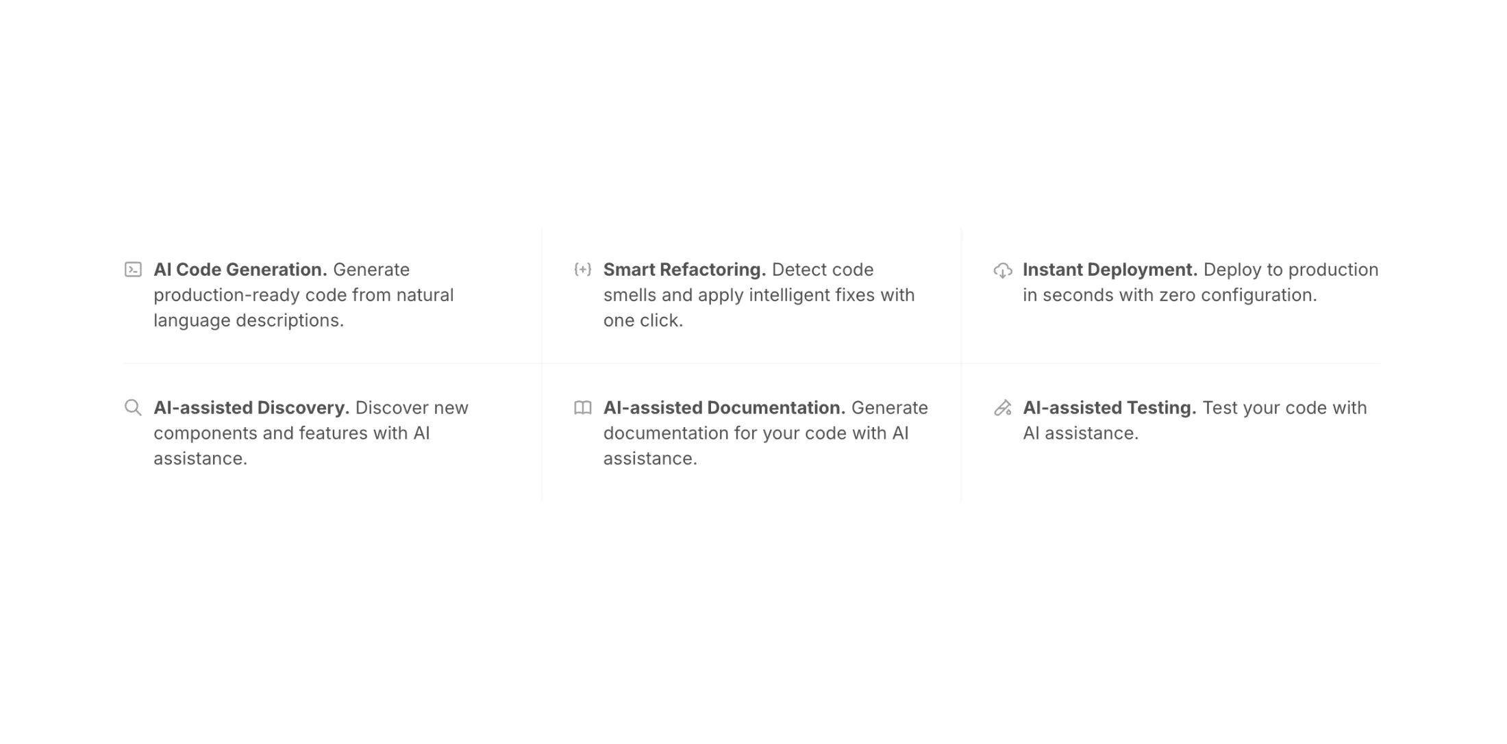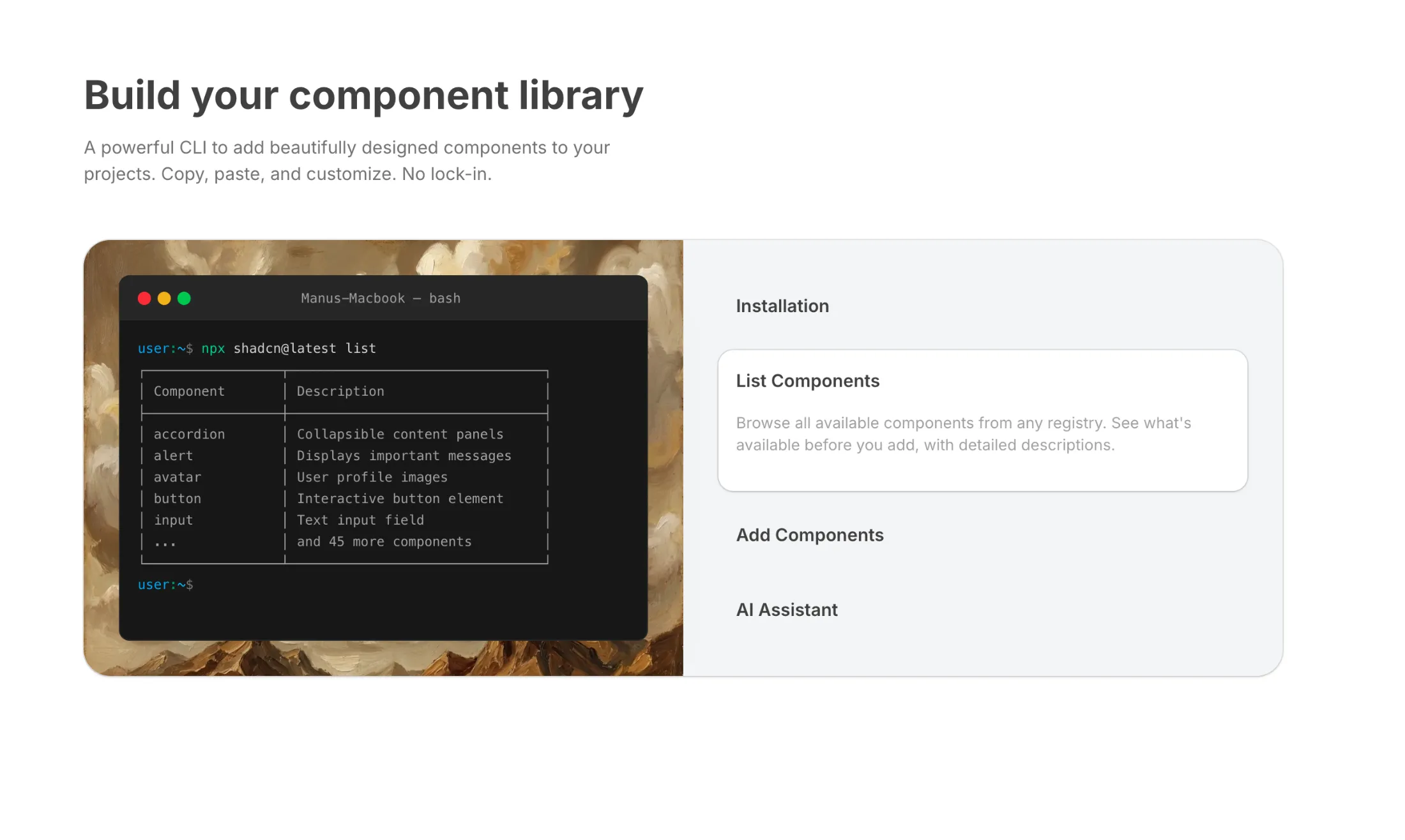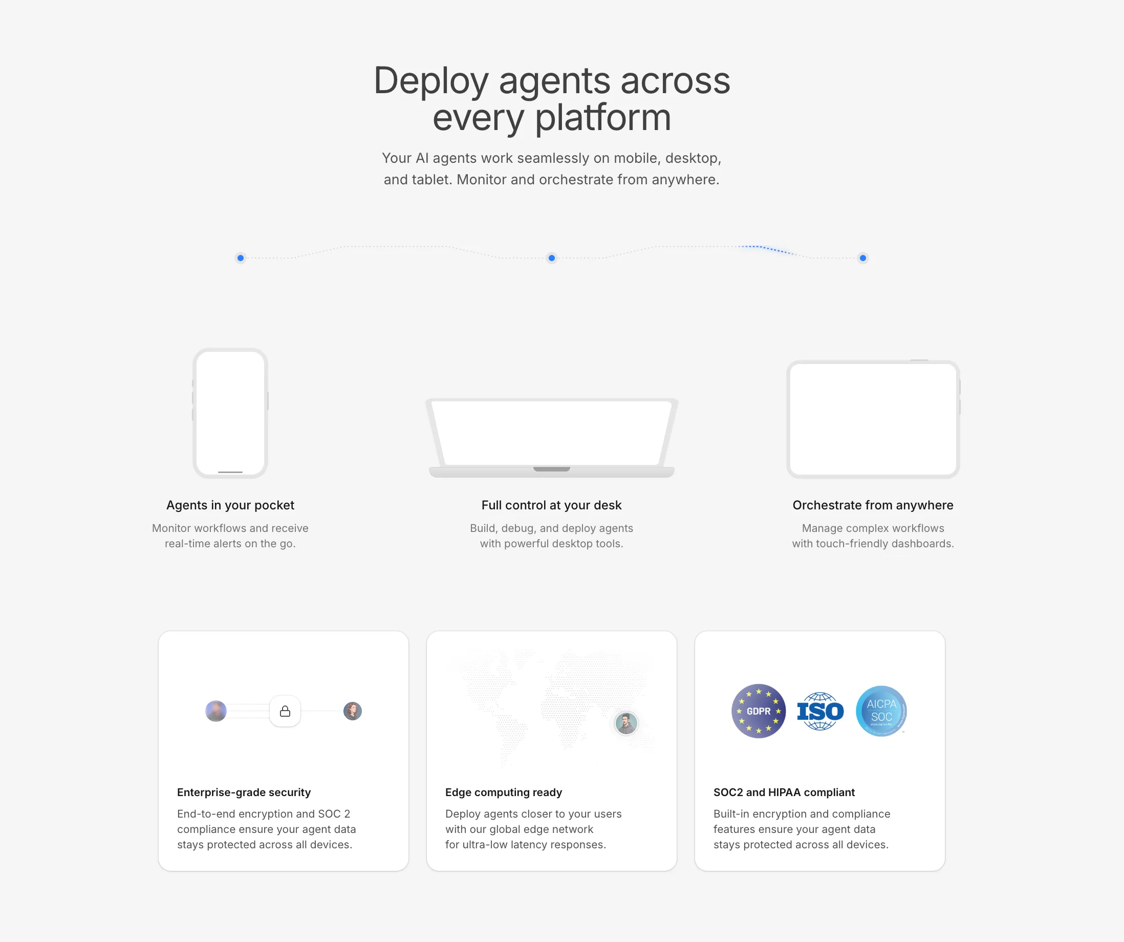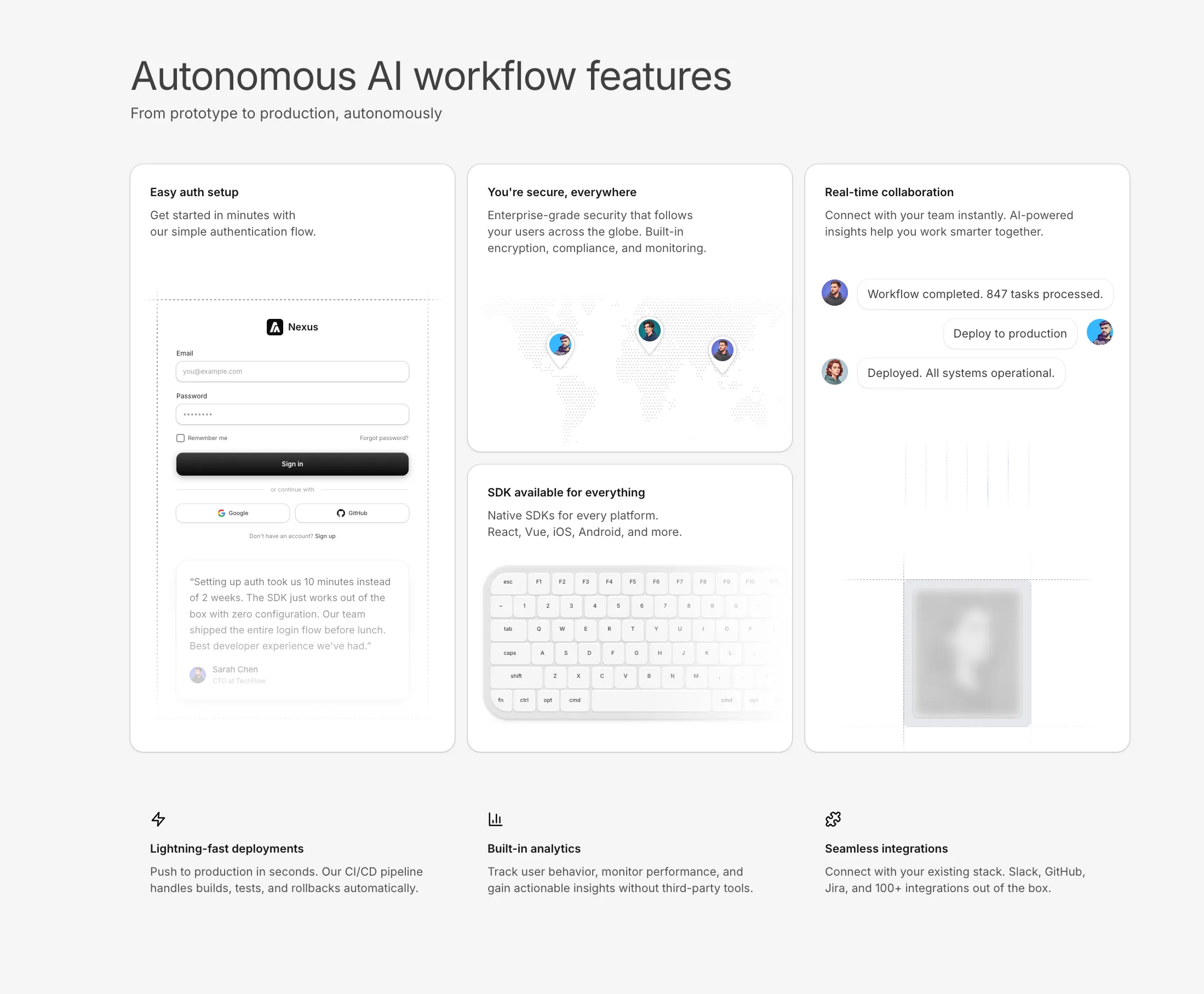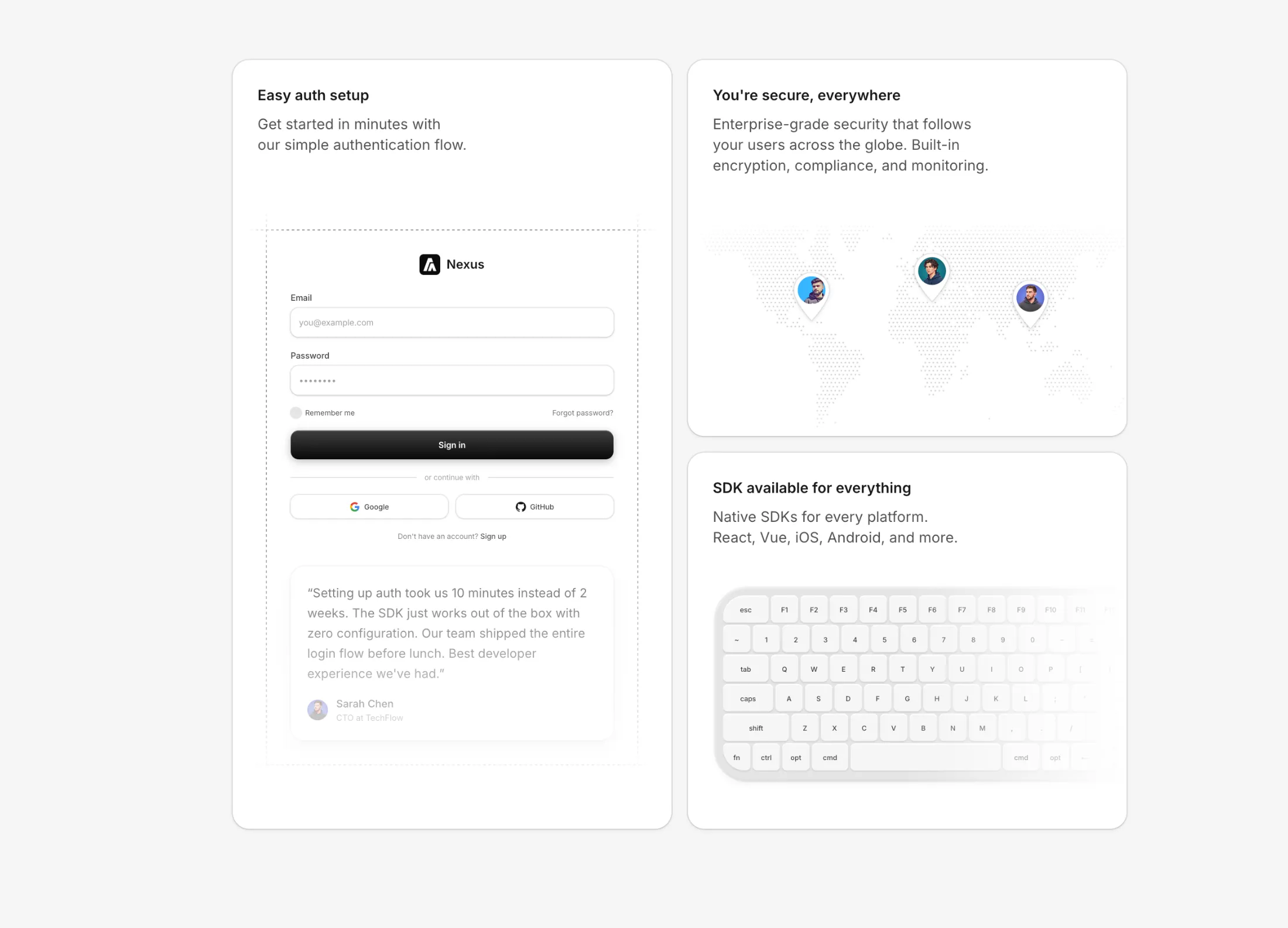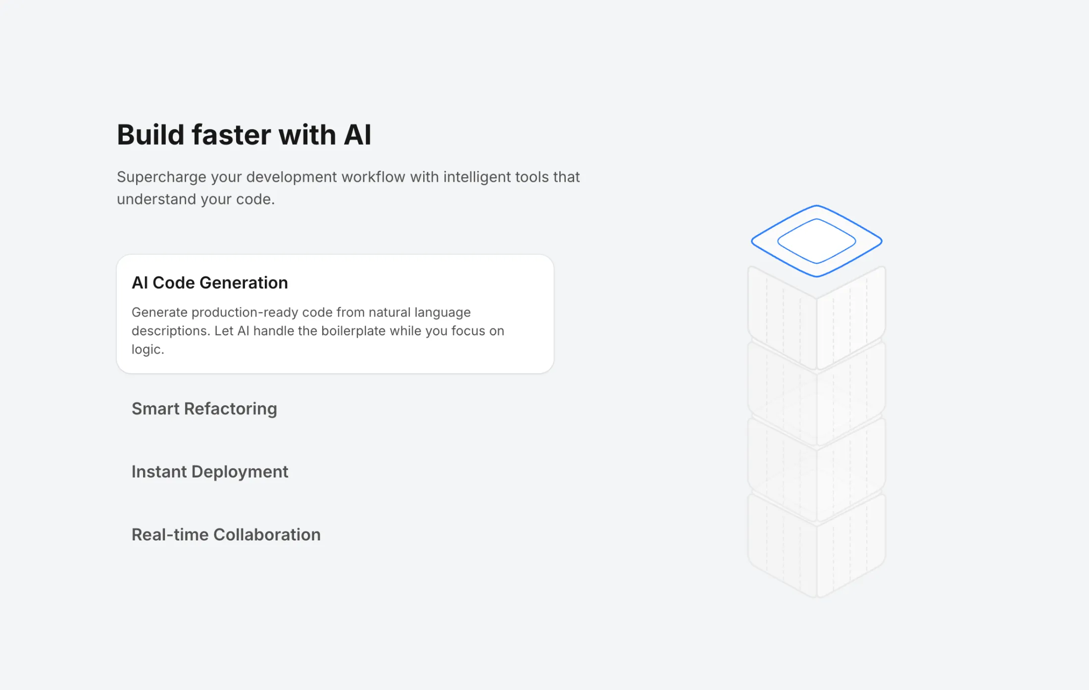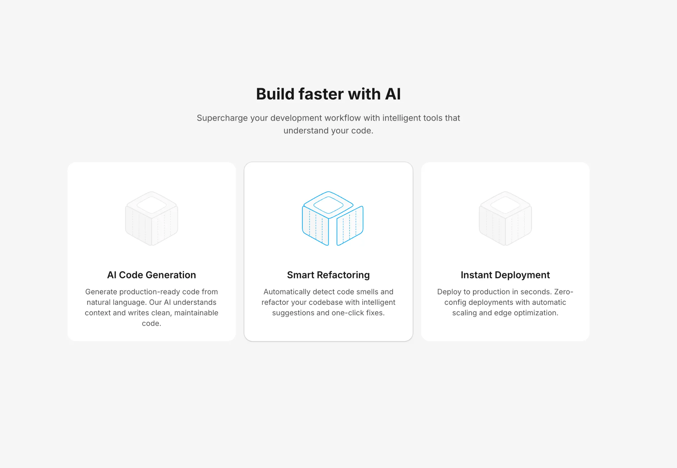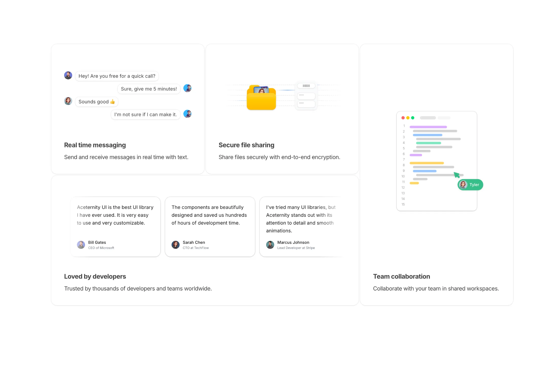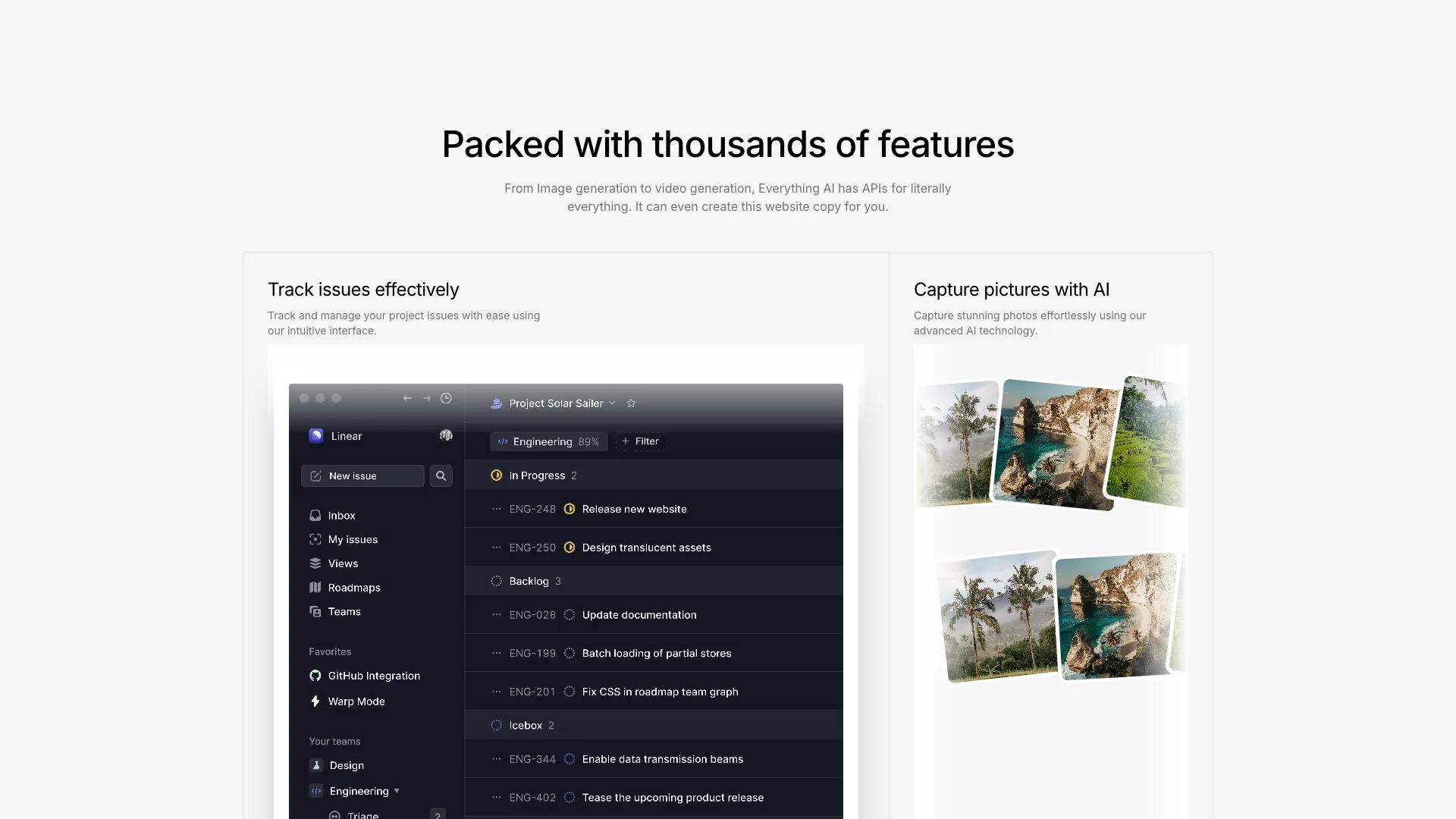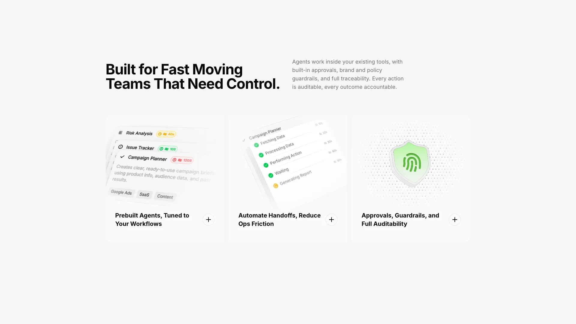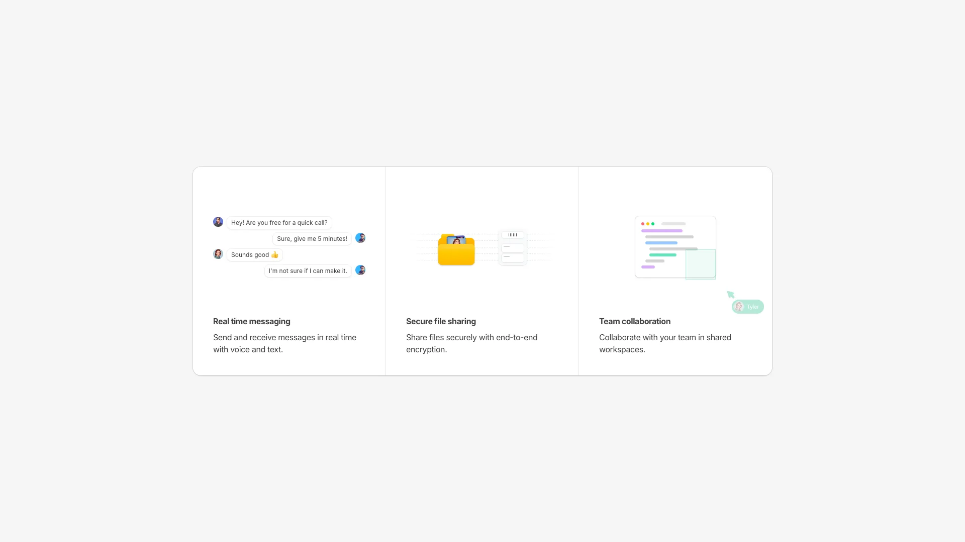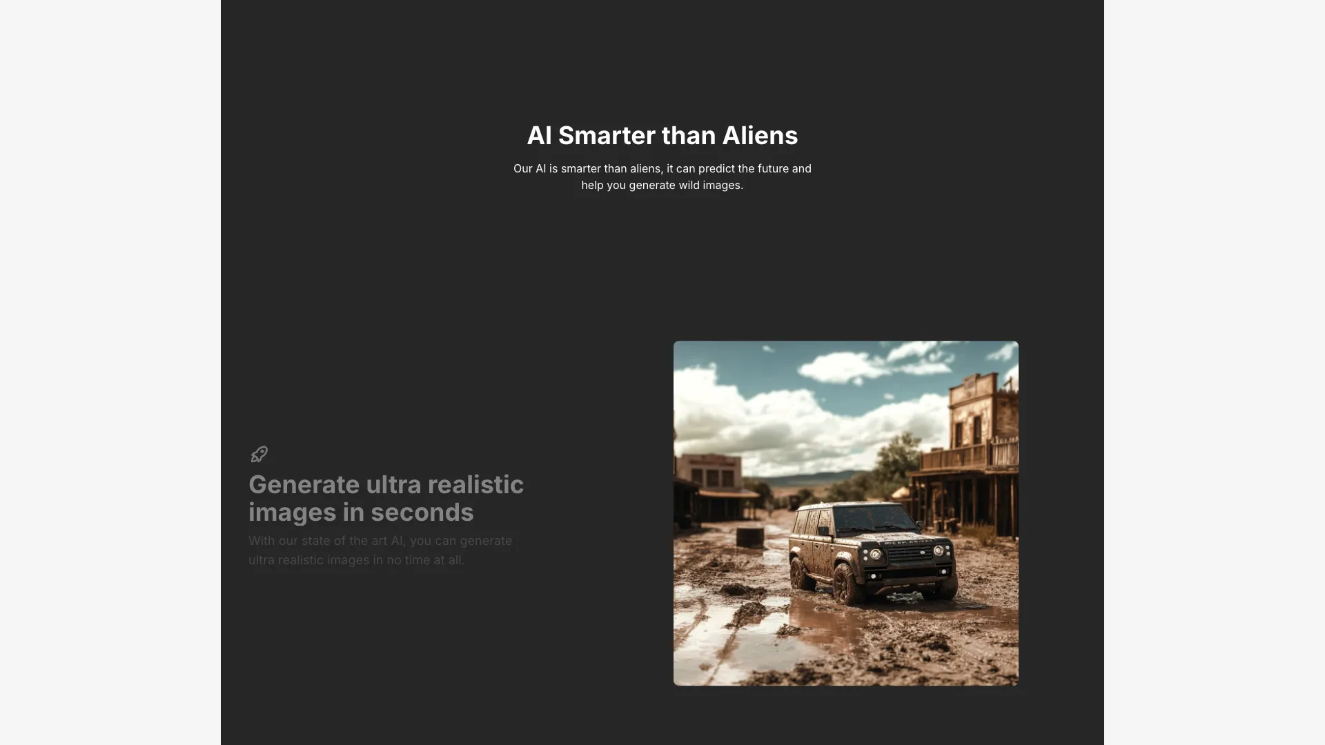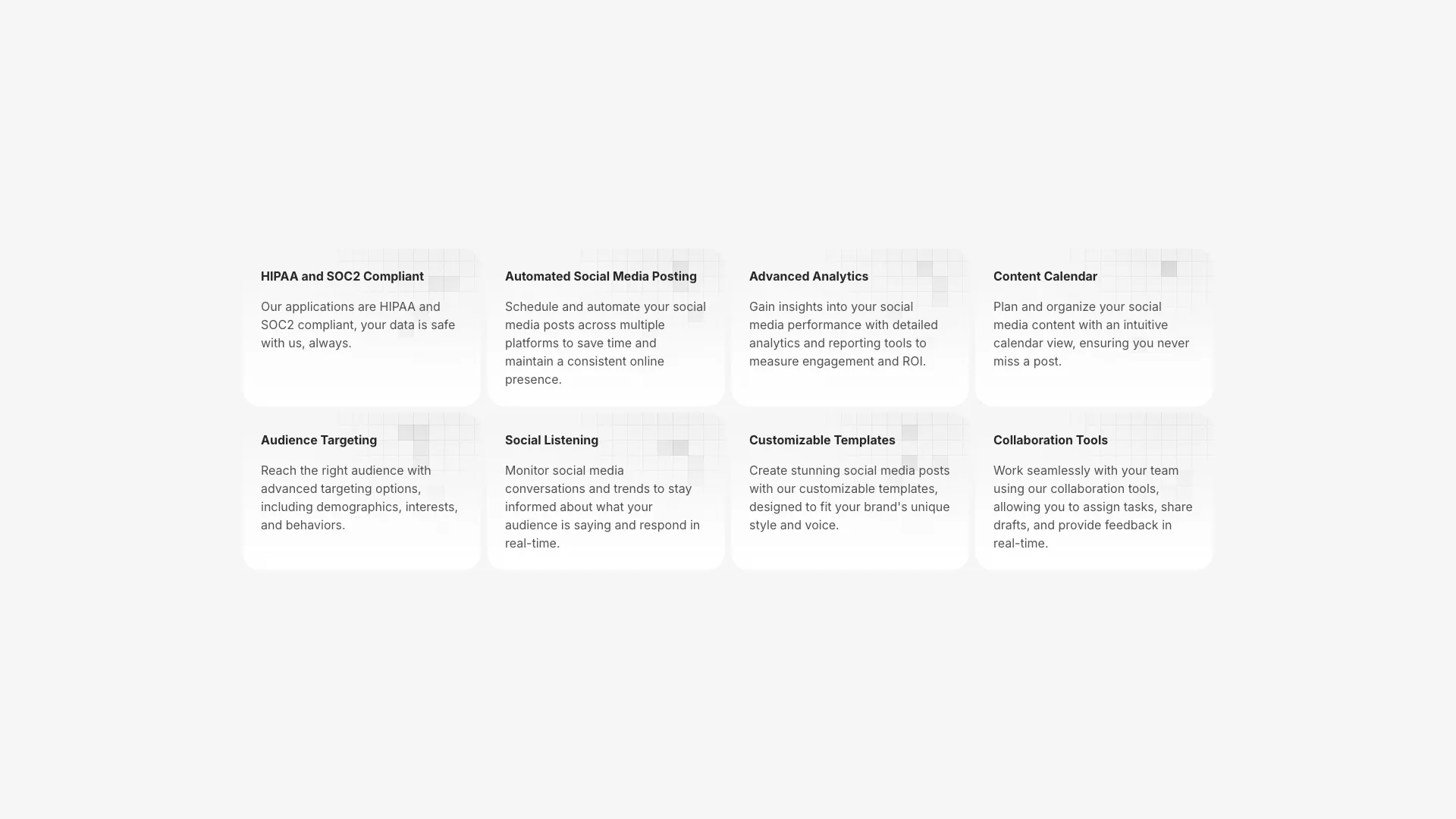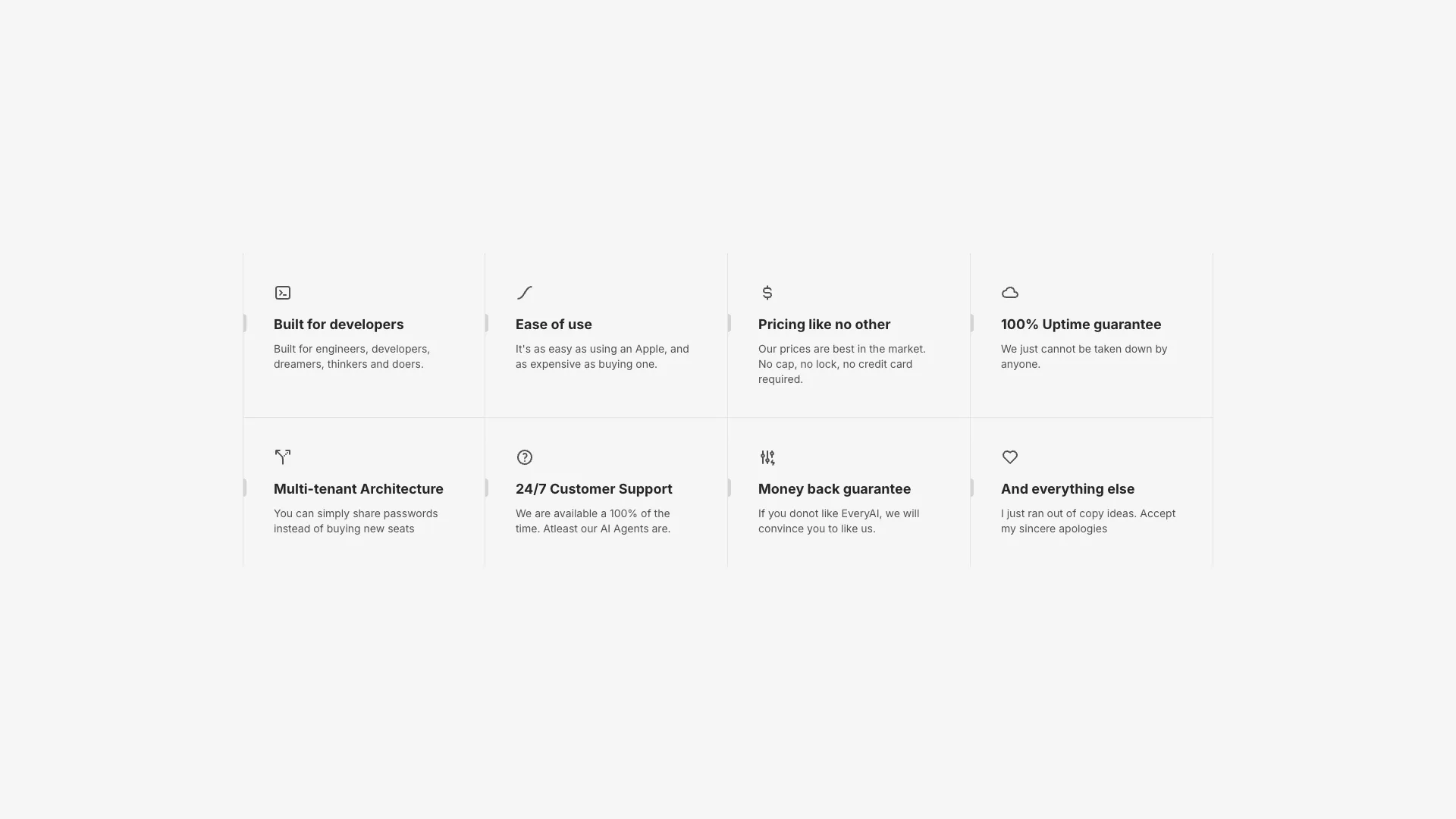








This is the largest category in the library, so filter by shape first: grid, two-column, bento, or scroll-driven. Then check which ones need Motion installed.
The mistake in almost every feature section is that the headings describe the implementation instead of the outcome. "Webhook-based event pipeline" tells a visitor nothing. "Know within a second when a payment fails" tells them everything, and the webhook detail belongs in the supporting line underneath. Write the benefit as the heading and the mechanism as the body, then read the headings alone and see whether the list still makes a case.
Layout should follow the number of features you actually have. Four to six items with short copy work well in a uniform grid, where equal visual weight is the honest signal because no single item dominates. Once you have one flagship capability and several supporting ones, a bento grid earns its keep, since unequal tile sizes encode importance without you writing the word "main". Past about nine items you are writing a comparison table and should stop pretending otherwise.
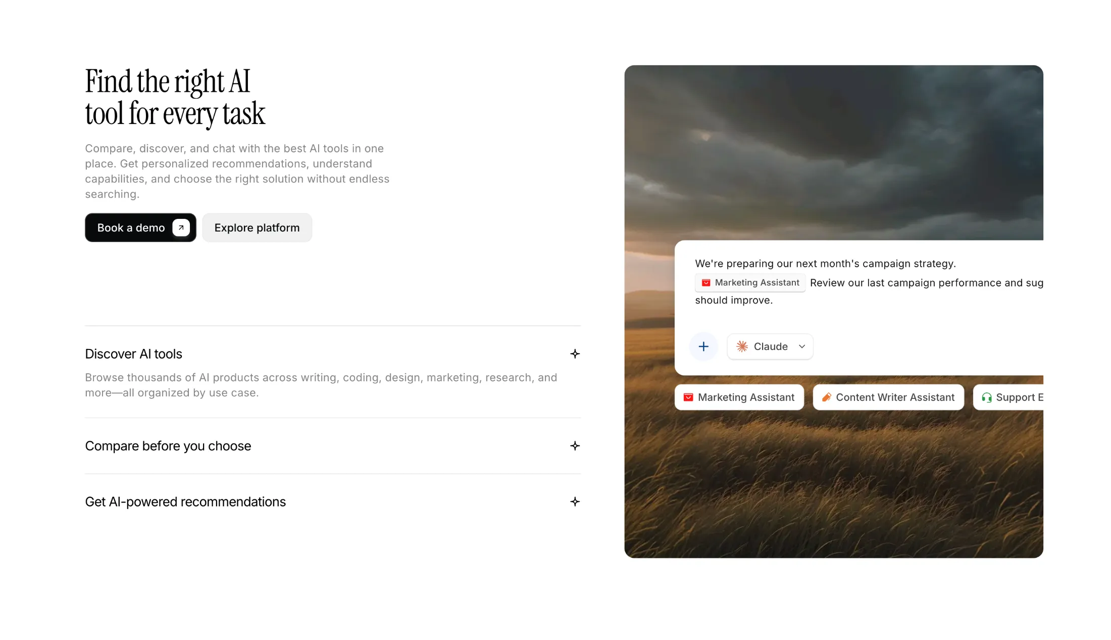
The skeleton illustrations in this collection deserve a warning. Abstract UI mockups look good and never go out of date, which is exactly the problem: they show nothing real. They are the right call early, when the product screenshot would be embarrassing or when the interface changes weekly. As soon as your UI is stable, replace them with actual screenshots. Visitors trust a slightly ugly real screen more than a beautiful fake one.
Scroll-driven sections like the sticky scroll layout are the highest-risk option here. They read well on a desktop trackpad and badly on a phone, they interfere with find-in-page, and a visitor who scrolls fast will blow past three features without registering any of them. If you use one, cap it at four steps, keep every heading readable at the moment its panel is pinned, and honour prefers-reduced-motion by falling back to a plain stacked list.
Four to six is the practical range for a landing page. Below four the section looks thin next to the hero, and above six visitors start skimming headings without reading any supporting copy. Move the long tail to a dedicated features page.
A grid where tiles occupy different numbers of columns and rows, so one feature can be twice the size of its neighbours. It lets you rank features visually. Several blocks in this collection use CSS grid with col-span and row-span utilities to build it.
Icons are fine when the copy carries the meaning and you have six or more items to keep visually consistent. Screenshots convert better for two to four flagship features because they prove the thing exists. Avoid mixing both styles in one section.
Yes, they are responsive, but scroll-linked layouts are less effective on touch devices where scroll velocity is higher and the viewport is short. For mobile-heavy traffic a stacked two-column layout usually communicates more per screen.
Here's what some of our users have to say about Aceternity UI.

amazing to see @calcom find its way into proper templates 🥳 excited to be powering the next thousands of startups and their demo calls!

Stumbled upon ui.aceternity.com today and my mind is blown 🤯 The seamless integration of framer-motion, tailwind CSS, and shadcn showcases a masterclass in UI design. 🚀 Kudos to @mannupaaji for creating such an innovative and inspirational resource for devs! #UI #nextjs

Have you heard of Aceternity UI? It's packed with various animated components that are ready to copy and paste! Mind-blowing stuff... 🤯 Click here ➡️ ui.aceternity.com #framermotion #nextjs #tailwindcss #techinnovation

ui.aceternity.com So well done. And its bloody free 🤯🤯 Phenomenal work by @mannupaaji

So happy to see @mannupaaji work being recognised 🥹🤌🏻♥️ His work is literally a treasure trove for devs 💎

Aceternity UI has some of the best components for designing landing pages I've ever seen. If you're struggling with figuring out what animations to use. Check it out. Thank me later 😉. ui.aceternity.com
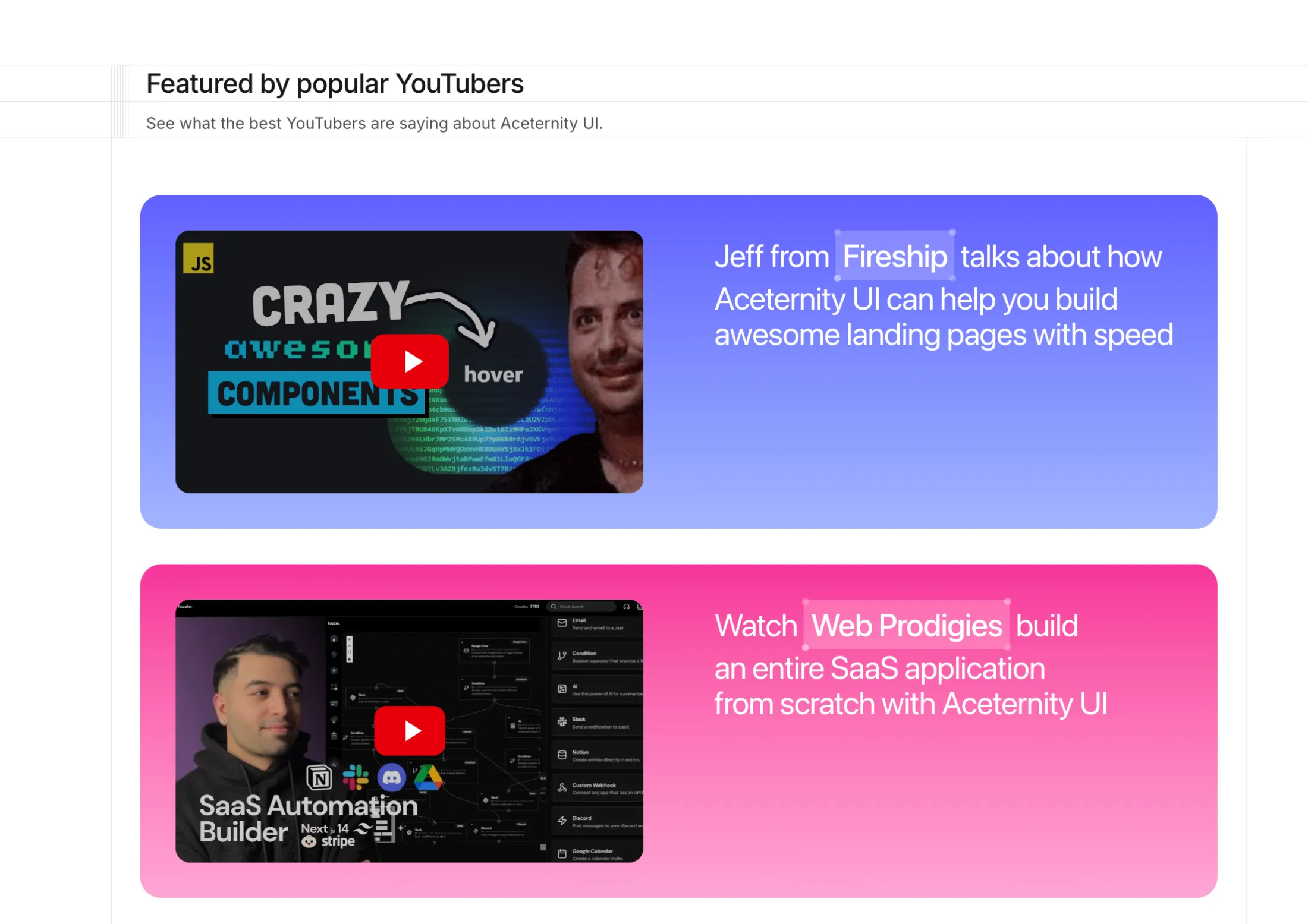
See what the best YouTubers are saying about Aceternity UI.


ceternity UI
Access an ever-growing collection of premium, meticulously crafted templates and Component Blocks.
© 2026 Aceternity Labs LLC. All Rights Reserved.