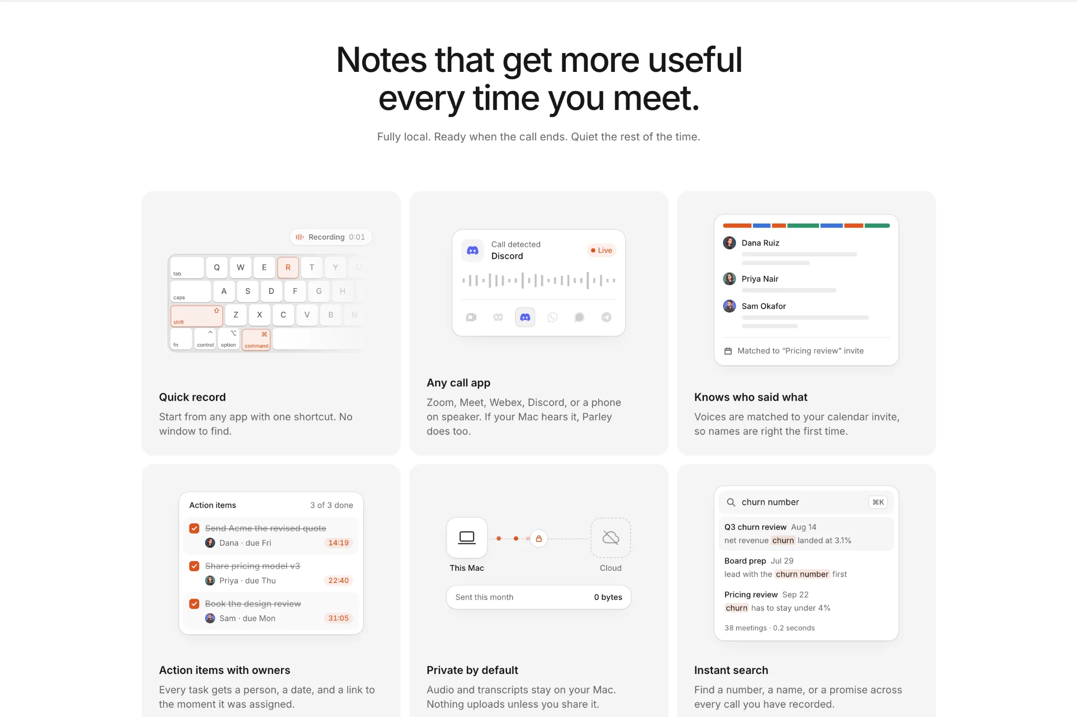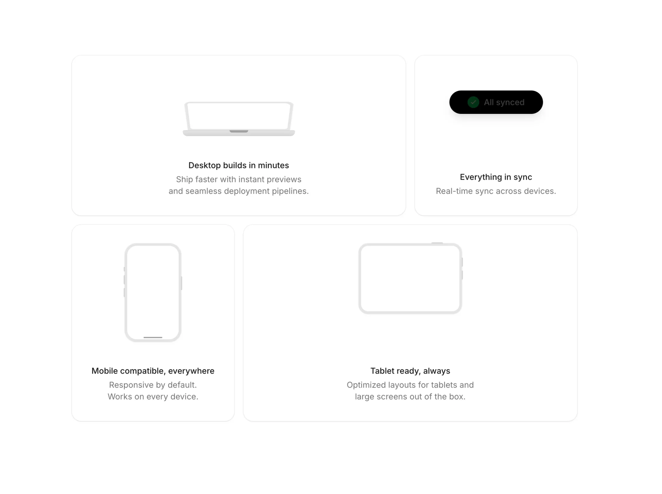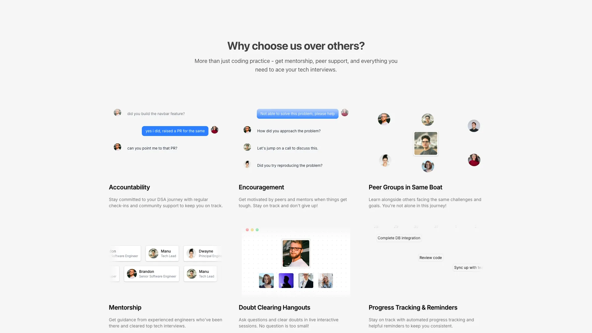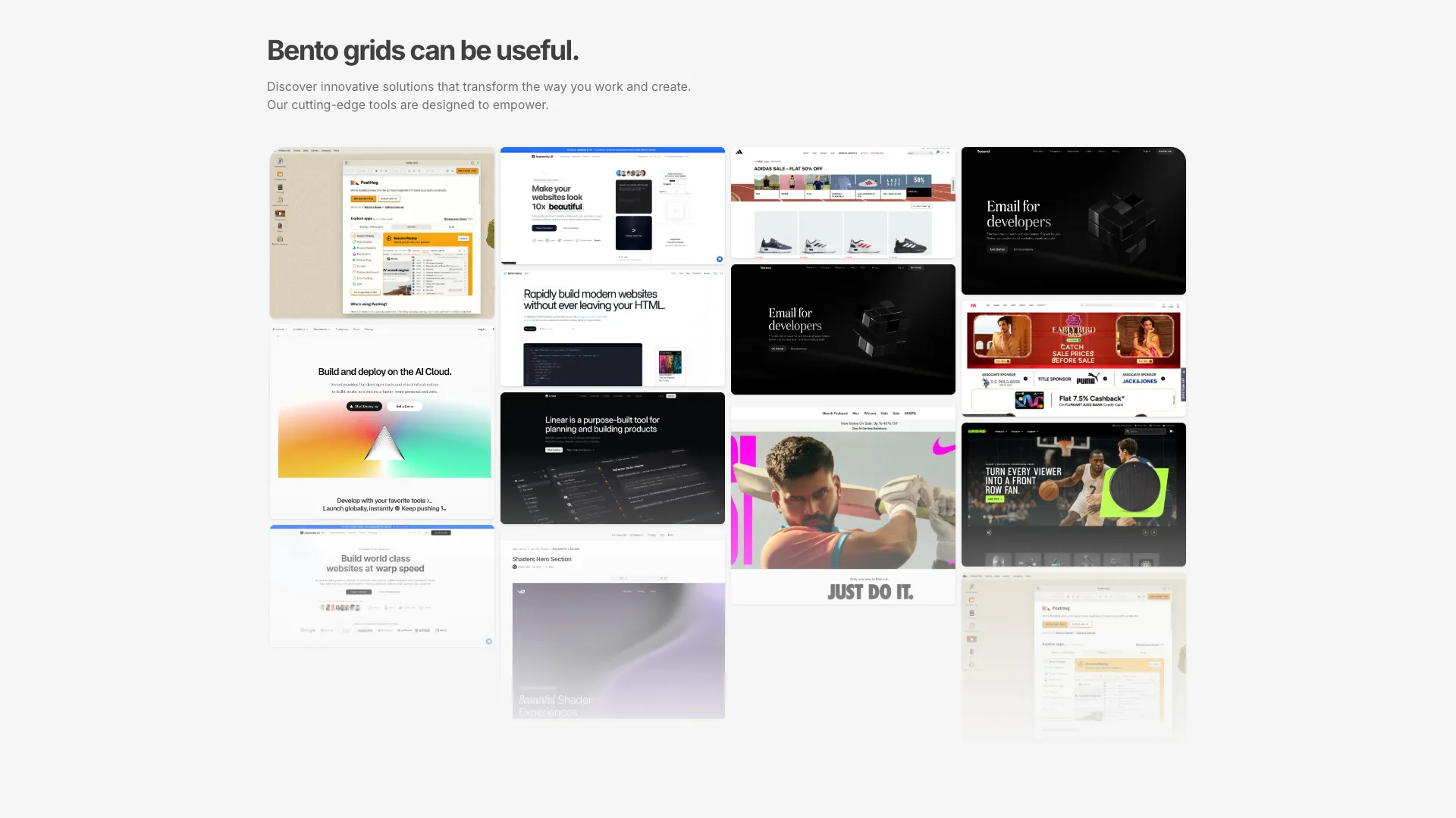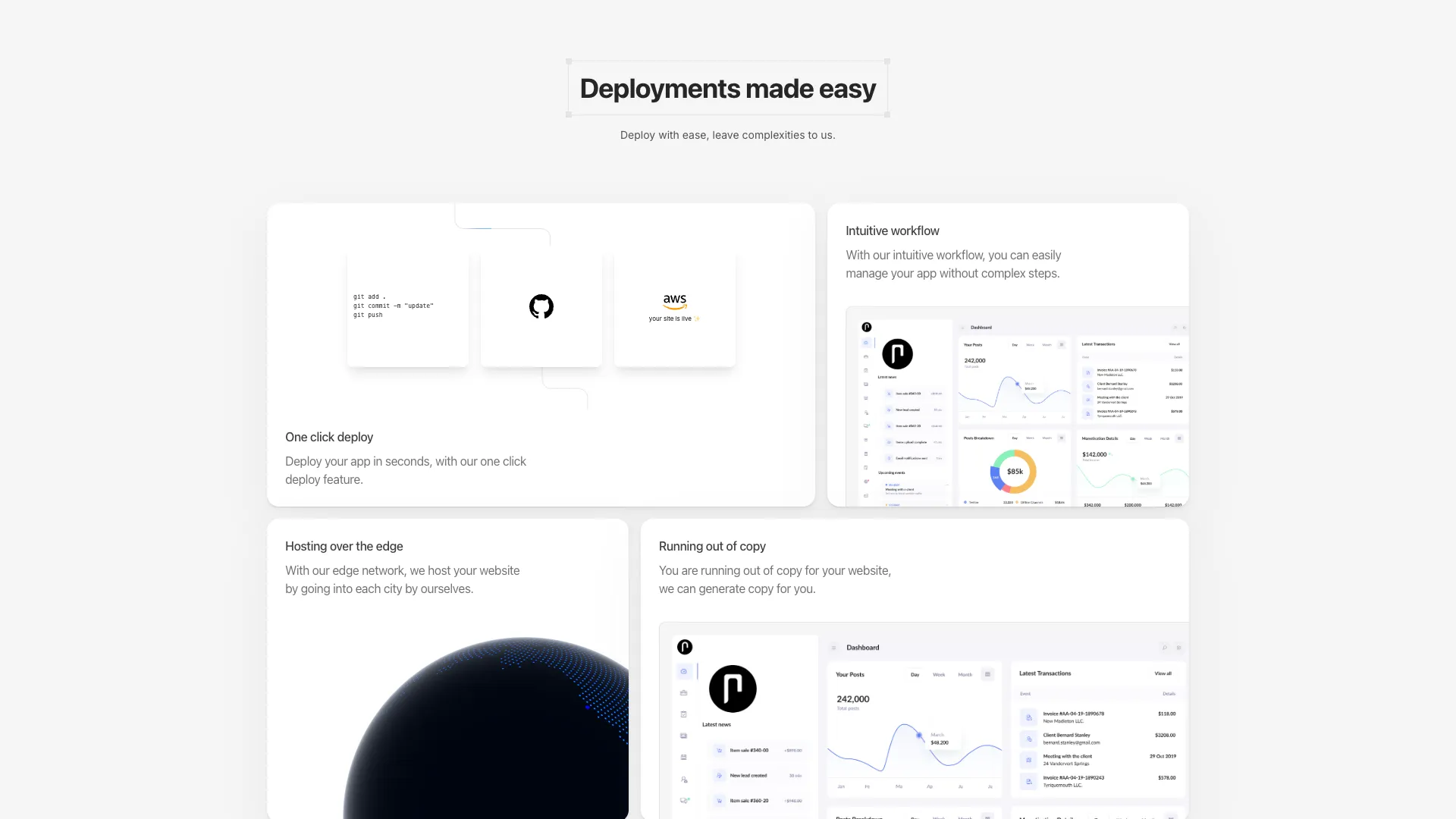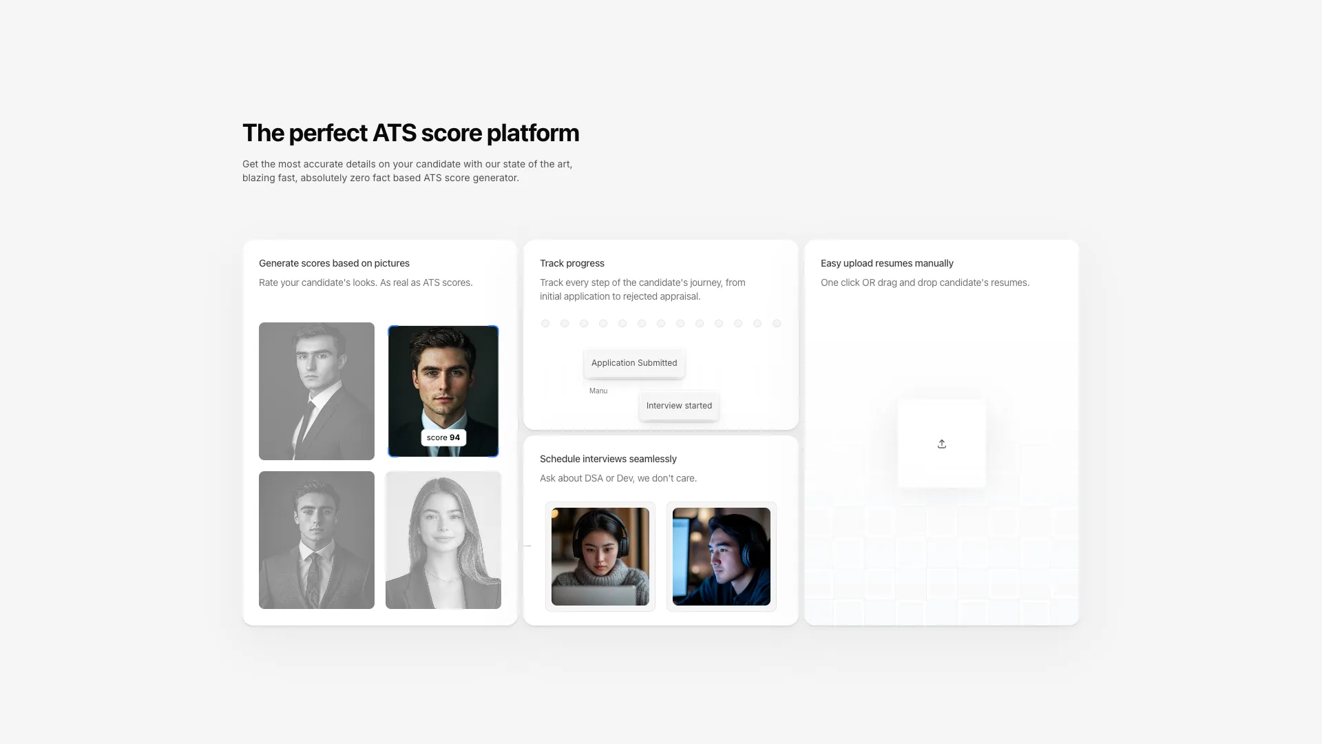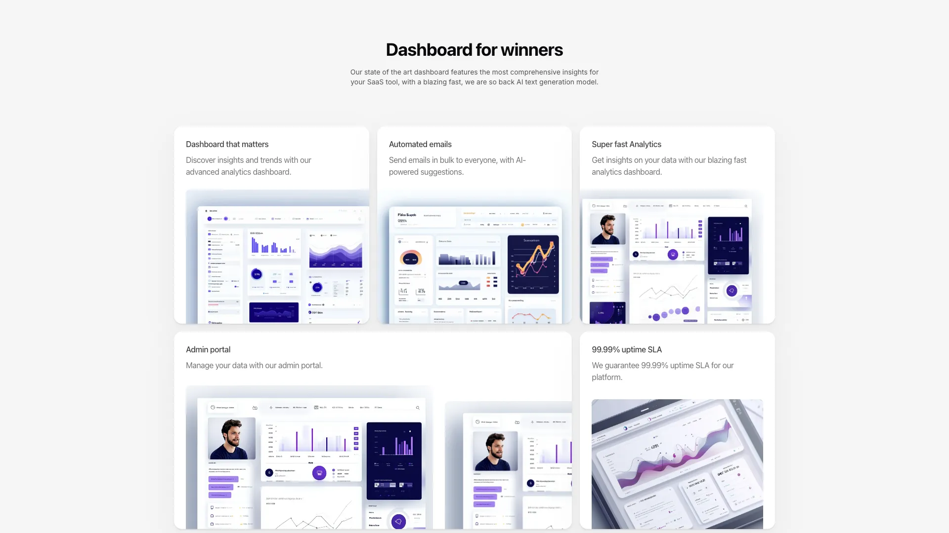








Swap the card contents and the grid spans stay intact. The skeleton-heavy grids include their illustrations, so you can delete the ones you do not need.
A bento grid is a feature section where the cards are deliberately different sizes. That asymmetry is the whole point and also the whole risk, because a grid where every card is equally loud reads as a wall. Decide up front which single card is the hero, give it roughly twice the area of the others, and let the remaining cards be quieter than feels comfortable. If you cannot name the most important card, the grid is a list wearing a costume.
Build the spans with explicit col-span and row-span utilities rather than grid-template-areas unless you genuinely need named regions. Spans are easier to override per breakpoint, which matters because a bento layout almost always needs a different arrangement at the medium breakpoint than at large. The pattern that holds up is a single column on mobile, a two-column pairing in the middle, and your intended asymmetry only at lg and above.
The animated skeletons are the expensive part. Each one is a small scene with its own timers or Motion values, and six of them mounted at once on a page that also has a hero will show up in your interaction latency. Mount them lazily with an IntersectionObserver and stop their loops when they scroll out, and give every card a fixed aspect ratio or min height so the grid does not reflow as illustrations initialise. Layout shift from late-loading cards is the most common bug I see with this pattern.
Keep the DOM order equal to the reading order you want on mobile. It is tempting to reach for order utilities or grid-auto-flow tricks to get a nicer desktop arrangement, and then the screen reader and the phone both get your fourth-most-important card first. Write the markup in priority order and let the spans do the visual rearranging.
A bento grid is a layout of unequal cards packed into one rectangular container, named after Japanese bento boxes with their divided compartments. It became a common way to show product features because the varying card sizes let you signal which capability matters most without writing a ranked list.
Start from a grid with a fixed column count and an explicit row height, then use col-span and row-span on individual cards to make some of them larger. Add responsive prefixes so the whole thing collapses to one column on small screens, since asymmetric spans rarely make sense below about 768px.
Four to seven works. Below four there is not enough variation for the asymmetry to read as intentional, and past seven the size differences flatten out and people stop scanning. The grids here range from three columns of cards up to a six-card arrangement.
A bento grid uses a fixed grid where cards span whole numbers of rows and columns, so the outer shape stays a clean rectangle. Masonry packs items of arbitrary height into columns, so the bottom edge is ragged. One of the blocks here is masonry, and it suits image galleries better than feature copy.
Here's what some of our users have to say about Aceternity UI.

amazing to see @calcom find its way into proper templates 🥳 excited to be powering the next thousands of startups and their demo calls!

Stumbled upon ui.aceternity.com today and my mind is blown 🤯 The seamless integration of framer-motion, tailwind CSS, and shadcn showcases a masterclass in UI design. 🚀 Kudos to @mannupaaji for creating such an innovative and inspirational resource for devs! #UI #nextjs

Have you heard of Aceternity UI? It's packed with various animated components that are ready to copy and paste! Mind-blowing stuff... 🤯 Click here ➡️ ui.aceternity.com #framermotion #nextjs #tailwindcss #techinnovation

ui.aceternity.com So well done. And its bloody free 🤯🤯 Phenomenal work by @mannupaaji

So happy to see @mannupaaji work being recognised 🥹🤌🏻♥️ His work is literally a treasure trove for devs 💎

Aceternity UI has some of the best components for designing landing pages I've ever seen. If you're struggling with figuring out what animations to use. Check it out. Thank me later 😉. ui.aceternity.com
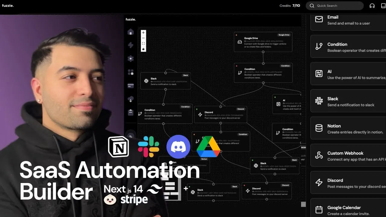
See what the best YouTubers are saying about Aceternity UI.



ceternity UI
Access an ever-growing collection of premium, meticulously crafted templates and Component Blocks.
© 2026 Aceternity Labs LLC. All Rights Reserved.