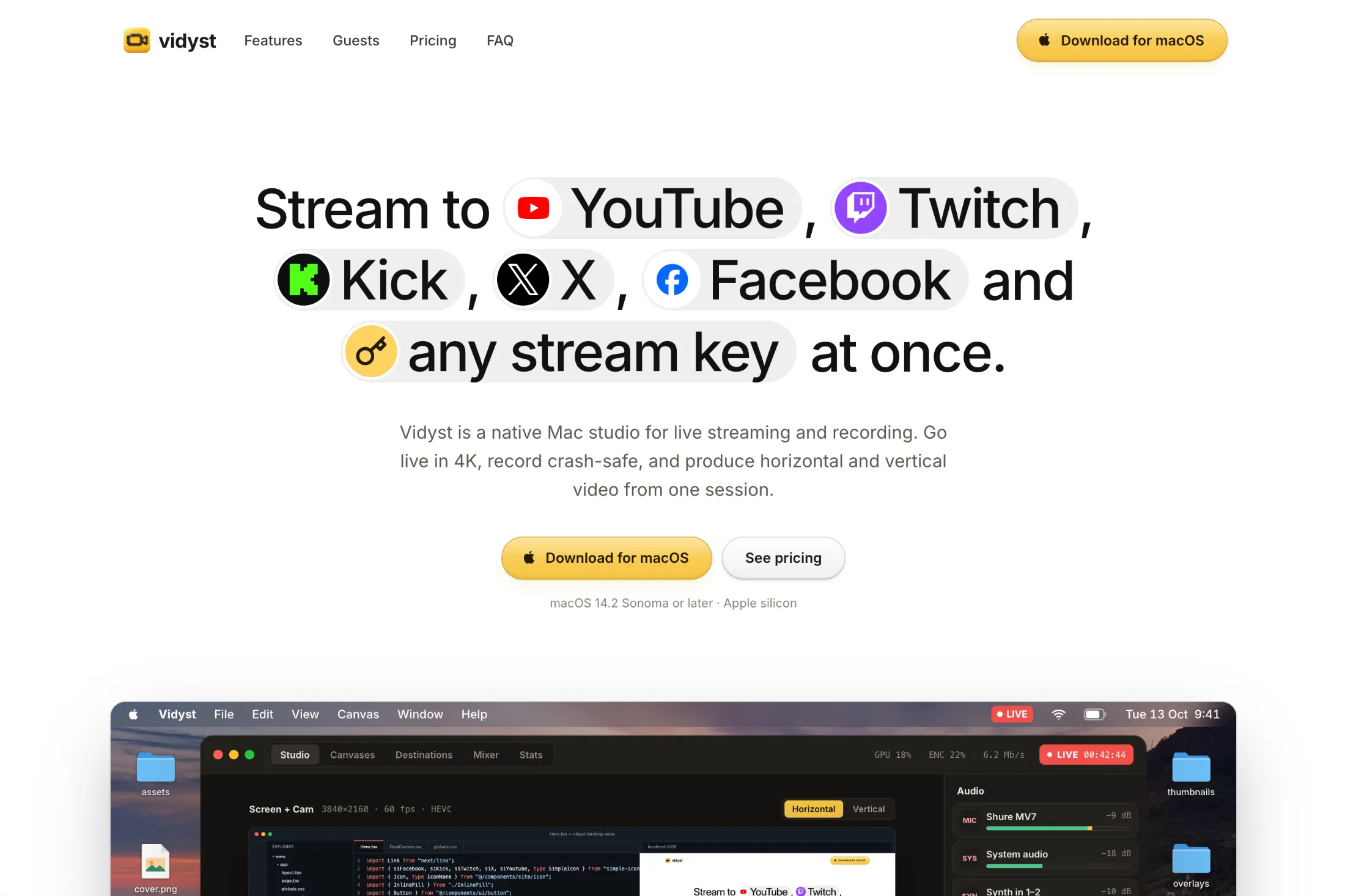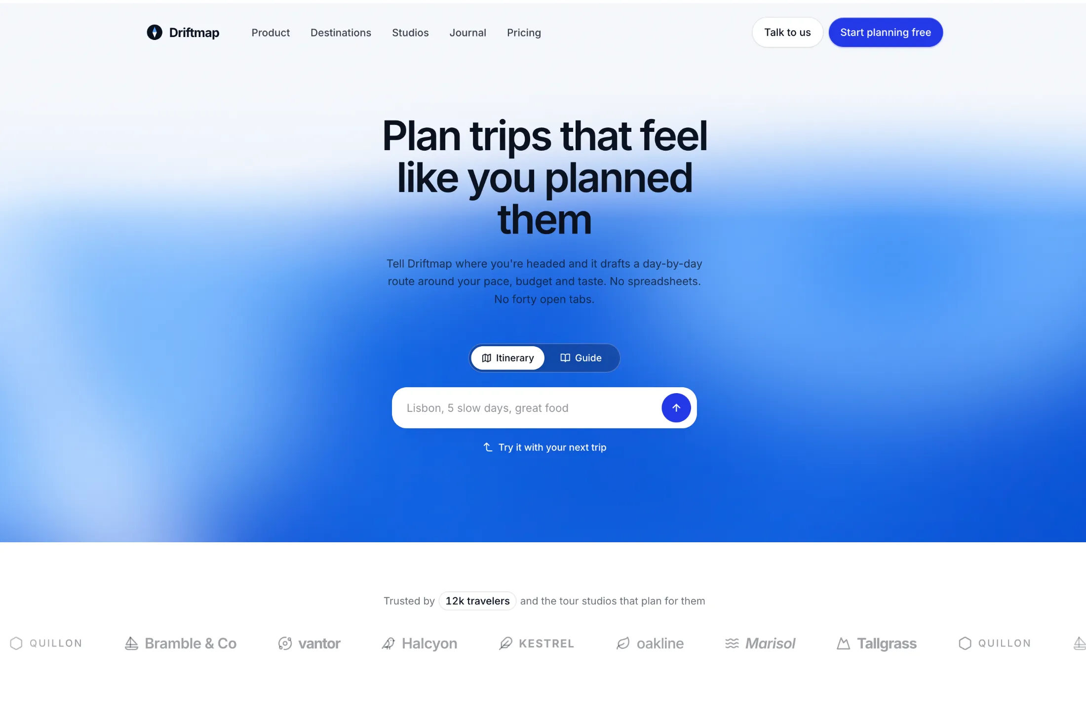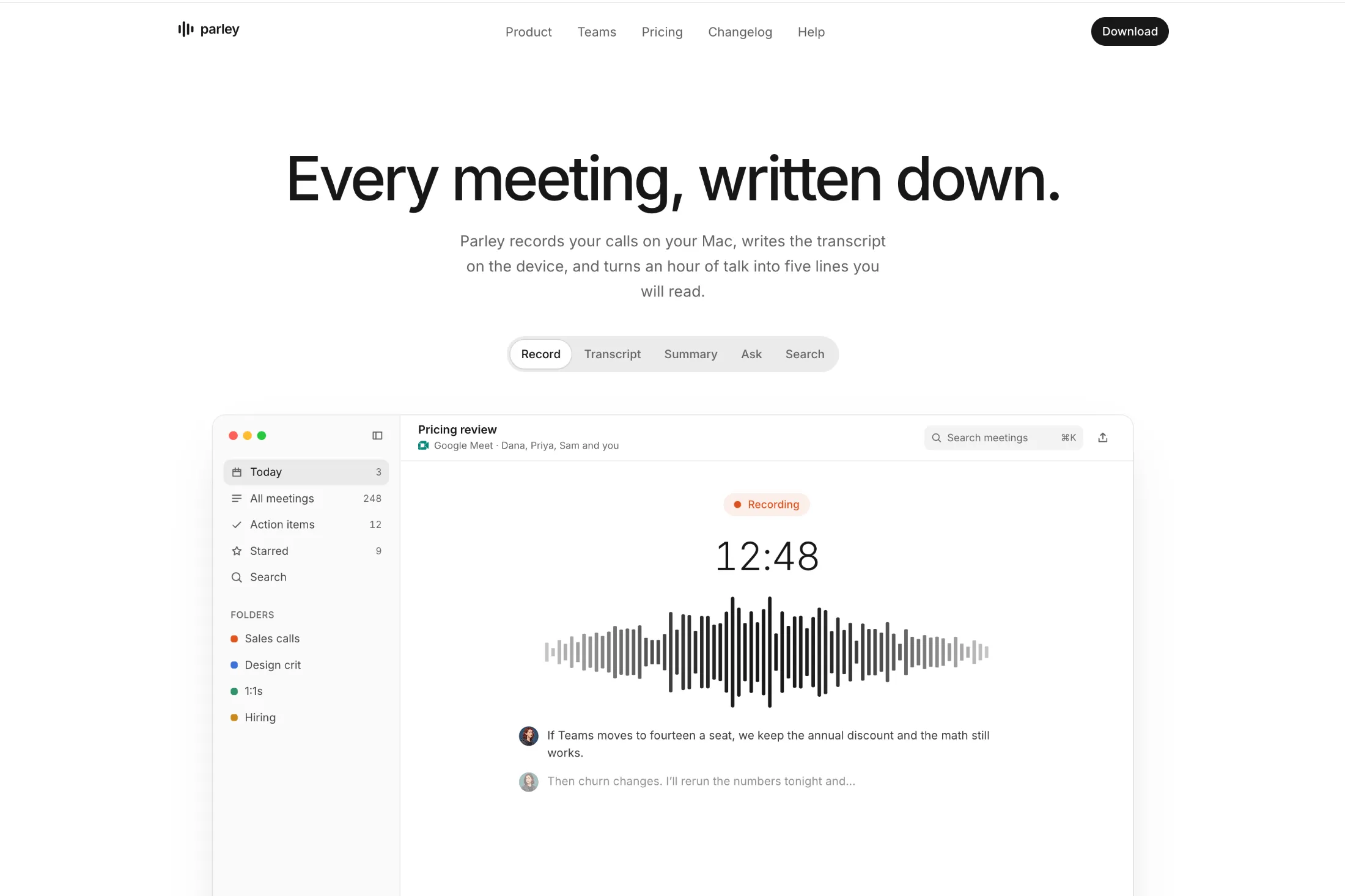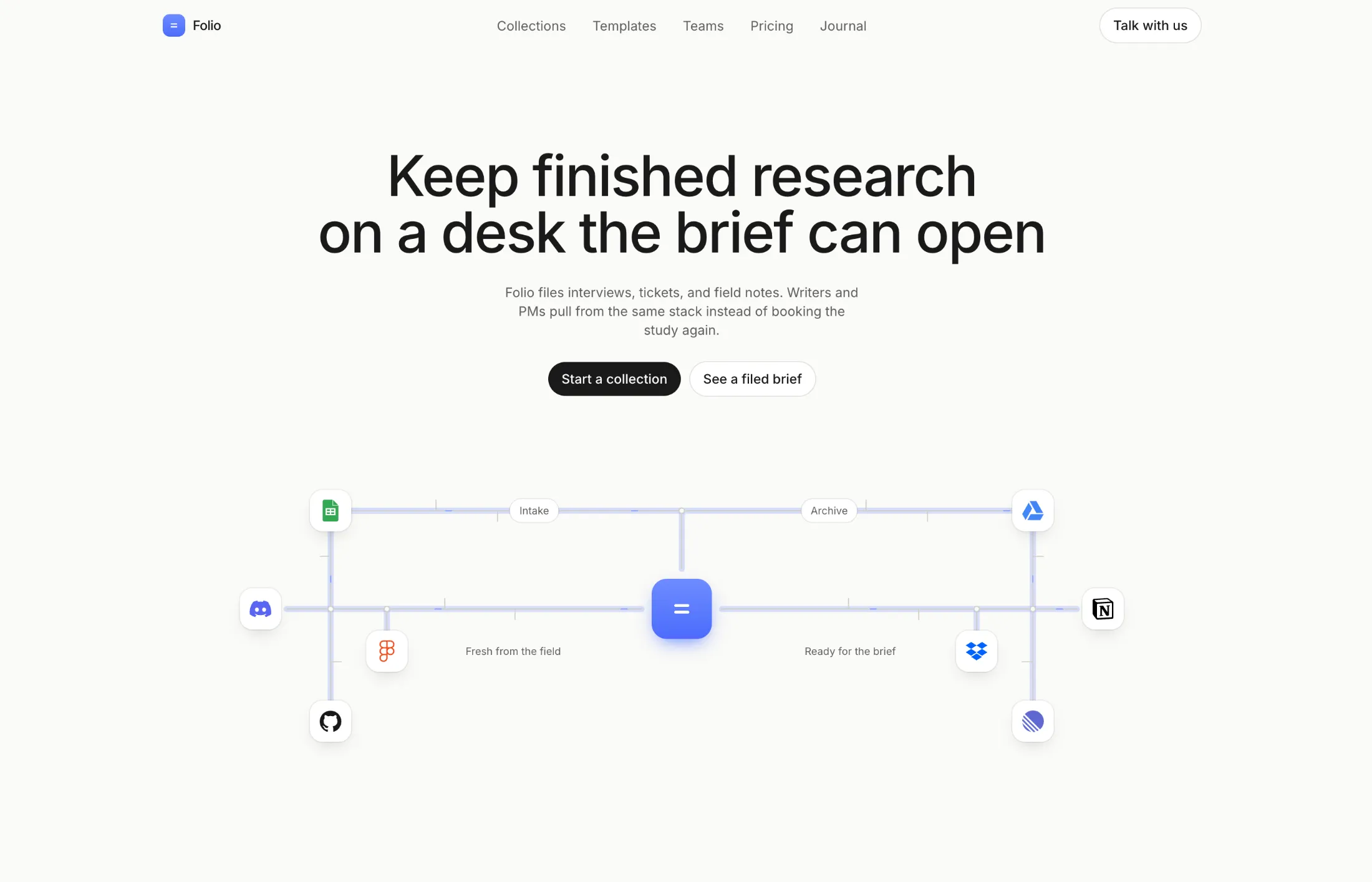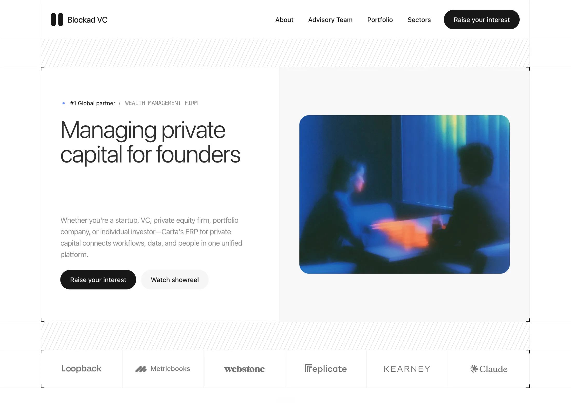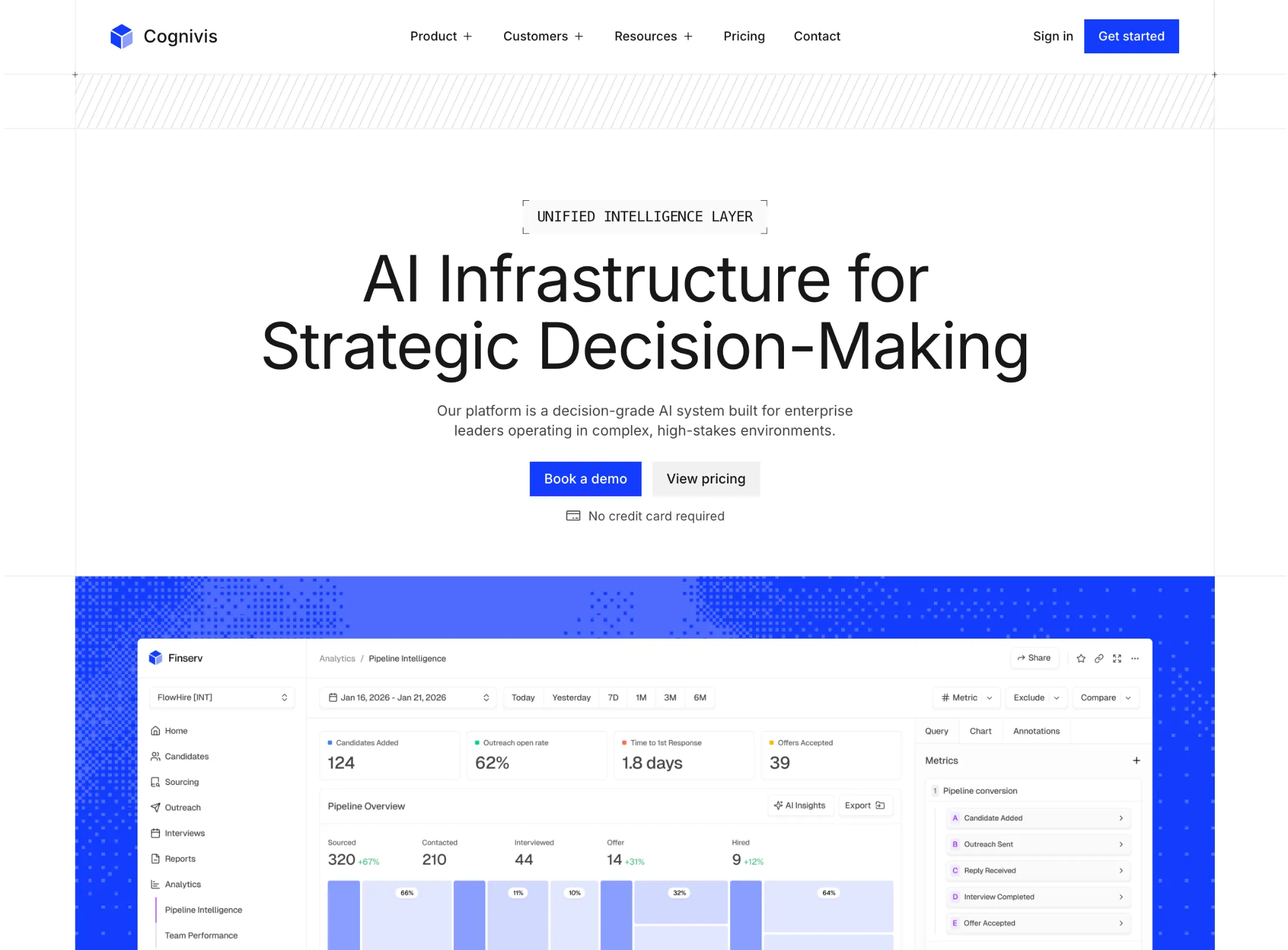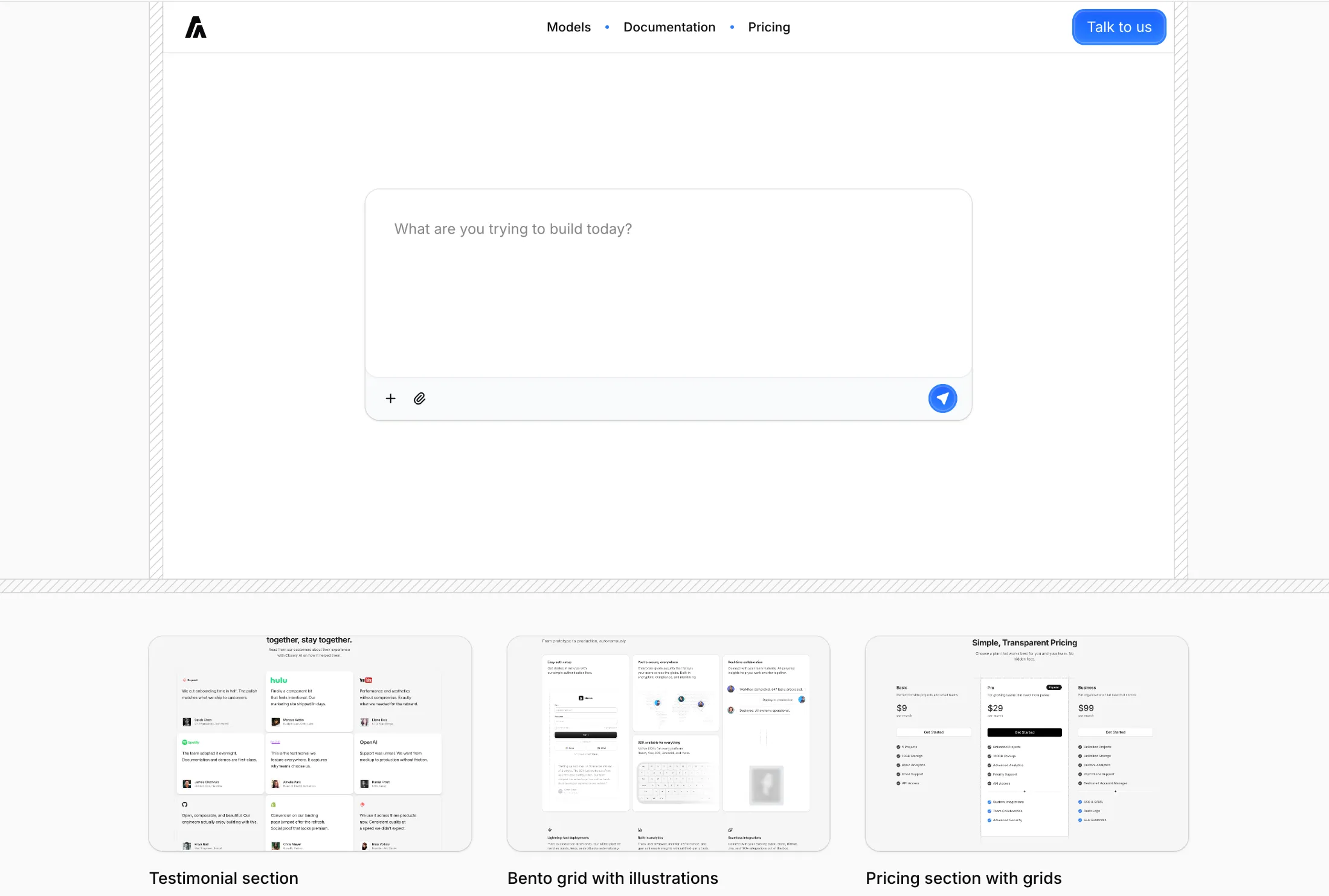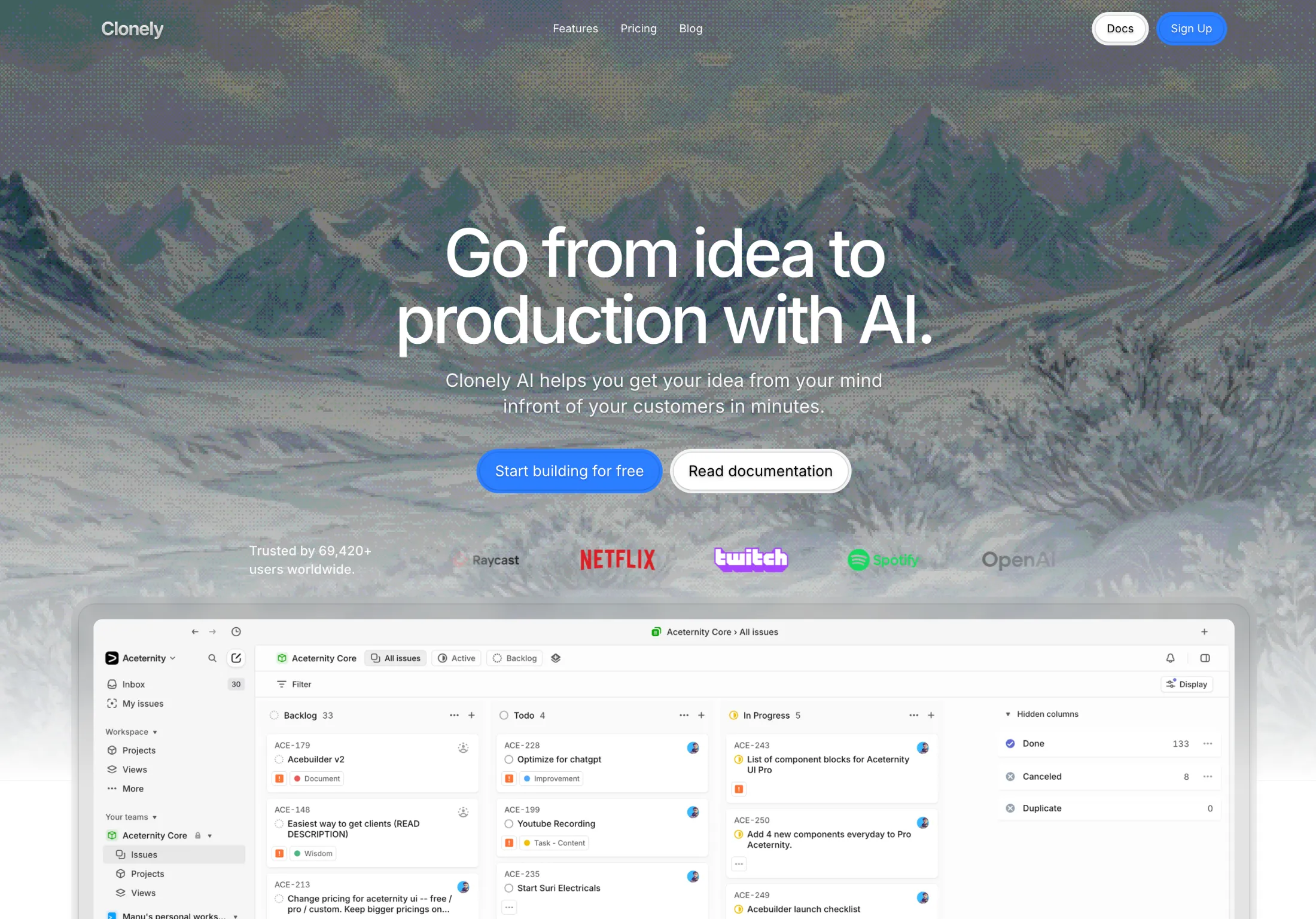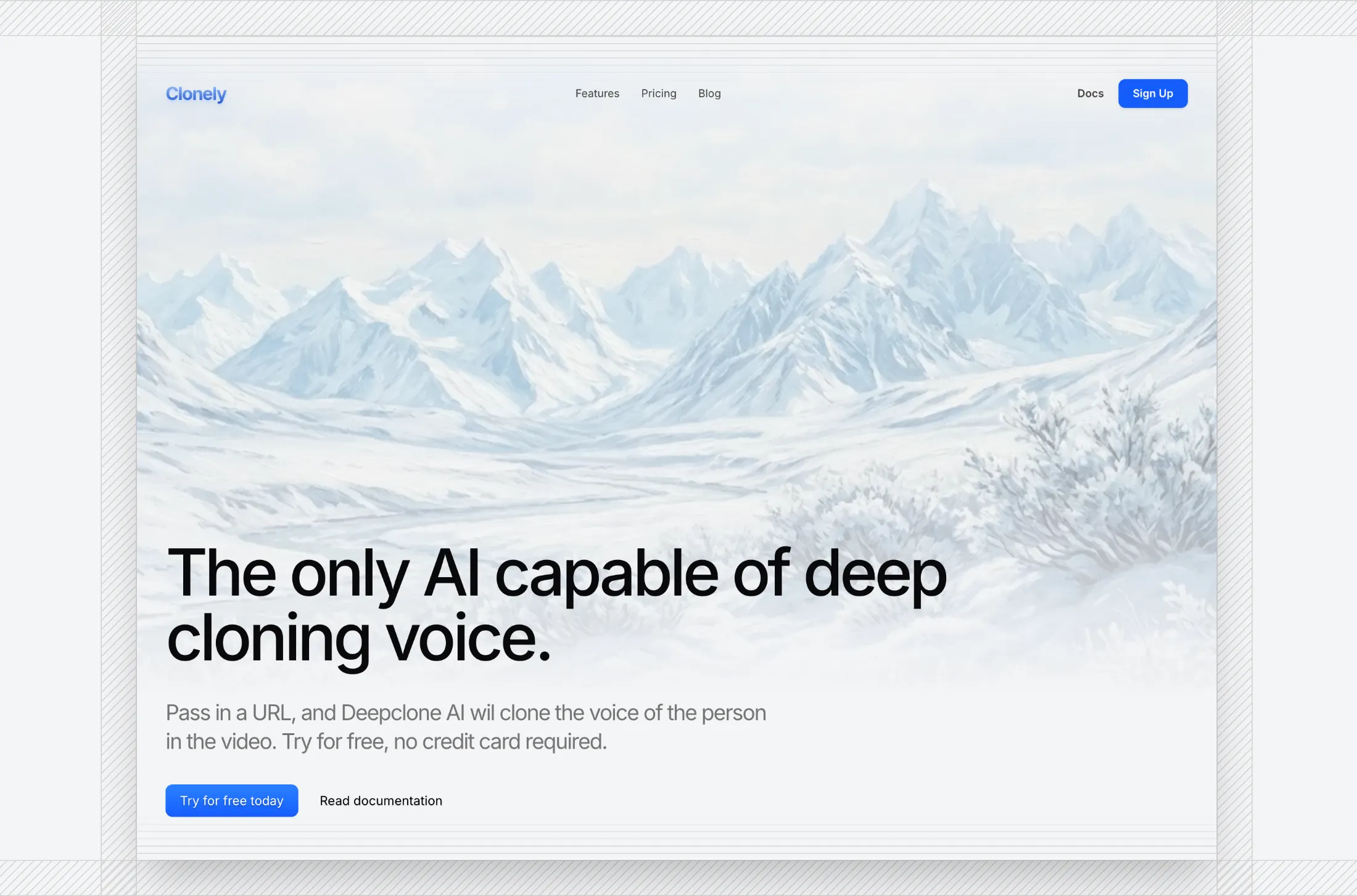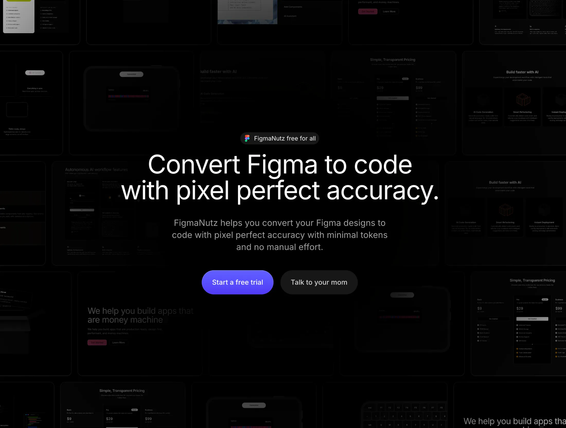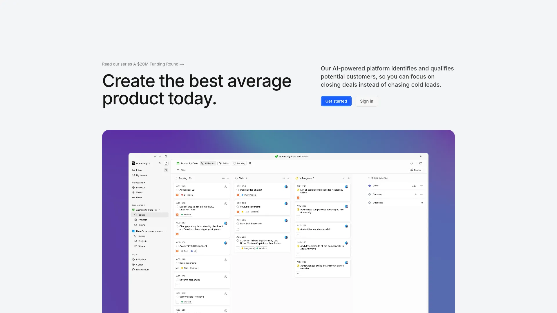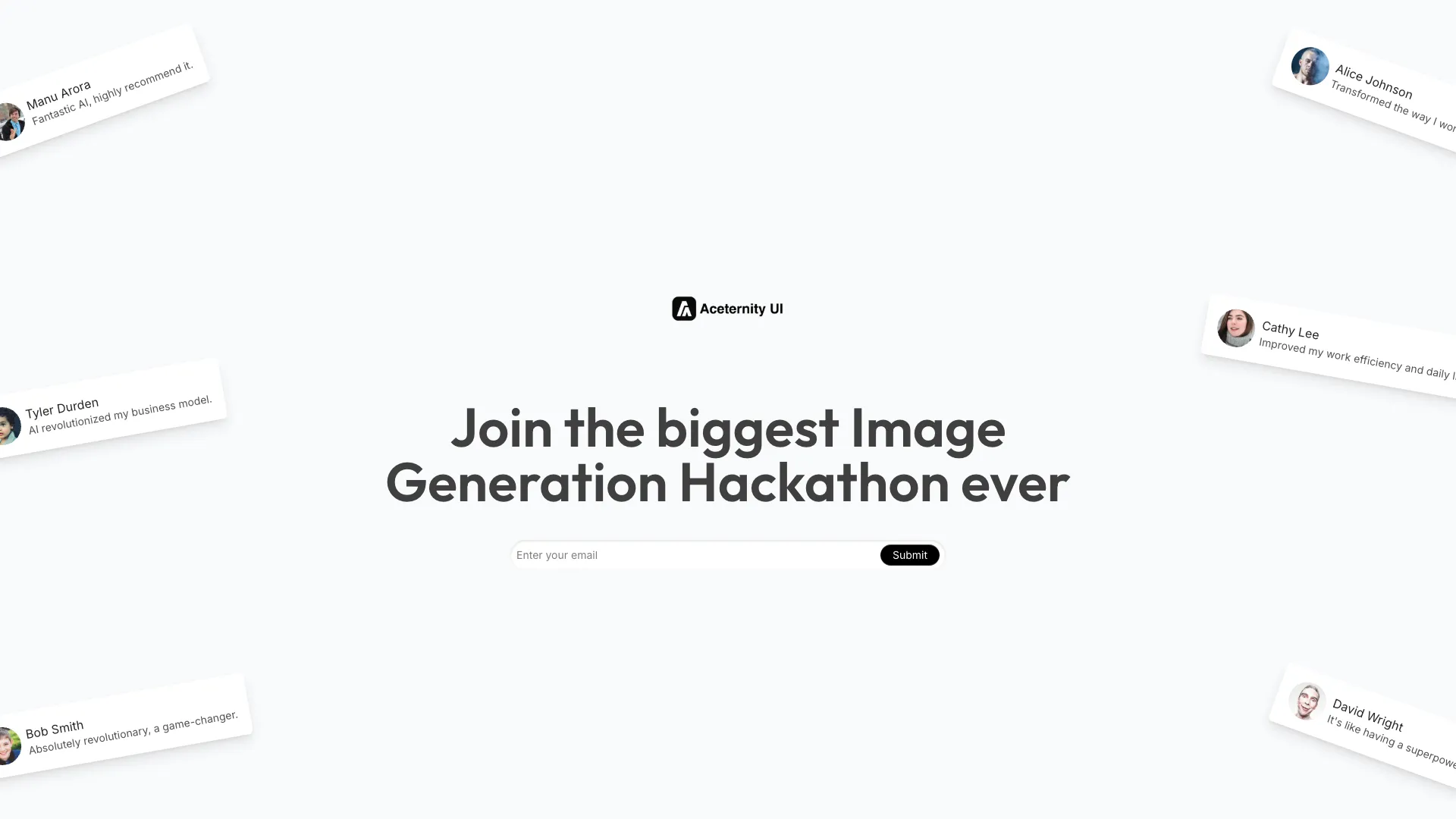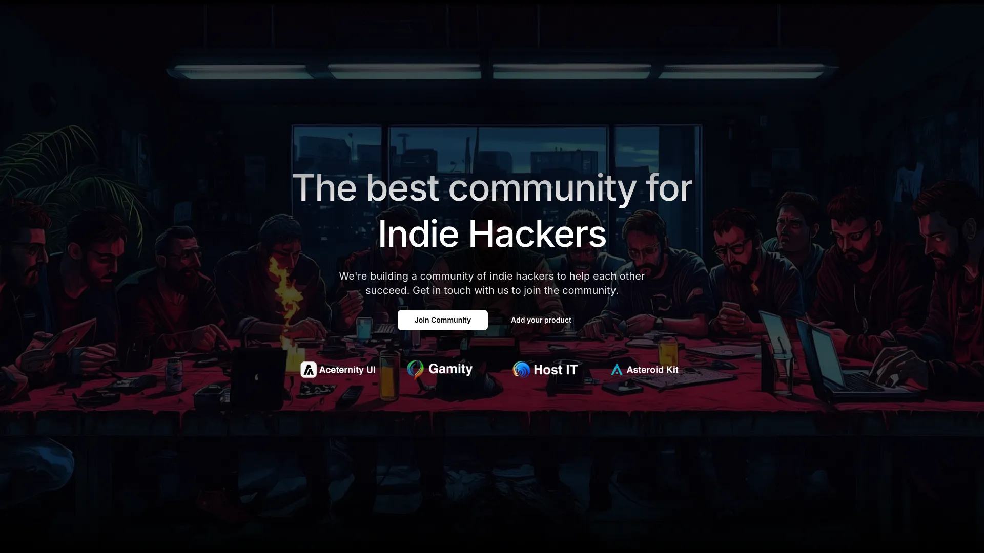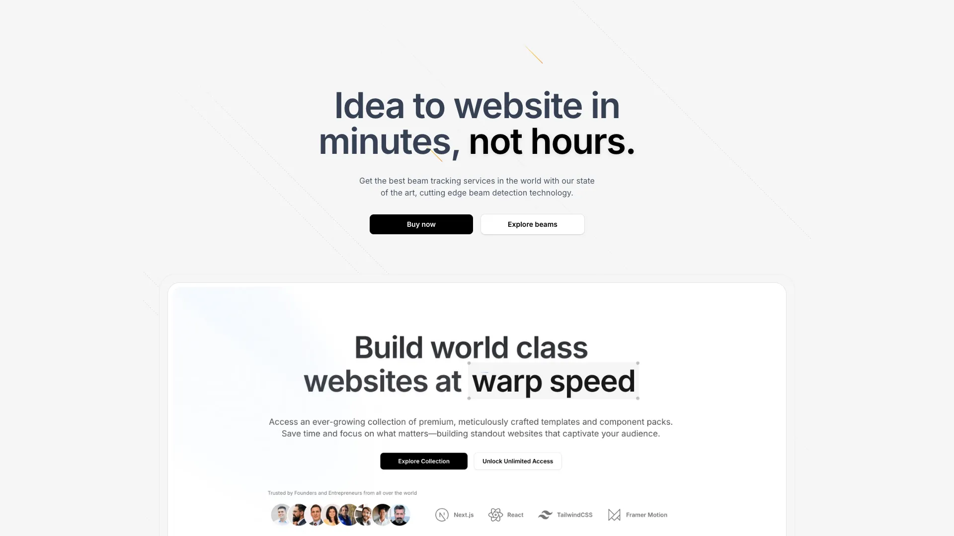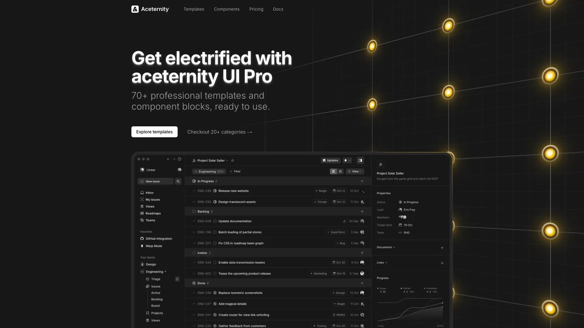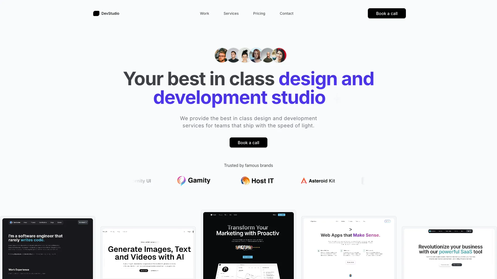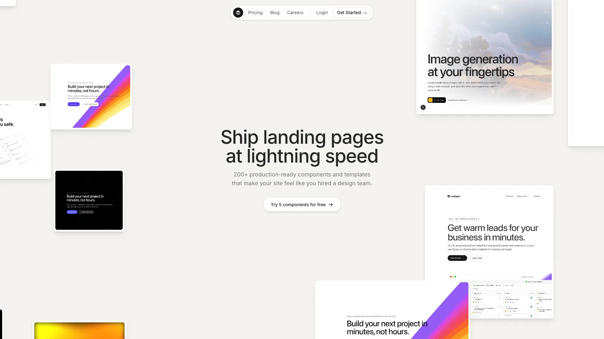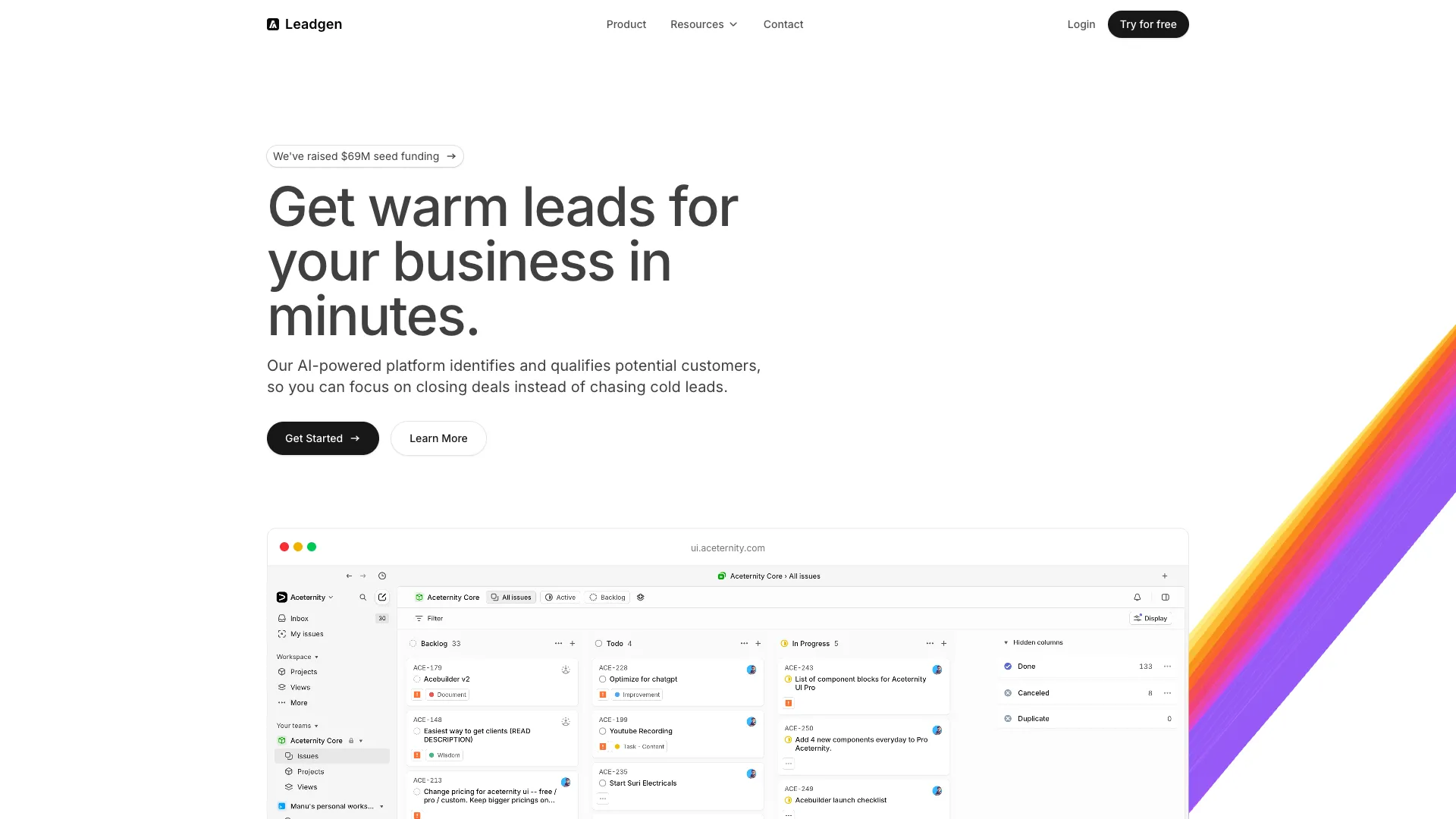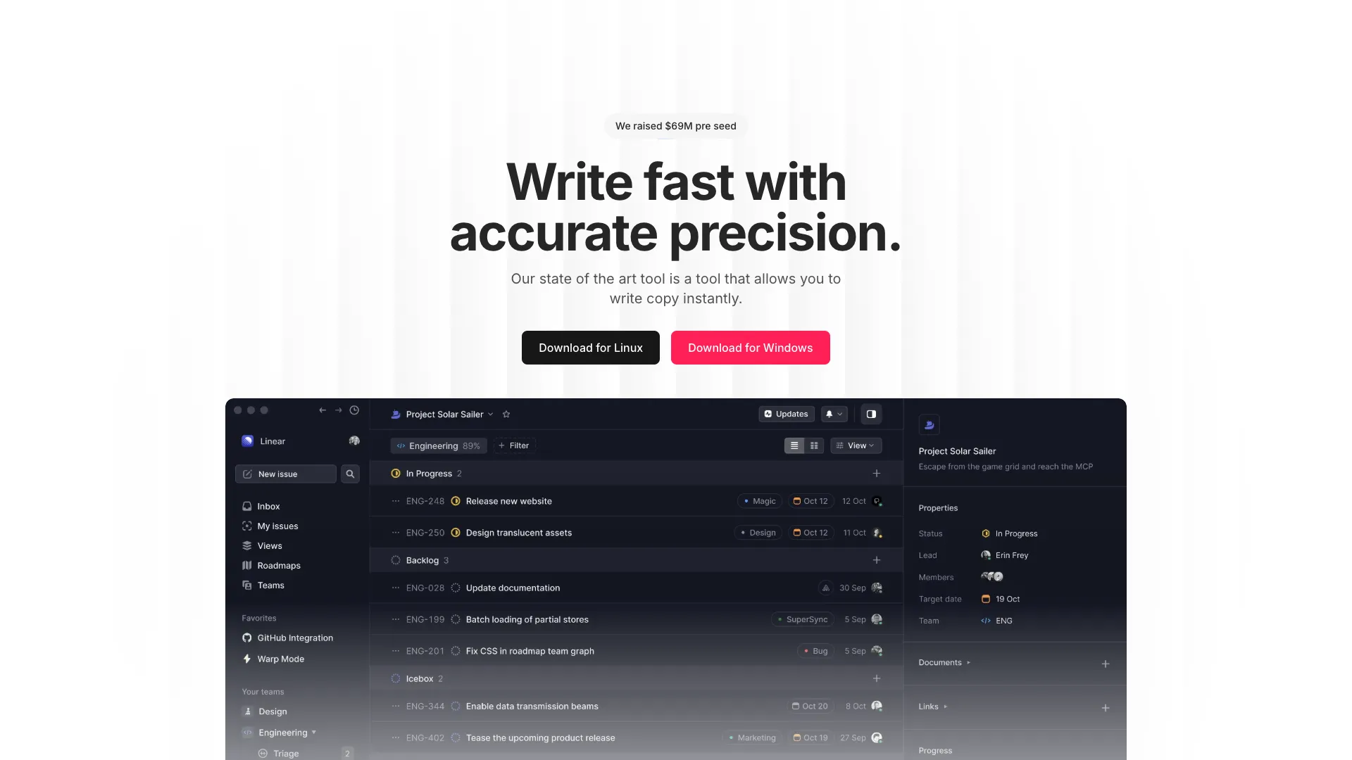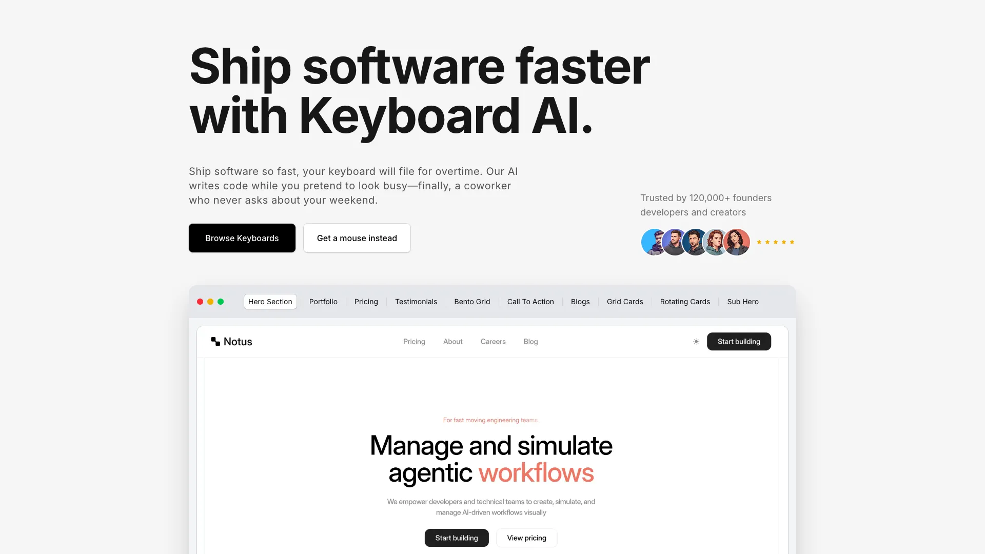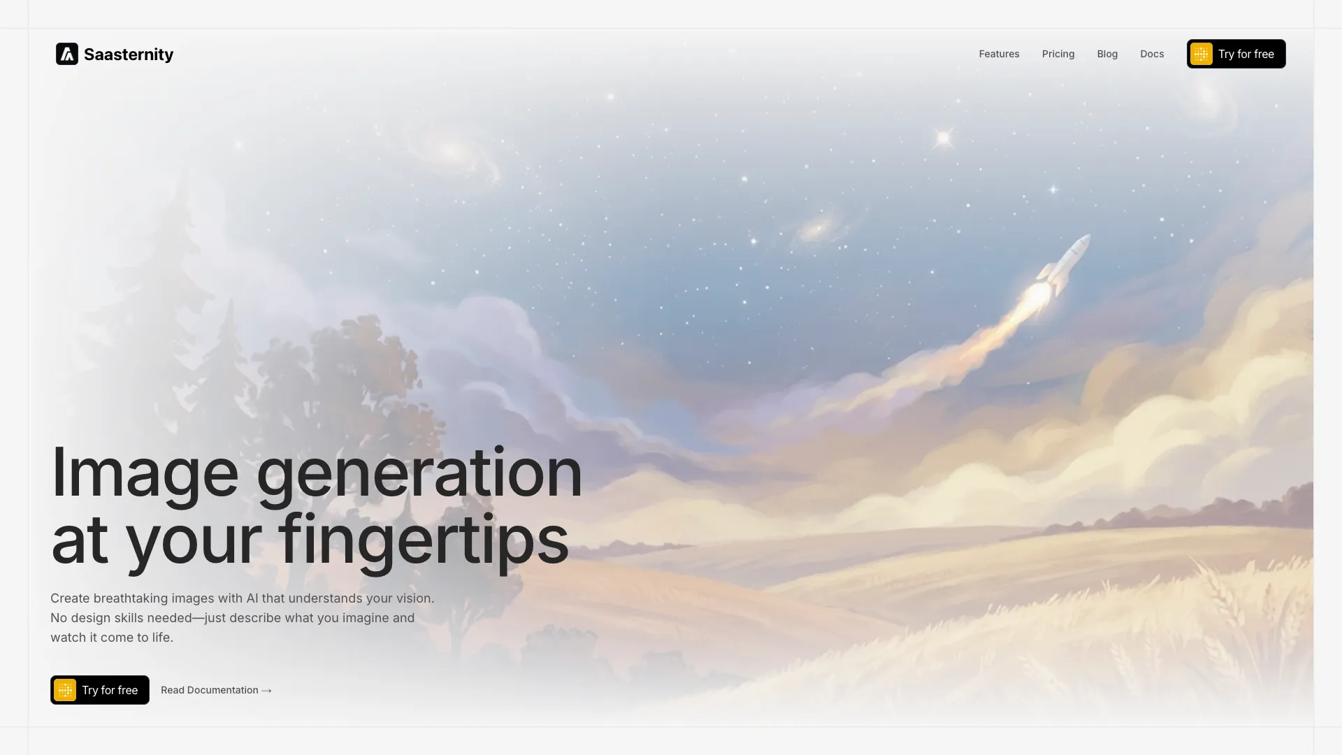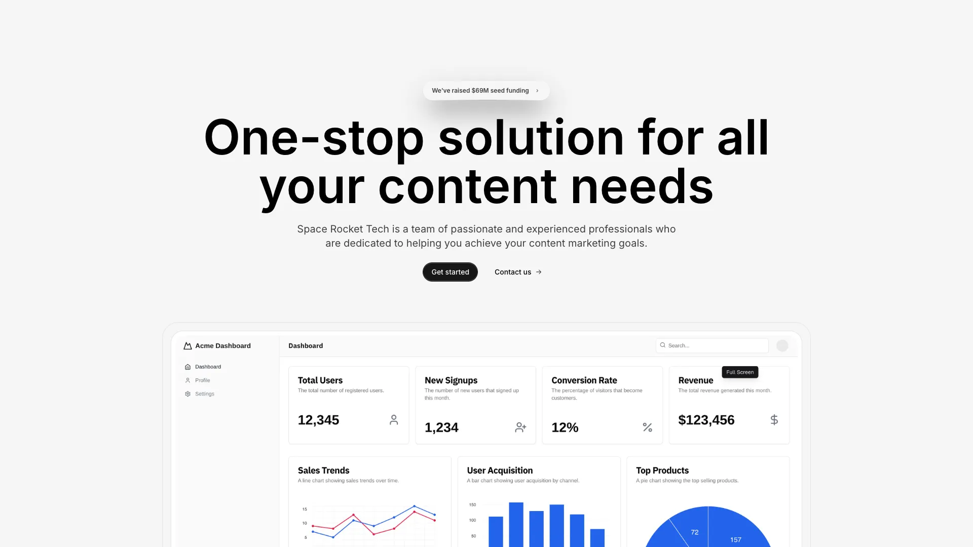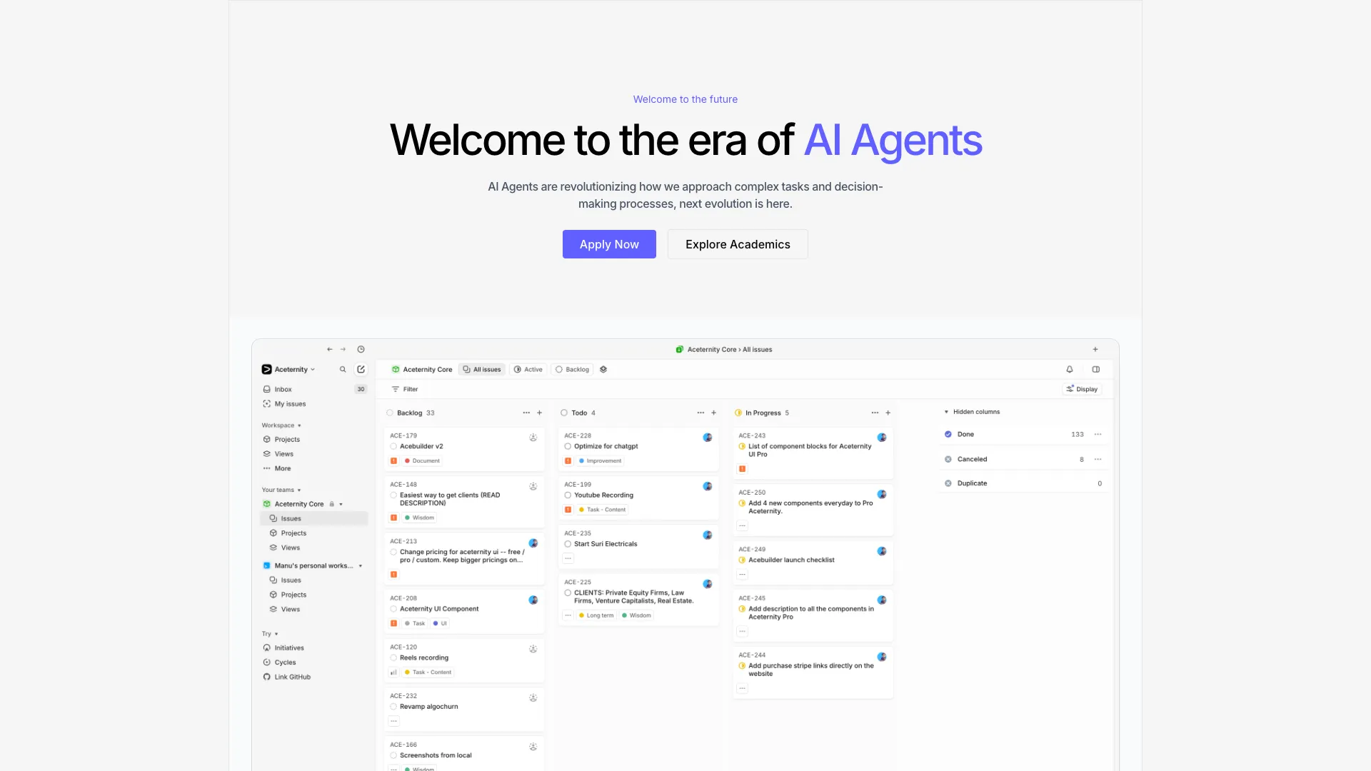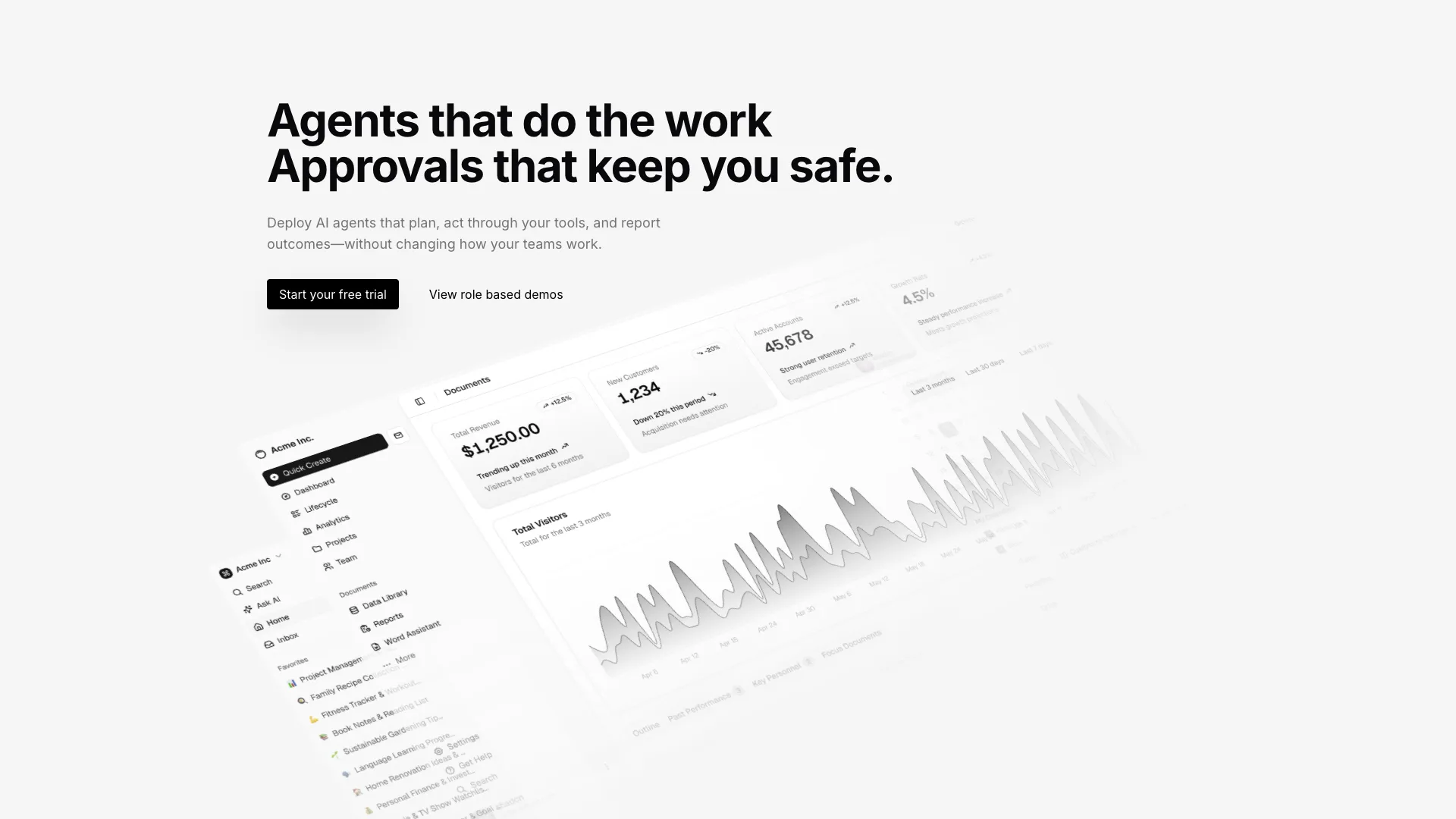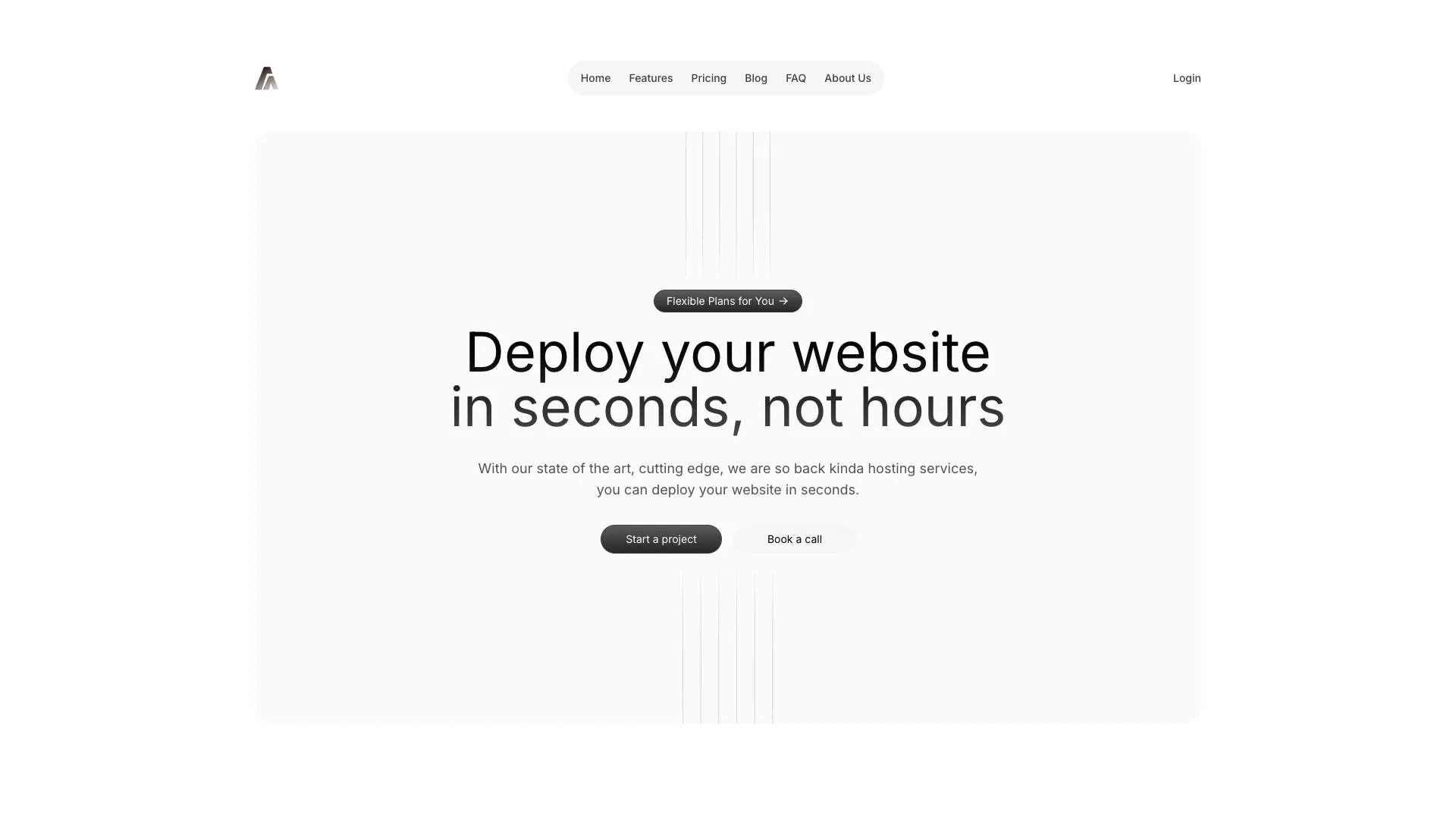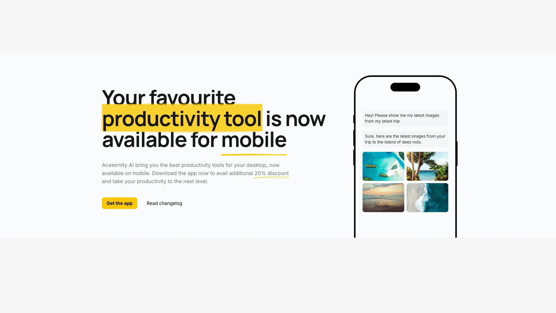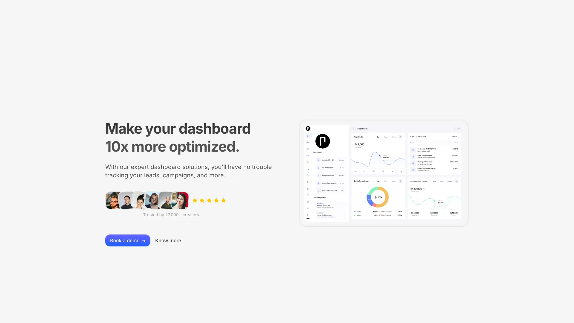








Each one is a self-contained component with its own dependencies listed. Copy the file, install what it asks for, and change the copy.
A hero has one job, which is to tell someone what the product does before they decide whether to scroll. Everything else, including the animation, is in service of that. If a visitor cannot restate your value proposition after two seconds on the page, the hero has failed no matter how good the motion looks.
The practical constraint most people hit is the largest contentful paint. Heroes sit above the fold, so whatever renders there is usually the element Google measures. A hero built around a full-screen video or a heavy WebGL canvas will struggle to stay under the 2.5 second threshold on a mid-range phone. The gradient and CSS-driven layouts in this collection render immediately because there is nothing to download first.
If you are unsure, start with a layout that puts the headline on the left and a product screenshot on the right. It is the most common arrangement in SaaS for a reason: it reads naturally in left-to-right languages, it degrades to a single column on mobile without any thought, and it gives you somewhere obvious to put the primary call to action.
The more theatrical options, like the parallax and spotlight heroes, work best when the product itself is visual. A design tool or a 3D editor can carry them. A payroll API generally cannot, and the mismatch reads as noise.
Copy the component file into your project, install the dependencies listed on the block page, and import it into your route. The components are plain React with Tailwind CSS classes, so there is no provider to configure and no build step to add.
The CSS and Motion based heroes animate transform and opacity only, which stay off the main thread and do not trigger layout shift. The heroes that use a canvas or a video are heavier by nature, so load those below the fold or behind a poster image if the hero is your largest contentful paint element.
Yes. The only Next.js specific pieces are next/image and next/link, and both can be swapped for an img tag and an anchor tag. Everything else is framework agnostic React and Tailwind CSS.
Every hero ships with mobile, tablet and desktop breakpoints already set. Text sizes step down with Tailwind responsive prefixes and multi-column layouts collapse to a single column below the medium breakpoint.
Here's what some of our users have to say about Aceternity UI.

amazing to see @calcom find its way into proper templates 🥳 excited to be powering the next thousands of startups and their demo calls!

Stumbled upon ui.aceternity.com today and my mind is blown 🤯 The seamless integration of framer-motion, tailwind CSS, and shadcn showcases a masterclass in UI design. 🚀 Kudos to @mannupaaji for creating such an innovative and inspirational resource for devs! #UI #nextjs

Have you heard of Aceternity UI? It's packed with various animated components that are ready to copy and paste! Mind-blowing stuff... 🤯 Click here ➡️ ui.aceternity.com #framermotion #nextjs #tailwindcss #techinnovation

ui.aceternity.com So well done. And its bloody free 🤯🤯 Phenomenal work by @mannupaaji

So happy to see @mannupaaji work being recognised 🥹🤌🏻♥️ His work is literally a treasure trove for devs 💎

Aceternity UI has some of the best components for designing landing pages I've ever seen. If you're struggling with figuring out what animations to use. Check it out. Thank me later 😉. ui.aceternity.com
See what the best YouTubers are saying about Aceternity UI.


ceternity UI
Access an ever-growing collection of premium, meticulously crafted templates and Component Blocks.
© 2026 Aceternity Labs LLC. All Rights Reserved.